Google Play Store Site Gets Redesigned

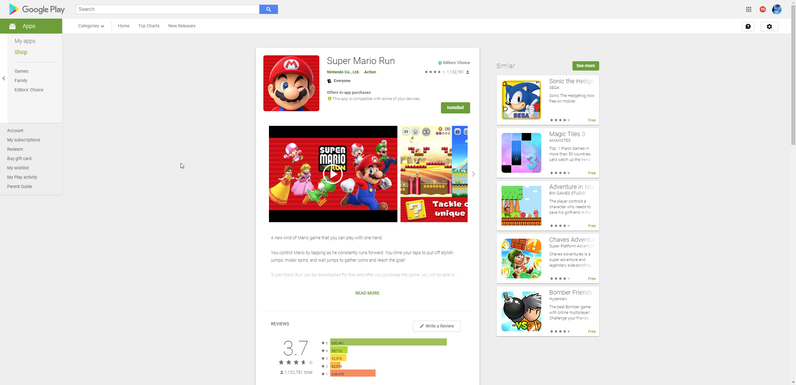
The company is rolling out a new redesign of the Google Play Store UI. What you will first notice is the new layout tweaks, larger screenshots and a new dedicated reviews page.
One good change is that every time you take a screenshot, you now get a larger image thanks to the new lightbox viewer. Although the lightbox popup will cover the entire window, the image is right at the middle, previously the screenshots were placed in an awkward spot in the slider interface which you will only see a small picture of the screenshot.
One thing we noticed when scrolling through the screens in the new design is noticeably slow.
As for the reviews, the review section now has a dedicated page where it used to be just an expanded section from the main page of the app. Each “review” now also shows how many “thumbs up”s it has received from other users. This is a good way to tell if a review is just spam or not.
The format for the number of app installs has also been tweaked, now it shows “100,000,000+.” Installs instead of the “100,000,000 – 500,000,000”
The mobile version of the Google Play Store only receive a small change; the mobile version now has a White background instead of Grey.
The reviews are different as well. If you open the “All Reviews” section, you’ll now get a dedicated page rather than an expanded section on the main app listing page. The new page shows how many thumbs-ups each review has received, and there’s a new “All Devices” filter option.
The mobile version of the web Play Store got a small tweak as well. Instead of a gray background, it’s white.
The redesign looks like it’s still rolling out, as not everyone is seeing the changes yet on the app store. There could be new changes that were not available yet as of writing this article so stay tuned and we will continue to update this article as it rolls out.


