5 Thumbs Up-Worthy Web App Design Examples to Spark Creativity and Inspiration

Your web application’s design is like a handshake. It’s the first impression that can make or break the user experience.
Users decide whether they like your app or not in less time than it takes to blink.
That’s right, within a mere 0.05 seconds of landing on your app, they’ve already formed an opinion. And a big part of that opinion is shaped by how your app looks and feels. You risk losing them if it’s not appealing or easy to use. Almost 40% bounce off unattractive sites.
Speed matters too. Over half of mobile users will leave if your app loads more than three seconds.
Here’s the silver lining: nail your app’s design, and you’re golden. A well-designed app builds trust and credibility — three-quarters of users judge a company by its web page’s design.
But what does a well-designed app look and feel like?
In this article, I’ll be analyzing five web app designs that exemplify excellence in user experience, aesthetics, and performance — based on the standards set by the award-winning designers of Appetiser Apps. Read on to gain valuable insights and inspiration for designing an app that leaves a lasting impression on your users.
What is a web app?
A web app is a software program that users access through a web browser over the internet. Unlike traditional desktop applications, web applications do not require installation and can be used on various devices with internet connectivity. They are typically hosted on servers and provide dynamic and interactive experiences, allowing users to perform tasks, access content, and interact with data in real time.
Native apps vs web apps
Web apps and native apps are different applications.
A web app works through a web browser and needs the internet to run. It can work on any device because it’s built with web technologies like HTML and JavaScript. On the other hand, a native app is made for a specific platform, like iOS or Android, using languages like Swift or Java.
Native apps are faster and can use special features of your device, but they need separate versions for each platform and are downloaded from app stores. On the other hand, web apps can be accessed directly through a browser without downloading or installing anything, making them more accessible.
Additionally, web app development costs less than native app development, primarily due to factors such as development time and resources required.
Web apps vs website
While both web apps and websites are accessed through web browsers, the main difference lies in their functionality and interactivity.
A website primarily provides static content, such as information or multimedia. It typically consists of interconnected web pages linked together. On the other hand, a web app is more interactive and dynamic. Users can perform tasks, input data, and interact with the interface, often requiring user authentication and data storage.
5 Web Application Design Examples to Inspire Your Software Development Project
1. Pointsbet: Betting on the power of seamless navigation
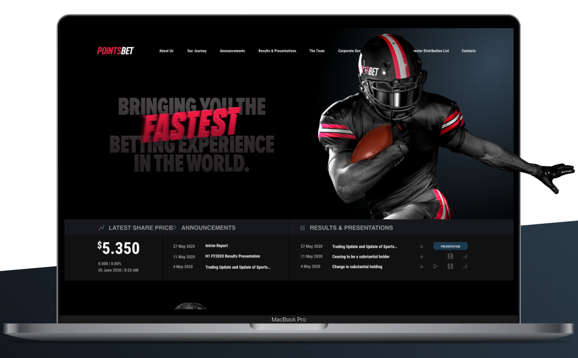
PointsBet is an online sports betting platform that allows users to wager on various sporting events. Founded in 2017 in Australia, this app gained rapid popularity for its innovative sports betting approach, including features like “PointsBetting” where users can win or lose more based on wager accuracy.
Since its launch, PointsBet has expanded to the United States and grown remarkably — surging from $100 million to $3.2 billion. The developers have also partnered with NBA superstars, such as Shaquille O’Neal and Allen Iverson.
I am not into sports betting, but by simply navigating their website, I can see why PointsBet has grown immensely in such a short period.
Pointsbet’s boasts an intuitive web app UI (user interface) that makes navigation a breeze. From registering an account to placing bets and managing transactions, every step is seamlessly integrated into the platform.
The app interface is clean, clutter-free, and designed to prioritize user experience. All these factors ensure that even newcomers to sports betting can easily find their way around.
Additionally, its responsive design ensures accessibility across various devices. These features matter in an app of this nature as users are often after getting real-time updates and results wherever they go.
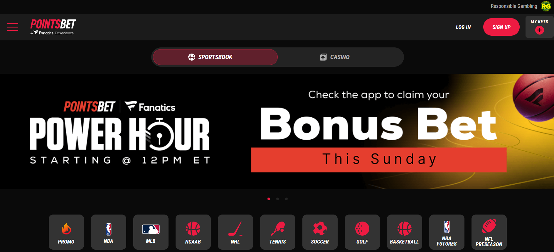
Another standout feature of Pointsbet’s web app design is its ability to offer a personalized betting experience. Through advanced algorithms and user data analysis, the platform delivers tailored recommendations, promotions, and betting options based on one’s preferences and betting history.
I encourage you to check out PointsBet’s case study to find out more about its journey to app success and how you can replicate it.
2. Praisal: Exemplifying the impact of a data-led design
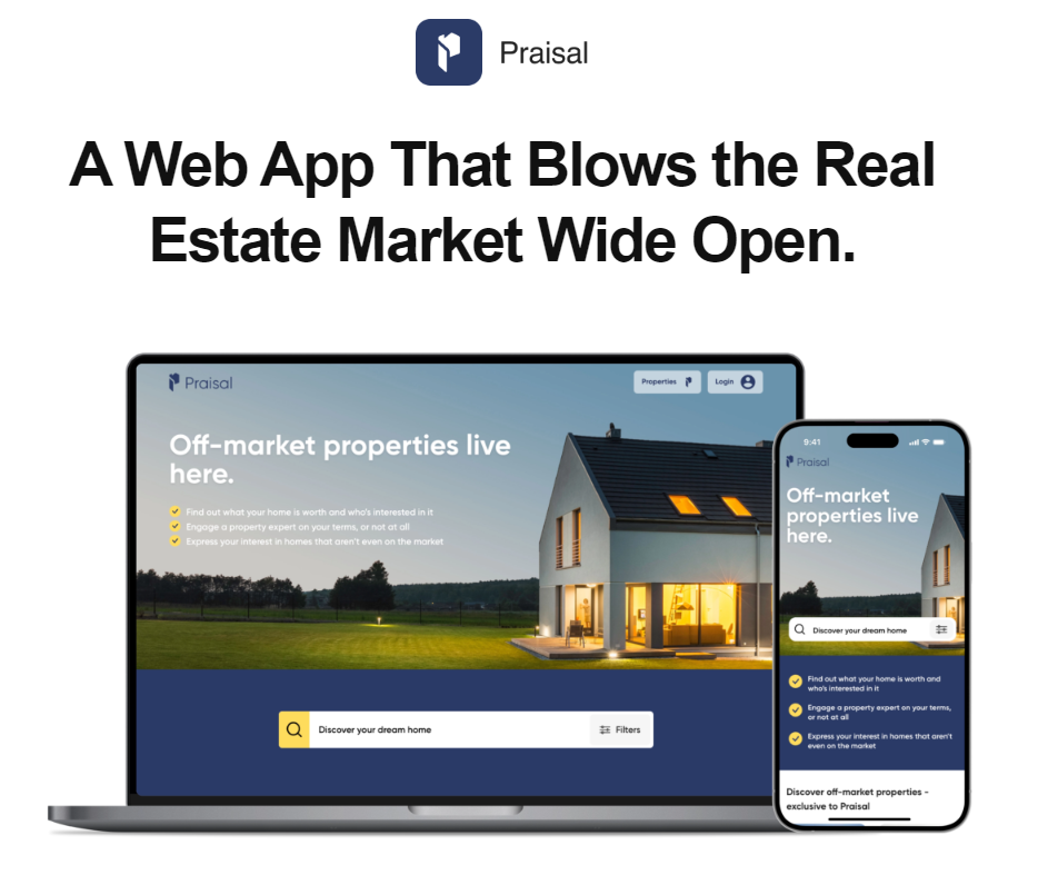
Praisal is a real estate marketplace specializing in pre-market properties. It aims to simplify the property valuation process by facilitating direct communication between owners and buyers. Through the app, users can express interest and submit initial bids transparently and confidently.
Praisal’s web app design is built with the user in mind. I say this because in the real estate industry, generating information based on data is crucial. Praisal makes property valuation simple by using data-driven techniques.
It incorporates predictive analytics to forecast future property trends and market conditions. By analyzing historical data and identifying patterns, Praisal provides users with valuable insights into potential changes in property values, equipping them with the foresight they need to make strategic decisions and succeed in real estate.
The visual elements and navigation layout were also well put together. From the moment you land on the homepage, you’re greeted with a clean and intuitive interface that guides you through the valuation process effortlessly. The navigation also seamlessly allows users to input property details and generate valuations with just a few clicks.
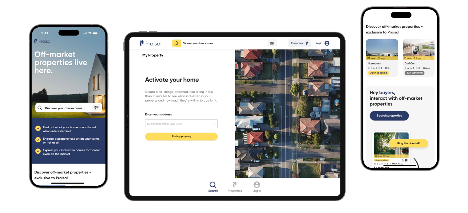
Would you like to know more about what makes this platform thumbs-up worthy? Read Praisal’s case study to learn how the startup has leveraged data-driven design to build an app that’s competing with the big platforms.
3. Canva: Making visual design intuitively easy
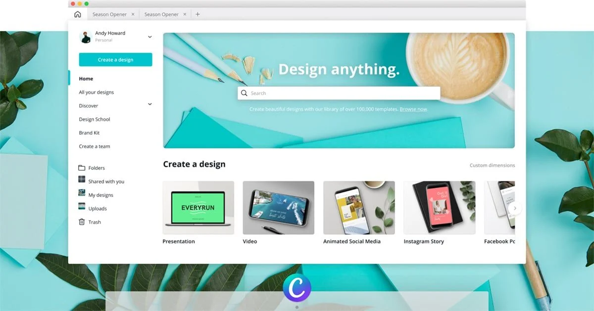
Source: Canva
Canva is a graphic design platform that offers a wide range of tools and templates for creating stunning visuals. Its web app design is characterized by its user-centric approach.
What I like the most about Canva is its simplicity and accessibility. Unlike traditional graphic design software that requires extensive training and expertise, Canva is designed to be accessible to users of all skill levels. Its intuitive drag-and-drop interface empowers even those with limited design experience to create professional-looking visuals effortlessly.
Furthermore, Canva’s extensive library of design elements, including templates, stock photos, and illustrations, provides users with endless possibilities for creativity.
By removing the barriers to entry typically associated with graphic design, Canva has transformed the way individuals and businesses approach visual communication, making high-quality design accessible to everyone, regardless of their background or expertise.
4. Airbnb: Driving clarity through visual hierarchy
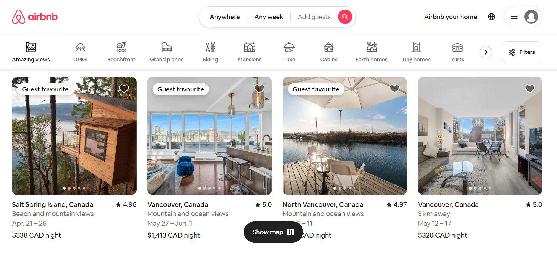
Source: Airbnb
Airbnb is an online marketplace and hospitality service that enables people to rent out their properties or spare rooms to guests. It offers a platform for travelers to find unique accommodations, ranging from apartments and houses to villas and even castles, for short-term stays.
Central to Airbnb’s success is its innovative web app design, which captivates users with stunning imagery, efficient layout, and immersive visuals that showcase destinations and accommodations.
The app has an intuitive navigation system, which allows users to easily explore listings, filter search results, and discover unique accommodations tailored to their preferences. It also hierarchically organizes content, with essential information such as destination, dates, and number of guests prominently displayed at the top of the screen.
Why do these design features matter?
Travelers often browse accommodation while on the go, so having an intuitive interface that allows them to view listings easily and book stays enhances convenience and encourages usage. A seamless booking process, free of friction and confusion, instills confidence in users and encourages them to complete their bookings quickly and efficiently.
You’ll find more relevant ideas and insights in our article The 5 Best Travel Apps of 2024. Check it out!
5. Trello: Keeping things clean and functional
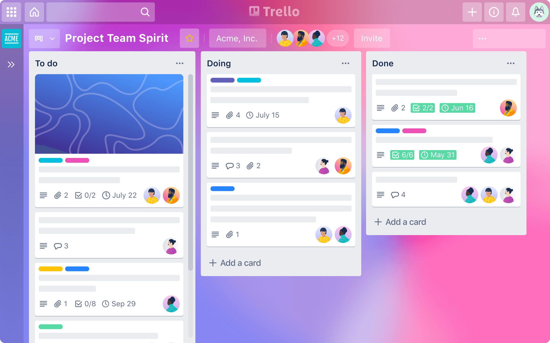
Source: Trello
Trello is a web-based project management tool that allows individuals and teams to organize tasks, projects, and workflows visually and collaboratively. It uses a system of boards, lists, and cards to help users track progress, assign tasks, set deadlines, and communicate with team members.
As a minimalist, I appreciate the simplicity of Trello the most. Its user-friendly interface is clean, simple, and highly functional. These things matter, especially since the app targets users looking for an efficient tool for organizing projects and tasks collaboratively.
Other standout features of Trello’s web app design are its flexibility and adaptability to different project management needs. Whether used by individuals, small teams, or large organizations, Trello’s customizable boards, cards, and lists empower users to tailor their workflows to suit their specific requirements.
Moreover, Trello regularly updates its platform with new features and enhancements based on user feedback, ensuring it remains relevant and valuable.
The key to designing an impactful web design
What do the featured web apps share in common?
They focus on meeting the needs and expectations of their users. They achieve this by making their interfaces easy to use, ensuring smooth navigation, and providing personalized experiences that fit seamlessly into users’ lives, making things more convenient, efficient, and enjoyable.
Moreover, these apps stand out by using innovative features, beautiful visuals, and compelling content to capture users’ interest and keep them engaged over time.
Simply put: the core of any successful app design is its ability to truly understand and cater to its users. Keep this principle and the above tips in mind when designing something similar.
And if you want the guidance and expertise of our award-winning designers, hit us up! Let’s talk about how to best turn your idea into a reality.
People also ask
Before you start designing your web app, let’s clear up some common questions.
1. How to design a web app?
Start by defining what problems your app solves and who will use it. Sketch out user flows to map how people move through key tasks. Create wireframes showing where buttons, menus, and content sit on each screen.
Pick a design system with consistent colors, fonts, and spacing rules. Build clickable prototypes to test before coding begins. User research beats guesswork every time; test with five real users to catch 85% of usability problems. Check out how PointsBet grew to $3.2 billion by nailing this process.
2. How to design a user-friendly web application?
Make navigation obvious. Users decide if they like your app in 0.05 seconds. Put your most important features front and center. Keep load times under three seconds or you’ll lose over half your mobile users.
Use familiar patterns like top navigation bars and standard icon meanings so people don’t have to think. Test on actual devices, not just your desktop. Apps like Canva win by making complex tasks feel simple through intuitive drag-and-drop interfaces and clear visual hierarchy.
3. How to design a web app UI?
Start with a grid system to keep layouts clean and aligned. Choose two fonts maximum, one for headings, one for body text. Pick a primary color for key actions and use it consistently. Make clickable elements look clickable with buttons that have clear borders or shadows.
Keep text readable with font sizes above 16px and contrast ratios of at least 4.5:1. Build mobile-first, then scale up to desktop. Use whitespace to separate sections and give content room to breathe. Airbnb nails this with stunning imagery and clear visual hierarchy.
4. What tools do you need to design a web app?
You need design software like Figma or Adobe XD for creating mockups and prototypes. Figma wins for team collaboration since everyone works in the browser. Add a prototyping tool to make clickable demos; Figma and Adobe XD both handle this.
Get user feedback with tools like Maze or UserTesting before writing code. For design systems, try Storybook to document components. Developers need the designs in formats they can code from. Most teams also use project management tools like ClickUp, GitHub, and Trello to track design tasks and feedback cycles.
5. How long does it take to design a web app?
Simple apps with basic features take 2-4 weeks to design. Apps with custom features and multiple user types need 6-12 weeks. Complex platforms handling transactions or sensitive data can take 3-6 months.
Design typically takes 20-30% of total project time. Discovery and research add 1-2 weeks upfront. Testing and iterations add another 1-2 weeks at the end. The timeline depends on scope, team size, and how quickly you provide feedback.
6. What makes a good web app design?
A good design solves real problems for real users. It loads fast (under 3 seconds), works on phones and desktops, and guides users through tasks without confusion. The best designs balance beauty with function; every element serves a purpose. Consistent patterns make new features feel familiar.

Jane Eslabra has 14+ years of experience producing content across traditional and digital platforms. She channels her strong passion for fostering tech startup growth through knowledge sharing.


