How to Design App Interfaces to Attract Loyal Users (7 Tips and 10 Amazing UX Examples)
")
Have you ever seen a design so bad that all you can do after is make a facepalm 🤦and say:
Source: Know Your Meme
A poor app interface design is just like that.
But while you may find the image above amusing, the same can’t be said for a lousy interface.
According to studies:
- 88% of users are less likely to return to a website if they experience bad user experience.
- 80% of customers are willing to pay extra for a better user experience.
- 90% of users said they have stopped using an app due to poor performance.
Meanwhile, a good user interface (UI) design can increase the conversion rate by up to 200%.
In other words, the user or app interface can draw the line that separates a successful app business from one that falls flat.
So, if you’re working on a new web or mobile app, this article will arm you with the key principles of a good interface design. It’ll also provide some remarkable examples of apps that got UI design right.
How to design app interfaces that attract loyal customers
- Purposeful layouts: Craft a cohesive design strategy
- Simplicity first: Create intuitive and accessible interfaces
- Visibility matters: Highlight crucial UX components
- Feedback in focus: Keep users informed and engaged
- Error-friendly design: Allow room for user mistakes
- Consistency counts: Harmonize your app’s visual elements
- Inclusive design: Embrace WACG principles for types of users
** Bonus content **
- 6 Key mobile app design principles you should know
- 10 Best apps with exceptional app interface and UX designs
- 7 Exciting app design trends to explore
- Frequently asked questions on app interface design
1. Purposeful layouts: Craft a cohesive design strategy
Designing a good app UI/UX involves more than just making things look pretty. Every element of the app, from the color scheme to the layout of the buttons, should be purposeful and contribute to a positive experience.
Designing beautiful app interfaces is a balancing act and challenging, too. In the words of one of our product designers, Calvin Cica, it’s like “Having a healthy balance of beauty (user interface) and brains (user experience). Achieving that balance can be quite tough for certain products—it’s walking a tightrope.”
This means you need to consider how different components will be arranged on the screen and how users will interact with them.
Content, too, must be well organized and easy to navigate. Users should be able to find the information they need quickly and without difficulty.
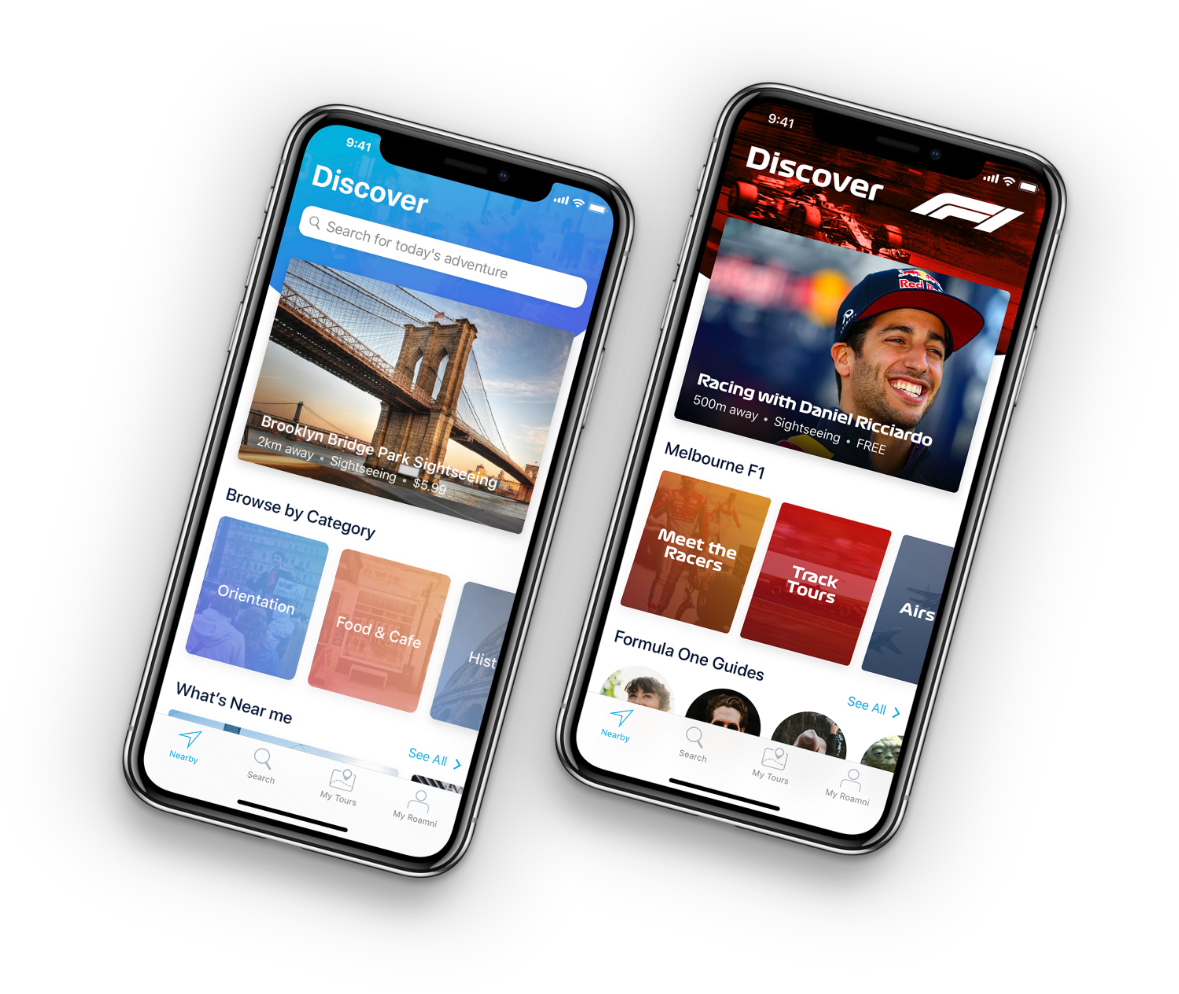
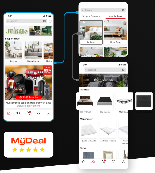
One great example of a mobile app that rocks an organized mobile app interface design is MyDeal, an e-commerce business and one of Appetiser’s web app partners.

To keep the UI/UX design neat, our designers organize the app’s offerings under main categories and subcategories. We kept the umbrella categories at the forefront and the details hidden behind them.
How do we know it was a great idea?
The app’s smashing success tells us it is.
MyDeal now has more than 890,000 active users, records 200% year-on-year growth, and sits above retailing giants such as Uniqlo, Asos, Wish, H&M, and Groupon.
📣 The inspiring journey of MyDeal is the real deal when it comes to using well-designed apps for growth and future-proofing.
2. Simplicity first: Create intuitive and accessible interfaces
The best app interface is easy to navigate and doesn’t require users to think too much about how to use the app. This means keeping apps free of clutter and unnecessary features.
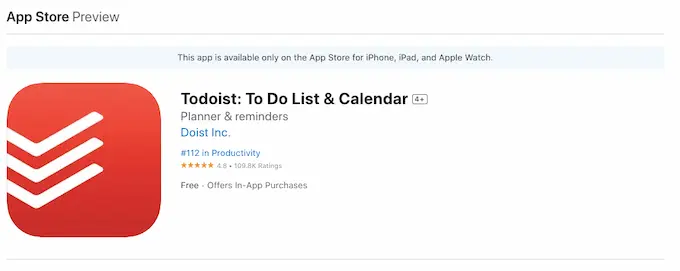
When I asked Calvin, our product designer, what makes an amazing app interface for him, he replied that Todoist made it on his list.
Here’s why:
- ✅ Very fast at adding notes.
- ✅ Isn’t afraid to explore outside of the app itself and will utilize things like widgets on phone home screens, etc.
- ✅ Very clear navigation and gives users the ability to make their own navigation.
- ✅ It’s mostly a free app.
I checked Todoist on the Apple App Store, and I think the numbers prove it well. With 4.8 stars (109.4K ratings), mobile app users are happy using it.
 Source: Apple Store
This shows that simplicity is better. Keeping UI design simple helps users spend less time figuring out how to use your app and more time using it.
To be clear, a simple and user-friendly app interface doesn’t necessarily mean it’s bare. It’s important to balance making the interface user-friendly and providing enough information to make it useful. As Calvin said…
“It’s similar to designing a car. You want people to love the look of it (so the UI) but also handle really well on the road (so the UX). Again, finding that healthy balance.”
So, how do you know whether your design is good enough for your users?
The best course of action — and one that we always advise our web and mobile app partners — is to test your assumptions with a minimum viable product (MVP).
We challenge you to start lean and then channel your resources to elevate the app UX after getting user testing and feedback. To achieve this, you would want to see your idea come to life fast — that means starting with a functional and interactive design prototype.
While this may take some companies 12 months, Appetiser’s innovative technology can take you from design to MVP launch in as little as four months. The best part is you won’t have to break your wallet!
A complex app development normally costs around $300,000, but with a single platform with a basic UI, you can have a functional and interactive MVP for $40,000 to $60,000.
Additionally, if you have an excellently designed web or mobile app prototype, you can use it to raise funds for development. It has worked for one of our mobile app partners, Vello, so I’m confident it’ll also work for your app idea!
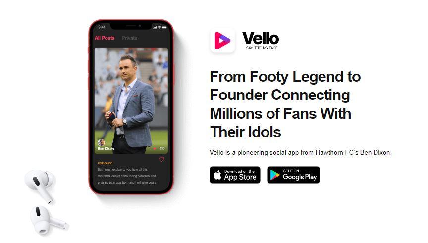
A brainchild of Hawthorn FC’s Ben Dixon, Vello was a pioneering social app that aimed to provide celebrities and their biggest fans a platform to connect.
To convey the true value of his idea and excite potential investors, Ben tapped our mobile app development team to build a clickable prototype design of the highest quality.
Our mobile app design has helped him raise more than $1 million and turn Vello into what it is today — a successful app with 1,000 high-profile celebrities and a fan base of over 150 million!
📣 Check out Vello’s case study to read their full story. You might also find our guide on how to make a social media app helpful.
3. Visibility matters: Highlight crucial UX components
When designing an app user interface, ensure that important components, such as core functions and features, are obvious and easily accessible.
For example, you may use highlight colors or other visual cues to call attention to important elements and make them stand out from the rest of the interface.
Additionally, buttons that trigger primary app functions should be large and easily within reach on the home screen. Secondary functions can be hidden away in menus to avoid clutter and distracting users.
This can also help resolve the “fat finger syndrome,” a common problem and a big source of frustration among app users. Simply making sure buttons are large enough to be tapped easily and text fields are spaced far apart to avoid accidental typos can make a big difference in your app users’ experience.
Here’s a quick explanation about ‘fat finger syndrome.”
Source: YouTube
That’s definitely a challenge for app designers who need to balance both UI/UX. One of the mistakes that designers make, in the words of Calvin, our product designer, “is focusing on user interface design more than user experience design. He adds, “I always recommended to achieve a healthy balance when making all design decisions.”
Take inspiration from what our app designers did for Grill’d.
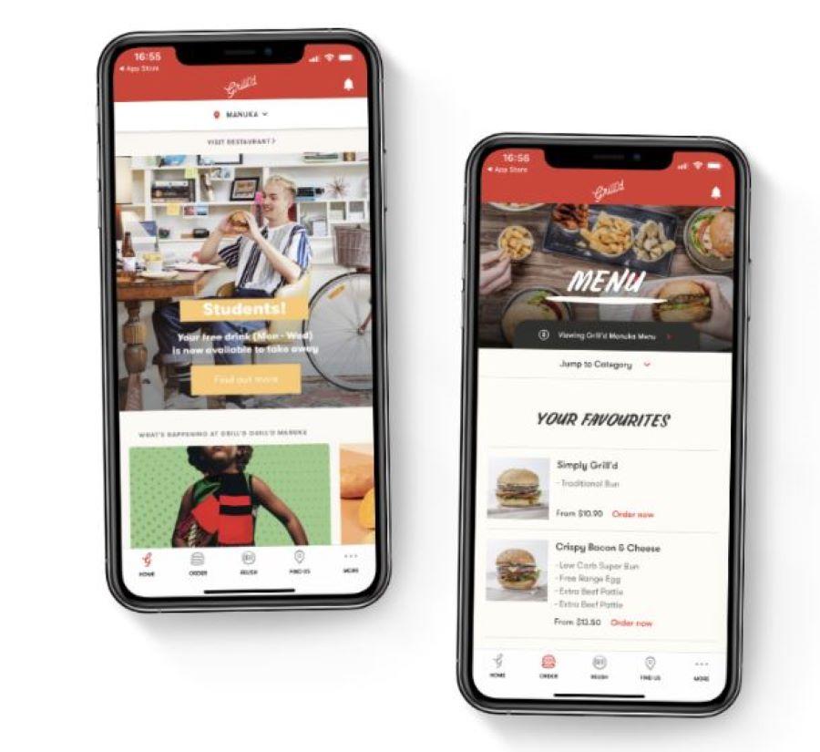
To help users easily find the most important features of the food ordering app, our designers featured Home, Order, Relish, and Find Us options on the navigation bar. Everything else is featured under More.
They also placed the most important information users should be aware of on the banner sections of the individual pages.
In the example above, the Home page features the special offer, while the order page features the menu — two things a food ordering app user would likely want to see.
Since Grill’d partnered with us, the app saw a 51% increase in their daily active users!
🚀 Want to know how we did it? Read Grill’d’s case study.
4. Feedback in focus: Keep users informed and engaged
If you’ve ever been to a restaurant, you’ve probably noticed that your waiter will often repeat your order back to you. This may seem like a simple courtesy, but it serves an important purpose.
By repeating the order to the customer, the attendant can assure the customer that they have understood the order correctly. It also allows the customer to correct any mistakes or make changes before the food is prepared.
This simple process that has been proven effective in increasing customer satisfaction also applies to the app interface.
Your app’s interface should provide clear and concise feedback to help users feel confident that they understand how your app works.
Keeping users informed about the results of their actions, even seemingly insignificant or infrequent ones, also makes them feel in control. These small gestures can lead to higher user satisfaction and increased app usage.
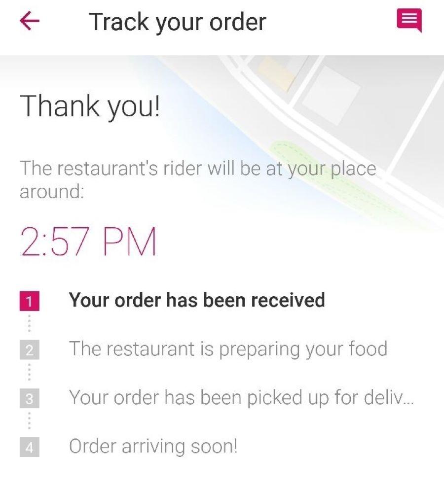
One good example of an app that provides feedback is Food Panda.
Source: Dawn
From order submission to delivery, the online food delivery app keeps its users in the loop. It even allows users to track their delivery status via interactive elements.
5. Error-friendly design: Allow room for user mistakes
Another key mobile app design principle to keep in mind is tolerance. This means that your app users should be able to complete their desired tasks even if they make small mistakes.
UI designers must anticipate where users might stumble and provide clear instructions for recovery.
In our experience, this helps prevent user frustration and reduces the chances of them giving up on using your app altogether.
Here are some ways our app designers apply the tolerance principle to our projects:
- Confirmation messages. Adding confirmation dialogs when users are about to delete something important. This gives your users a chance to reconsider before taking irreversible actions.
- Error messages. Providing helpful and clear error messages when users enter invalid data. This guides users on how to correct their mistakes.
- Password reset. Including an easily accessible link to reset passwords in case users forget their login credentials.
- Autosave features. Implementing automatic saving of user progress in applications like word processors or design tools. This prevents data loss in case of unexpected closures or crashes.
- Input flexibility. Accepting various date formats (e.g., MM/DD/YYYY, DD-MM-YYYY) in date fields, allowing users to input information in their preferred style.
- Forgiving search. Implement search functions that can handle minor typos or misspellings while returning relevant results.
A forgiving search, for instance, can be frustrating for some app users. For instance, this HMO app doesn’t recognize the missed periods and apostrophes when you search for a hospital. Instead, it requires you to type the exact same word and punctuation until it shows the search results.
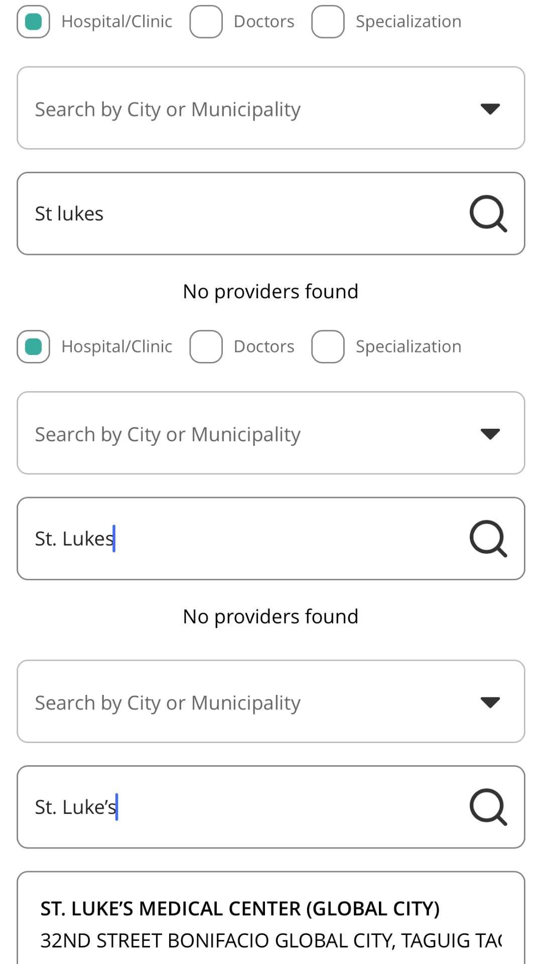
The mobile app (PhilCare) could have considered these search experiences since it has an exhaustive list of hospitals in its database.
By incorporating the Tolerance Principle, app designers can create more user-friendly interfaces that reduce frustration, increase user confidence, and lead to a more positive user experience.
This approach acknowledges the human element in interaction design, making apps more adaptable to different user behaviors and skill levels.
6. Consistency counts: Harmonize your app’s visual elements
Humans are naturally drawn to what feels familiar and comforting. This is why maintaining consistency in app interface design is not just beneficial—it’s essential. A consistent design doesn’t just level up the user experience; it also boosts user retention and satisfaction.
Consistency is crucial in shaping how users perceive and interact with your app. Consider these findings from the UXcam website:
- 94% of first impressions are design-related, showing just how much the initial look matters.
- 75% of users judge a website’s credibility based on its visual appeal, emphasizing the need for a cohesive design.
- 83% of consumers find seamless user experience across all devices to be essential.
- 80% of people are willing to pay more for an app that offers a superior user experience.
These figures underscore the importance of maintaining consistency throughout your app’s design to influence user perception and behavior positively. Below, I’m pointing out some of the key areas to achieve this:
What are the key areas to maintain consistency?
- Visual consistency. This involves keeping a unified appearance across your app. Use the same color palette, typography, and icon style throughout. For example, if your main actions are represented by a blue button with rounded corners on one screen, ensure this style is mirrored across the app.
- Functional consistency. Users should expect similar actions to yield similar outcomes. If a swipe left action deletes an item in one list, it should perform the same function in every list within the app.
- Behavioral consistency. Interactions should follow a predictable pattern. For example, the back button should reliably return users to the previous screen, no matter where they are in the app.
Here are some examples and inspirations worth emulating:
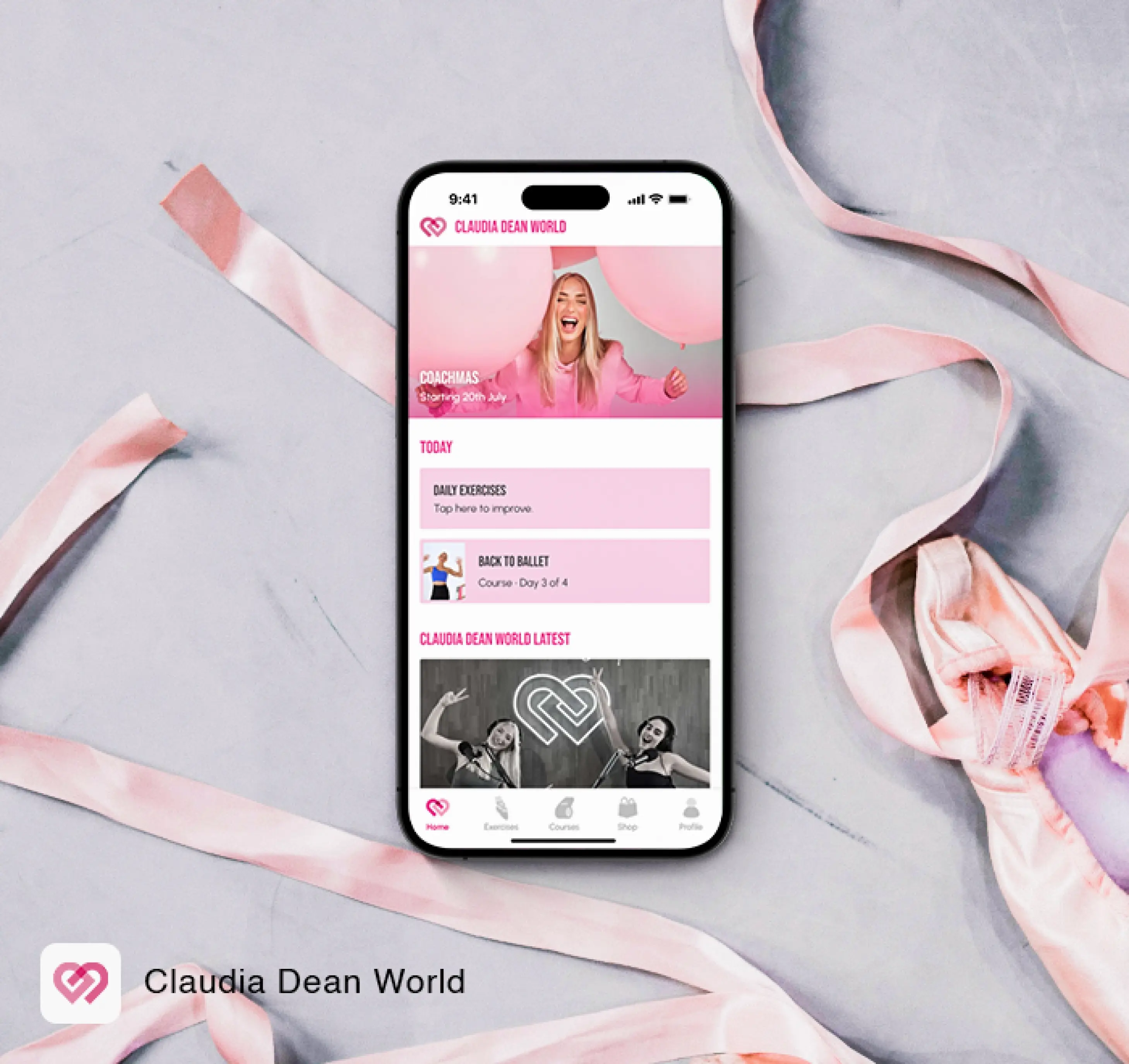
1. Claudia Dean World
This app is a masterclass in consistency, with uniform color schemes and iconography that deliver a cohesive brand experience.
2. Spotify
Known for its consistent navigation and interaction designs, Spotify enhances usability by using familiar patterns, such as a bottom tab bar and swipe actions.
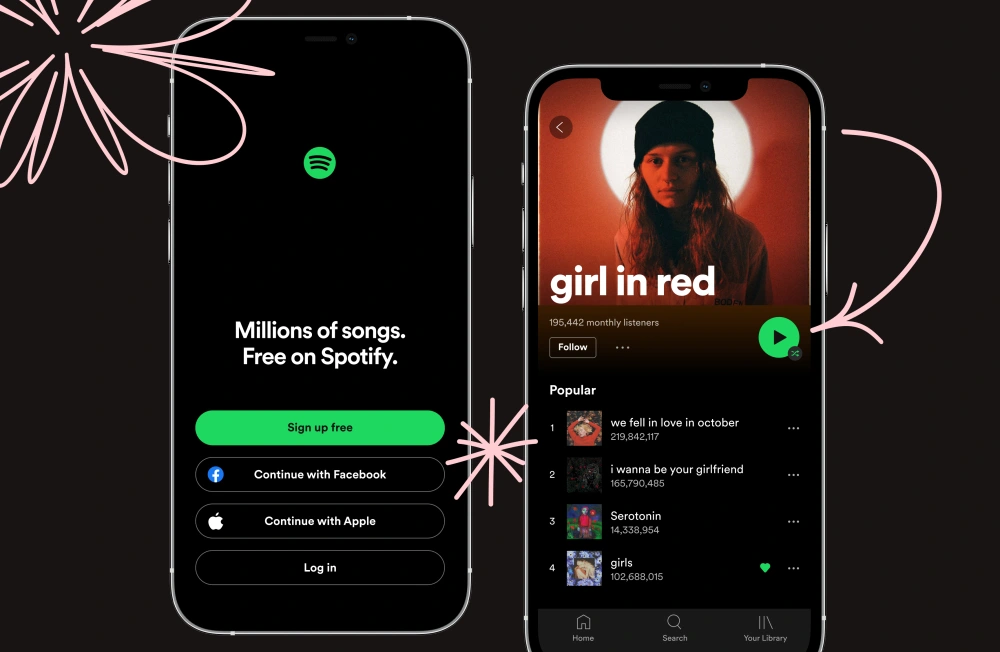
Source: Spotify
3. Google Workspace Apps
Google excels in maintaining a consistent look and feel across its suite of apps, making it easy for users to switch between Gmail, Drive, and Docs seamlessly.
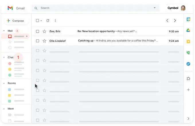
Source: Google
Here’s my take about consistency and why it matters in app interfaces: By putting consistency at the forefront of your app design, you create a user experience that is intuitive and efficient but also gratifying and memorable, leading to greater user loyalty and long-term success for your app.
Think of app consistency as building muscle memory. Just like you don’t have to think about typing on a keyboard after doing it enough times, a well-designed app lets users breeze through tasks without second-guessing themselves. They know where to tap, swipe, and scroll, making the experience smooth and frustration-free.
This kind of predictability isn’t boring—it’s comforting, like coming home to a familiar space. And when users feel at home in your app, they’re far more likely to keep coming back.
Building on the foundation of consistency I mentioned above, it’s also essential to broaden our focus to inclusivity to ensure that app interfaces are uniform and accessible to all users.
Now this leads me to the next crucial element: embracing WACG principles to accommodate diverse user needs.
7. Inclusive design: Embrace WACG principles for types of users
Inclusive design is important for creating app interfaces that attract and retain loyal users across diverse demographics.
By embracing the Web Content Accessibility Guidelines (WCAG) principles, your app becomes both usable and appealing to individuals with a wide range of abilities and preferences. These guidelines are not just about compliance—they pave the way for creating a truly inclusive user experience.
Calvin, our product designer, shares this commitment to inclusivity. As he puts it,
“Every app is different and there will need to be more principles to follow for certain apps made for specific audiences. But I’d say overall, I like to stick to principles like WCAG by using high-contrast colors if needed, readable fonts, and alt text for images. Then there is the more basic UX items like ensuring buttons are big enough for easy tapping, etc. The overarching goal no matter for all apps is to try our best to make sure no one gets left out.”
The WCAG are built on four core principles that ensure digital content is accessible and inclusive. Just remember the acronym P.O.U.R.
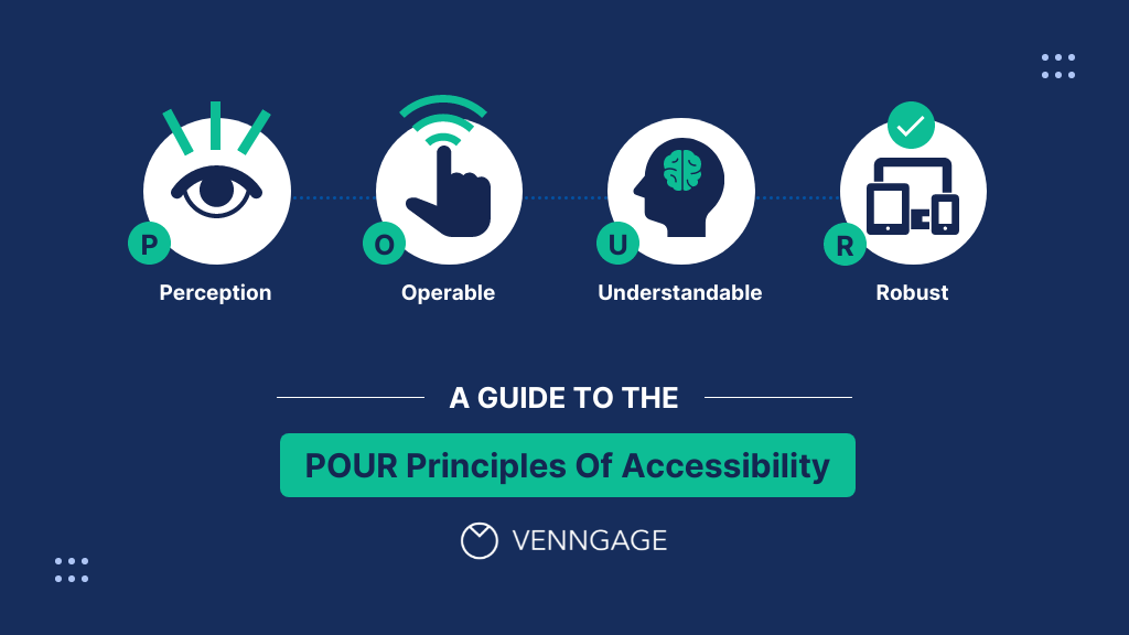
Source: Venngage
1. Perceivability: Can you see it?
Imagine trying to read a book in the dark—frustrating, right? Perceivability is all about ensuring everyone can “see” and understand what’s on the screen, whether through text, color contrast, or captions for videos. It’s like making sure everyone has a flashlight when reading that book.
2. Operability: Can you interact with it?
Think of this as making sure every door in a building opens easily, whether you push, pull, or use a wheelchair button. Operability ensures users can navigate and interact with an app using different methods, like a keyboard or voice commands, so no one feels locked out.
3. Understandability: Can you follow the instructions?
Ever tried to assemble furniture with confusing instructions? Understandability aims to avoid that frustration by using clear language and intuitive navigation.
It’s like having easy-to-follow steps to assemble your new bookshelf without pulling your hair out.
4. Robustness: Can you access it across devices?
Picture your favorite website working smoothly on both a smartphone and a desktop. Robustness ensures digital content functions well across various devices and assistive technologies, keeping it reliable as tech evolves. It’s about future-proofing your content so it’s accessible no matter how people choose to access it.
To summarize the POUR. (Pun not intended!)
| WCAG Principle | What’s it about? | What does it look like on a daily task? |
|---|---|---|
| Perceivability | Can everyone see and get what’s on the screen? | Think about trying to read a book in a pitch-black room. |
| Operability | Is it easy for anyone to use and navigate? | Imagine every door in a building opens easily, whether you’re pushing, pulling, or using a wheelchair button. |
| Understandability | Can you easily follow along and not get lost? | Ever put together a shelf with confusing instructions? |
| Robustness | Does it work across all devices and stay reliable? | Picture your favorite website working just as smoothly on your phone as on your laptop. |
By following these principles, your app users can benefit from meaningful and helpful digital experiences. You open doors to inclusivity and make the digital world a welcoming place for all.
We have a complete guide on testing accessibility on mobile apps, explaining further the P.O.U.R in WACG principles. Check it out!
Aside from the inclusivity and accessibility principles that every designer should be mindful of, I have listed key mobile app UI design principles that will make your mobile app an exceptional experience for every user.
6 Key mobile app UI design principles you should know
Here are some key UI design principles that will help you create remarkable experiences for your users:
| UI Design Principle | Description |
|---|---|
| The Structure Principle | Organize information logically and hierarchically for easy navigation and discovery. |
| The Simplicity Principle | Keep interfaces simple by reducing clutter and focusing on core functionality. |
| The Visibility Principle | Make important elements visible and easy to find using visual cues and clear labeling. |
| The Feedback Principle | Provide clear, timely feedback to confirm user actions and system responses. |
| The Tolerance Principle | Design forgiving interfaces that handle errors gracefully and offer recovery options. |
| The Reuse Principle | Use consistent design patterns and components to enhance familiarity and reduce learning curves. |
1. The Structure Principle
The Structure Principle emphasizes the importance of organizing information and elements in a logical and hierarchical manner. By designing a clear and intuitive app structure, users can easily navigate through different sections and find what they need.
Implementing this principle effectively requires employing consistent navigation patterns, grouping related elements, and providing a well-organized layout.
Here’s how our team applied this principle to the MyDeal app.
2. The Simplicity Principle
“Simplicity is the ultimate sophistication.” This principle emphasizes the significance of keeping interfaces simple and reducing unnecessary complexity.
By eliminating clutter and focusing on core functionality, a UI designer can enhance usability and ensure that users can accomplish tasks effortlessly.
One of our projects, CycleGuide is the epitome of a simple, yet straightforward interface design.
3. The Visibility Principle
The Visibility Principle emphasizes making important elements and features readily visible and discoverable to users. Employing visual cues, appropriate contrast, and clear labeling helps draw attention to critical actions and information.
By creating an interface that guides users effortlessly, you empower them to make informed decisions and interact seamlessly with the app.
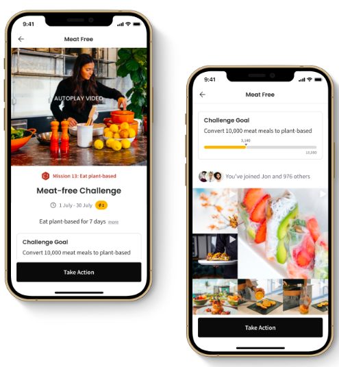
Good Empire is a good example of ensuring buttons are prominent enough to prompt the user to act—like taking an action to support a challenge goal.
4. The Feedback Principle
Providing users with clear and timely feedback is crucial for a positive experience. The Feedback Principle emphasizes confirming that users’ actions have been recognized and the system is responding appropriately.
Visual cues, animations, progress indicators, and informative messages play a pivotal role in keeping users engaged and informed about the outcome of their interactions.
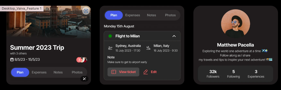
A travel planning app like Vaiva shows how important it is to have informative messages when planning a holiday. As you can see in the Plan tab, you’ll see your flight details and a CTA button to view the ticket.
5. The Tolerance Principle
The Tolerance Principle acknowledges that users make mistakes. Designing interfaces that are forgiving and can handle errors gracefully is essential.
Effective error prevention, informative error messages, and offering ways to correct or undo actions can help users recover from errors, enhancing user confidence and reducing frustration.
6. The Reuse Principle
The Reuse Principle encourages designers to leverage existing design patterns, components, and interactions consistently throughout the app.
Reusing design elements such as buttons, icons, or menus enhances familiarity and reduces the learning curve for users. Consistency in design and interaction patterns promotes efficiency, cognitive ease, and seamless experience for users.
10 Best apps with exceptional app interface and UX designs
Looking for more design ideas? Here are some brands that exemplify great mobile app designs to spark inspiration for your app development project:
1. Instagram
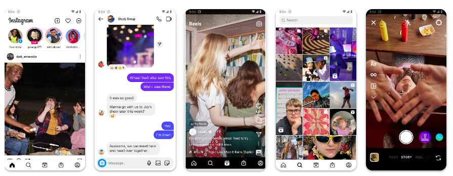
Source: Google Play
Instagram has a clean and visually appealing interface with intuitive navigation, responsive design, and straightforward functionality. It emphasizes visual content and provides a seamless browsing experience.
2. Airbnb
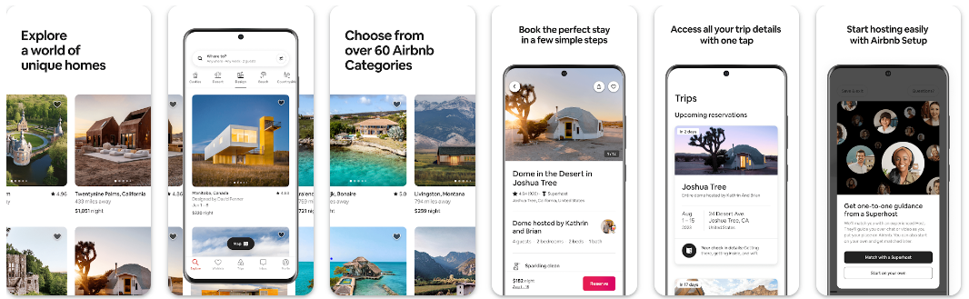
Source: Google Design
Airbnb offers a user-friendly and visually engaging interface that simplifies the process of finding and booking accommodations. Its home screen highlights its most important features. Additionally, the app’s interface provides intuitive filters, maps, and a clear booking flow, making it easy for users to navigate and make informed decisions.
3. Headspace
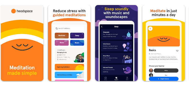 Source: Google Play
Headspace, a meditation and mindfulness app, features a calming and minimalist interface. It offers a delightful experience for users with simple icons, straightforward navigation, personalized recommendations, and soothing visuals, creating a serene atmosphere for users.
4. Spotify
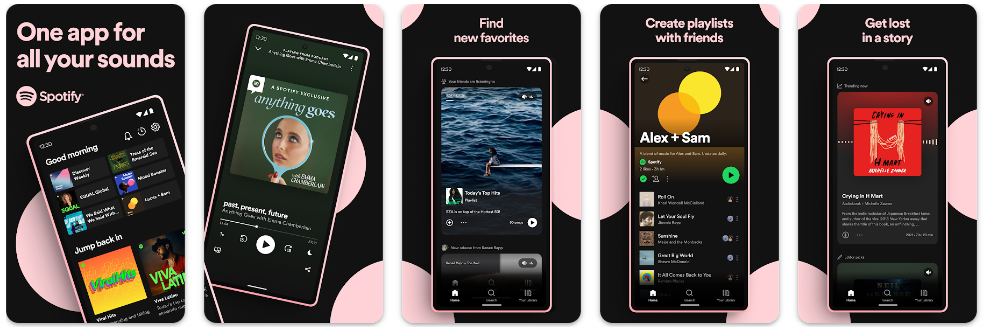
Source: Google Play
The popular music app’s interface focuses on delivering a seamless and immersive music streaming experience. It provides a clean layout, intuitive controls, and personalized recommendations, making it easy for users to find their favorite songs, create playlists, and enjoy unlimited access to great music.
5. Duolingo
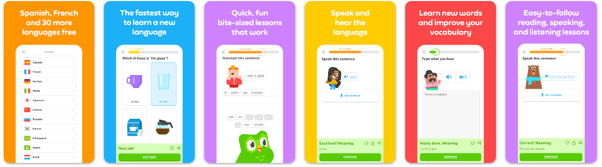
Source: Google Play
Duolingo is a language-learning app with a vibrant and gamified interface. It utilizes a clean design, clear progress tracking, and interactive exercises to engage users and make language learning enjoyable and accessible.
6. Todoist
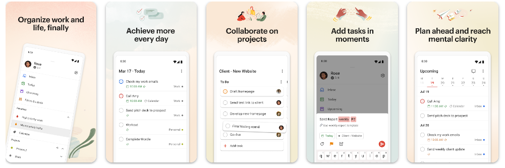
Source: Google Play
Todoist is a task-managing app known for its clean and organized interface. It offers a simple and intuitive design, allowing users to manage tasks, set reminders, and collaborate effectively.
7. Slack
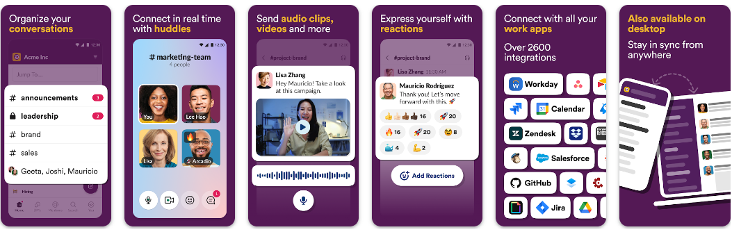
Source: Google Play
Slack, a team collaboration and communication app, features a clean and organized interface. It utilizes a minimalist design with intuitive navigation, customizable notifications, and a visually pleasing color palette, making it easy for users to communicate and collaborate effectively.
8. Google Maps
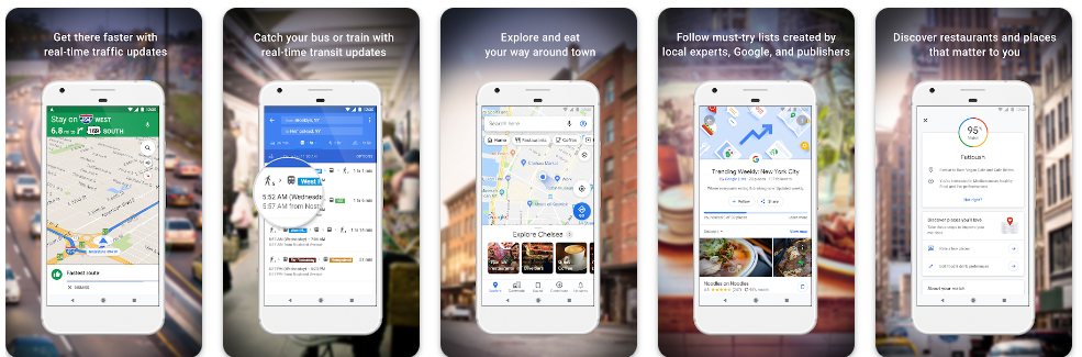
Source: Google Play
Google Maps provides a seamless and intuitive interface for navigating and exploring maps and different places. It offers a clean design, clear iconography, and smooth transitions.
The interface including its use of color psychology (e.g., blue color for suggested route, green for clear traffic, and red for heavy traffic) allows users to easily find directions, explore points of interest, and discover nearby businesses.
9. Pinterest
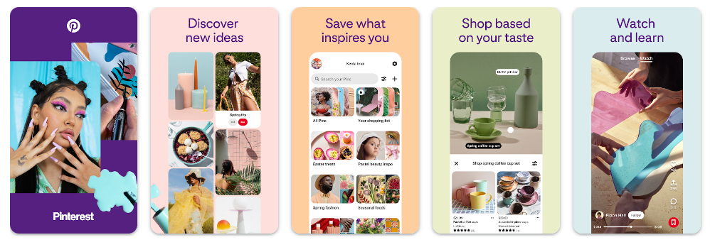
Source: Google Play
Pinterest boasts a visually appealing and intuitive interface that focuses on discovery and inspiration. The use of cards, grids, and a clear visual hierarchy makes it easy for users to browse and save content.
10. Pocket
Source: Apple App Store
Pocket greets you with a bright, inviting interface where whites and grays gently frame your saved articles, eliminating any visual chaos. This minimalist design isn’t just easy on the eyes; it turns reading into a soothing escape, letting your content shine without distractions.
App user interface trends are constantly evolving to adapt to changing user expectations and technological advancements.
Here are some notable trends in app UI design:
7 Exciting app UI trends to explore in 2024 and beyond
As technology advances and mobile app user expectations evolve, new UI trends emerge, shaping the future of app interfaces.
These trends reflect the ongoing evolution of app UI design, driven by user preferences, technological advancements, and industry innovations.
Implementing these trends thoughtfully can help you create a modern, user-centric mobile app UI that delivers exceptional UX:
- Minimalistic design. Minimalism continues to be a UI prevalent trend. Clean and minimalistic designs with simple layouts, generous white space, and focused content help streamline the user experience and highlight essential elements.
- Microinteractions. Microinteractions are small, subtle animations or feedback that provide users with visual cues and create a more engaging experience. They add a sense of delight and interactivity to the app, such as button animations, loading spinners, or progress indicators.
- Voice User Interface (VUI). With the rise of voice assistants and smart speakers, VUI is becoming increasingly prevalent. Apps are incorporating voice interactions, allowing users to perform tasks or navigate the app using voice commands.
- Gesture-based navigation. Gesture-based navigation is gaining popularity, especially with the proliferation of edge-to-edge screens on mobile devices. Users can swipe, pinch, or perform gestures to navigate between screens or access app features, providing a more immersive and intuitive experience.
- Neumorphism: Neumorphism is a design trend that blends skeuomorphism and minimalism, creating flat design interfaces with soft, subtle shadows and highlights to mimic physical objects. It adds depth and realism to the UI, enhancing the visual appeal.
- Augmented Reality (AR) and Virtual Reality (VR). AR and VR interfaces increasingly leverage object recognition capabilities to identify and interact with real-world objects. These technologies are being used in various domains, including selling real estates, gaming, education, shopping, and interior design.
- Biometric authentication. Features, such as fingerprint scanning and facial recognition on the login screen, are becoming increasingly common in UI. This trend enhances security and simplifies the login and authentication process for users.
As we explore the vibrant world of emerging app design trends, the seamless blend of AR, VR, and biometric authentication paints a vivid picture of innovation in action.
These advancements are transforming our interactions with technology, making life easier and more secure in ways we once only dreamed of.
When I sought Calvin’s insights on these transformative trends, his vision was both intriguing and forward-thinking:
I believe and have believed for a couple years now that Augmented Reality and Artificial Intelligence will slowly take over app interfaces, making it easier and faster for us to navigate apps and complete certain tasks. I envision a future where we control our phones with our minds and the physical phone itself no longer being something we carry, but instead wear. The paths are unlimited and exciting!
Frequently asked questions on app interfaces and UI designs
There’s so much to talk about about app interfaces and mobile designs. To get the most of the information, I’ve added this section as your supplemental read.
What is an app interface?
An app interface, also known as a user interface (UI), refers to the visual and interactive elements through which users interact with a mobile application or software program. It serves as a bridge between the user and the underlying functionality of the application.
The app interface encompasses different elements, controls, and interactive components that allow users to navigate, input data, and receive feedback from the application. It includes screens, menus, buttons, icons, text fields, sliders, checkboxes, and other graphical elements that users interact with to perform various actions within the app.
Are user interface and user experience the same?
When talking about app design, user interface (UI) and user experience (UX) are often used interchangeably. However, they refer to two different aspects of the app design process.
The UI involves the app’s visual elements, including the layout, color scheme, and typography. On the other hand, UX is about how easy and intuitive it is to use a web or mobile app.
While UI and UX designs focus on different aspects, both are crucial in creating apps that satisfy the users of mobile devices.
How can UI design contribute to the success of an app?
A great UI design invites users in and makes them want to stay. A thoughtfully crafted interface not only catches the eye but also ensures users have a smooth and enjoyable experience. This can lead to glowing reviews and enthusiastic recommendations.
Conversely, a confusing layout can leave users feeling lost and frustrated, prompting them to leave.
That’s why investing in stellar UI design is like setting the perfect stage for a delightful first impression and nurturing long-lasting loyalty.
Having a great app UI design is a must
In a time when businesses are won and lost through mobile presence, creating a great app design with a user-centric interface is no longer something that’s “nice to have.”
It’s imperative to success.
Keep the above key points in mind and start designing!
Taking action may not necessarily lead you to achieve the “perfect” app, but it’s the first step to getting closer to creating an app that users would love to use.
Turn your vision into a smashing UX success!
If you need help conceptualizing or implementing your app interface design, contact us. Our team of UI and UX design experts has extensive experience building mobile apps and other apps that look good and function even better.
💡 Special thanks to the following Appetiser Apps team members for contributing valuable insights: Calvin Cica (Product Designer)

Jane Eslabra is a content strategist with 18+ years of experience. Working alongside app development teams, she helps founders and startups move from idea to action through content that breaks down what actually works in real-world app building and scaling.