Accessibility Testing for Mobile Apps: Making User Experience Inclusive

Building successful mobile apps goes beyond the profits gained, media coverage, and app funding from investors — it’s also thinking of a customer-centric approach to every stage of the process — from design to development and testing until deployment. It’s being inclusive in all aspects.
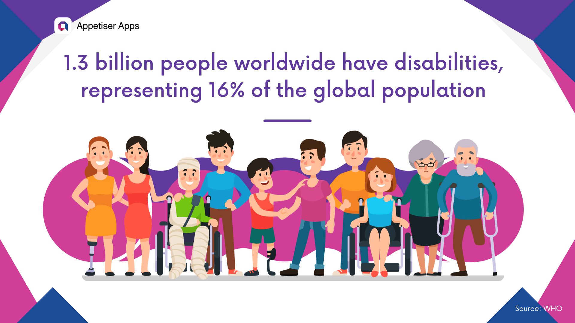
Inclusivity is an indispensable concept in user experience and app interface that should not be overlooked. The World Health Organization reports that 1.3 billion people worldwide have disabilities, representing 16% of the global population. In the United States alone, there are 42.5 million Americans with disabilities in 2023.
Whether you currently have a mobile app for your brand or plan to invest in a web app soon, the figures above highlight the need for apps publishers to prioritize accessibility and cater to this significant user base.
In this article, I’ll tackle the importance of accessibility testing for mobile apps. I’ll also share some tips to ensure your web or mobile app is a champion of inclusivity.
But before we delve deeper, allow me to give you an overview of what accessibility is and its importance in the realm of mobile app development.
Table of Contents
- What is accessibility for mobile apps?
- What’s the impact of accessibility to mobile users?
- What are the legal considerations for accessibility?
- Key principles of mobile app accessibility based on WCAG
What is accessibility for mobile apps?
Accessibility refers to the ease with which everyone, especially those with disabilities, can use and interact with mobile apps. This includes people with visual impairments, hearing loss, cognitive disabilities, and physical disabilities.
As mobile devices and apps become more ubiquitous, it’s vital to ensure that all app users, regardless of their abilities, can access and benefit from them.
What’s the impact of accessibility to mobile users?
Imagine waking up daily and using your mobile device to check emails, scroll through social media, or shop on ecommerce apps.
Now, picture having to rely on someone else to perform these tasks for you because you cannot see well or have difficulty using your fingers or voice to navigate the app’s interface.
The inability to use mobile apps independently puts individuals with disabilities at a disadvantage, limiting their abilities to communicate, access essential services, and stay connected with others.
To understand this further, this illustration encapsulates the disabilities and barriers — from visual to auditory to speech.
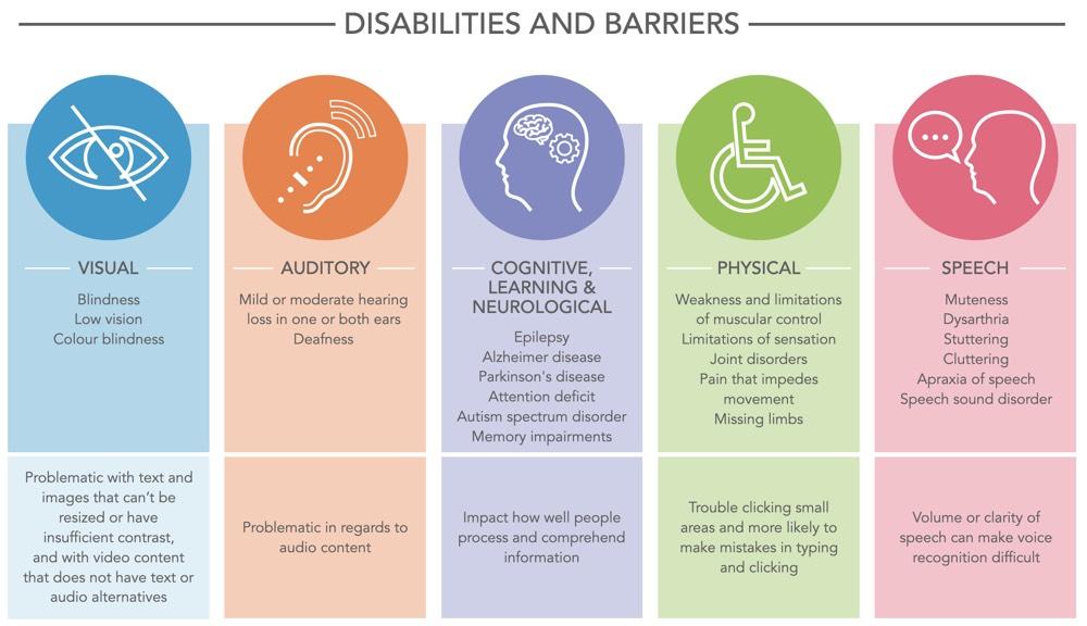
Source: W3.org
Accessibility is not only about enabling people with disabilities to use apps. It’s also about designing better mobile apps for everyone.
A well-designed, accessible mobile app can benefit all users by providing intuitive interfaces, clear and concise instructions, and easy-to-read content.
I’ll give you a prime example of the concept of placeholders.
A placeholder is a text that appears in an input field before the user enters any data. It gives the user an idea of what information to enter or write in that field. Placeholders are often available on contact forms, search fields, and login forms.
Here’s a placeholder for AliExpress and the Amazon mobile app sign-in page. For the meticulous eyes, they can already pinpoint what’s wrong with the way placeholder texts on how the “Email” was positioned.
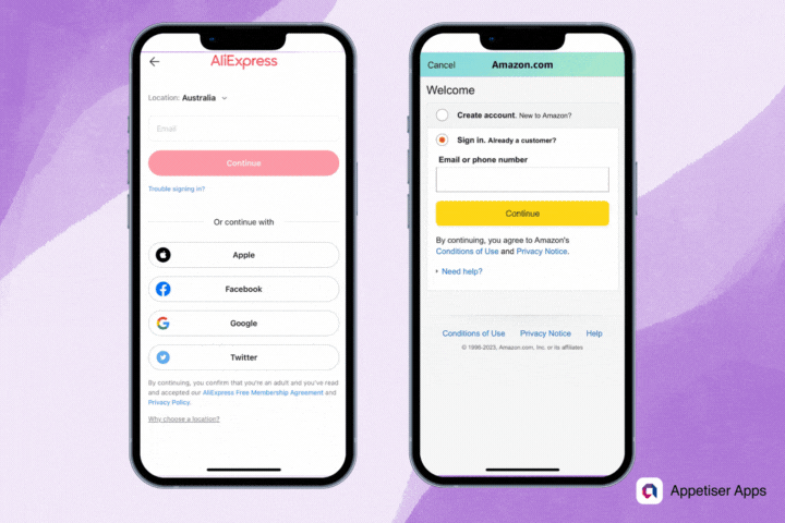
The AliExpress email address form has form fields without labels, only placeholder text.
Moreover, the lack of necessary contrast ratio in the placeholder text color exacerbates an existing accessibility issue.
However, in Amazon’s example, form fields include labels using bold black text, “email or phone number,” albeit with some redundancy — but making the essential information visible at all times.
Moreover, accessibility can take the form of designing alternate input methods, such as a simple swipe gesture or a keyboard shortcut, that make app usage more convenient for everyone, including those without disabilities.
What are the legal considerations for accessibility?
Not everyone is equally capable of using mobile devices, and mobile app developers must also be aware of legal concerns to make mobile apps accessible to people with disabilities.
The Americans with Disabilities Act (ADA), a civil rights law enacted in the 1990s, doesn’t specifically mention mobile apps, but courts have interpreted it to apply to mobile content, too.
Here’s the gist of ADA’s provisions:
Mobile apps are considered “places of public accommodation” and must provide reasonable accommodations for people with disabilities.
Although the ADA doesn’t explicitly outline accessibility standards for mobile apps, many court decisions and settlements have accepted conformity with the Web Content Accessibility Guidelines (WCAG) as a reasonable standard.
On that note, let’s further dive into the key principles of accessibility testing for mobile apps based on the WCAG standards.
Key principles of mobile app accessibility based on WCAG
Mobile app design and development for accessible digital experiences won’t exist without following the regulations of WCAG (Web Content Accessibility Guidelines).
WCAG is a set of standards created by the World Wide Web Consortium (W3C) that outlines the requirements for designing and developing accessible digital content. These guidelines are essential in mobile app accessibility testing because they ensure everyone, including individuals with disabilities, can access and understand digital content.
Let me walk you through each guideline.
1. Perceivability: Make information clear and understandable
Perceivability requires that mobile content be presented clearly and understandably. It entails providing text alternatives for non-text content (such as images, videos, and audio) so that users who are blind, visually impaired, or have other disabilities can understand the information conveyed.
It also requires that the layout and design are structured in a clear and organized manner. This means using appropriate color contrast that considers users with visual impairments, font sizes and styles that are easy to read, and clear headings and labels that accurately describe the website sections.
How do we test perceivability for mobile apps?
Here’s what our QAs at Appetiser check when making accessibility testing for mobile apps.
- ✅ Color contrast and visual cues. Does the color contrast between text and background meet the minimum WCAG requirements to ensure readability for users with visual impairments? For normal text, a contrast ratio of at least 4.5:1 is required. For large text (18-point or 14-point bold), a contrast ratio of at least 3:1 is required.
- ✅ Easy-to-read typography and resizable text. Does the app use clear, easy-to-read fonts and font sizes that can be resized by users?
- ✅ Text alternatives for non-text content. Does it provide appropriate alternative text (alt text) for images and graphics that describe the image content or function for screen reader users?
- ✅ Clear and organized layout and design. Is the app’s layout and design structured in a clear and organized manner, using descriptive section headings and clear titles?
- ✅ Captions and transcripts for multimedia. Does it provide captions for videos to make them accessible to users with hearing impairments?
A prime example of easy-to-read typography and good color contrast and visual cues is the MyDeal mobile app.
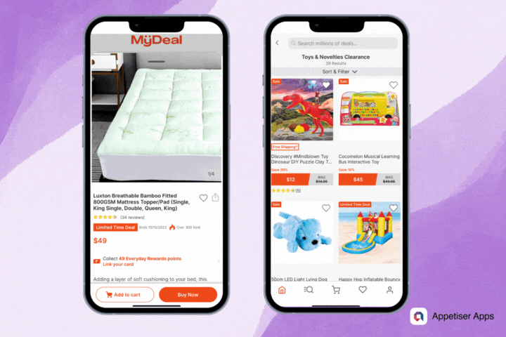
You’ll see how the brand’s primary color, orange, perfectly blends white and grey. The texts on CTAs and the user interface are readable and recognizable. The structure of the texts and design are well-organized, so shoppers can find what they’re looking for on the app.
Sometimes, teams often discover issues during testing that require code-level fixes, policy updates, and re-audits. If you need expert help to audit, remediate, and verify conformance across web and mobile experiences, including Section 508 requirements, consider partnering with specialists in WCAG Compliance who provide assessments, remediation plans, and ongoing support.
2. Operability: Ensure easy navigation and interaction for all users
Operability refers to the ease and efficiency of navigating and using the interface of a website or application. Essentially, operability pertains to how easy the content is to interact with to achieve a task or goal.
An operable website or app can be accessed and operated using various devices and input methods, including touchscreens, keyboards, and assistive technologies such as screen readers or voice commands.
How do we test operability for mobile apps?
According to WCAG, operability is divided into four main components: navigable, keyboard accessible, enough time, and seizure-safe.
Let’s go through each briefly.
- ✅ Navigable. Is the content and interface easy to navigate? Does it allow users to find content and determine their location within the app? Implementing intuitive navigation patterns like tab bars, hamburger menus, or gesture-based navigation will help users move between different app sections.
- ✅ Keyboard accessible. Are functions available from a keyboard for people with motor disabilities? This should include those who can’t use a mouse but want to interact with the app.
- ✅ Enough time. A concrete example of an app feature that gives users enough time to browse the content is an e-commerce app with a shopping cart. When users add items to their cart, they may be given a certain amount of time to complete the purchase before the items are removed from the cart.
- ✅ Seizure safe. Design and develop apps to minimize the risk of triggering seizures or physical reactions in users, particularly those with photosensitive epilepsy. Avoid flashing or flickering elements, rapidly changing visuals, or high-contrast patterns that potentially induce seizures.
An ecommerce app like this that possesses easy-to-navigate content will make shoppers’ user experience much better whenever they browse products.
There’s a search bar that lets you type whatever product you’re looking for. But there’s also a navigation bar on top to view primary product categories.
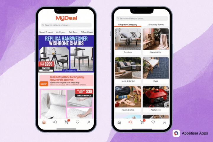
When you click a category, it takes you further to a more organized and structured list of products, and you can even sort or filter them according to the shopper’s preferences.
3. Understandability: Making the app’s features and functionality clear to all users
WCAG defines understandability as “the degree to which the content can be understood by users, including those with disabilities.” This principle is closely related to other core WCAG principles, such as perceivability and operability, essential for creating inclusive digital experiences.
To ensure understandability, designers and developers must consider various factors, such as the language used, the complexity of the information presented, and the clarity of navigational elements. In short, understandability ensures that the app is user-friendly and intuitive.
How do we test understandability for mobile apps?
Here are some of the steps our QAs do to test the understandability of the accessibility of a mobile app:
- ✅ Examine labels and descriptions. Are they short and clear? Do they give useful information to users throughout the UI? Icons and symbols must have text labels or descriptions for users who don’t understand visual elements.
- ✅ Test with different groups. Include users with different disabilities in the testing process — users who have trouble seeing, hearing, moving, or thinking. Observe how well users with disabilities can use the app, understand instructions, and determine what each feature does.
- ✅ Evaluate error messages. These are assessed for clarity and understanding. They must clearly state the problem and include guidance for resolving the issue. Technical jargon or cryptic language is forbidden.
- ✅ Check the consistency of UI elements. Does the user interface have seamless and consistent navigation, layout, and terms? Otherwise, it will confuse app users.
- ✅ Test with screen readers. Use screen reader software such as VoiceOver for iOS or TalkBack for Android to navigate the app. Make sure that UI elements and content are read by screen readers in a logical and understandable order. Form fields, buttons, and navigation menus must be accessible to the users.
These are some of the elements that are critical to test for accessibility. While this is not an exhaustive list, it gives you an idea of how meticulously accessibility testing is when building mobile apps that deliver inclusive digital experiences.
4. Robustness: Build apps that work reliably across different devices and platforms
Robustness refers to the ability of a product to maintain its functionality and accessibility across different platforms, devices, and assistive technologies. A robust website or mobile app can withstand various challenges and remain operational without losing any of its features or capabilities.
For instance, a mobile app designed to be robust should provide the same level of accessibility and functionality to a visually impaired user as it would to a fully able individual.
The website or mobile app can be navigated using keyboard-only access, screen readers, and other assistive technologies. It maintains its integrity and accessibility even when accessed through various browsers and devices like smartphones, tablets, laptops, and desktops.
How do we test robustness for mobile apps?
Our QAs recommend the following action points and features to test the robustness of mobile apps:
- ✅ Understand accessibility guidelines. Learn accessibility guidelines like WCAG and Mobile Web Best Practices to make the mobile app accessible and have a framework to follow when performing quality assurance.
- ✅ Testing environment setup. Test the app on various mobile devices and operating systems, such as iOS and Android. Take into account different screen sizes and resolutions. Simulate the experience of visually impaired users by installing screen reader software like VoiceOver (iOS) or TalkBack (Android).
- ✅ Conduct manual testing of the app. Try using screen readers and assistive technologies to navigate the app and assess the user experience. Interactive elements, images, and multimedia should have proper alternative text. Check for keyboard navigation support and ensure all functions work without a touchscreen.
- ✅ Test with real users. This process will collect feedback on their actual experiences using the app while QAs watch for any difficulties users encounter. The feedback from real users will be used to improve your app’s design and development process and fix accessibility issues.
To reiterate, this is not an exhaustive list of how to test the robustness of an app.
The tools and processes seem overwhelming. But they are an integral part of the app development process.
QAs also conduct manual testing involving interaction with the app using Android accessibility services or iOS accessibility features to experience the app from the user’s perspective and identify potential usability issues.
They also use tools like Accessibility Insights for Android or other mobile accessibility testing tools to discover opportunities to improve your app’s accessibility.
And for more complex projects, it’s even better to have direct testing from users. It’s the best way to get feedback from people with disabilities who interact with your app to ensure it meets their needs and expectations.
Mobile apps with inclusive digital experiences are built to win
The realm of mobile apps is a highly competitive arena where even the slightest advantage can mean the difference between success and failure. With millions of apps flooding the market, businesses must stand out.
One of the ways to do this is by incorporating inclusive digital experiences into your mobile app design, development, and testing phase.
Mobile app accessibility ensures that users with disabilities or impairments can use your app, which demonstrates your brand’s commitment to inclusivity. By providing inclusive digital experiences, you create a level playing field for all users, which can help improve customer satisfaction and boost app retention.
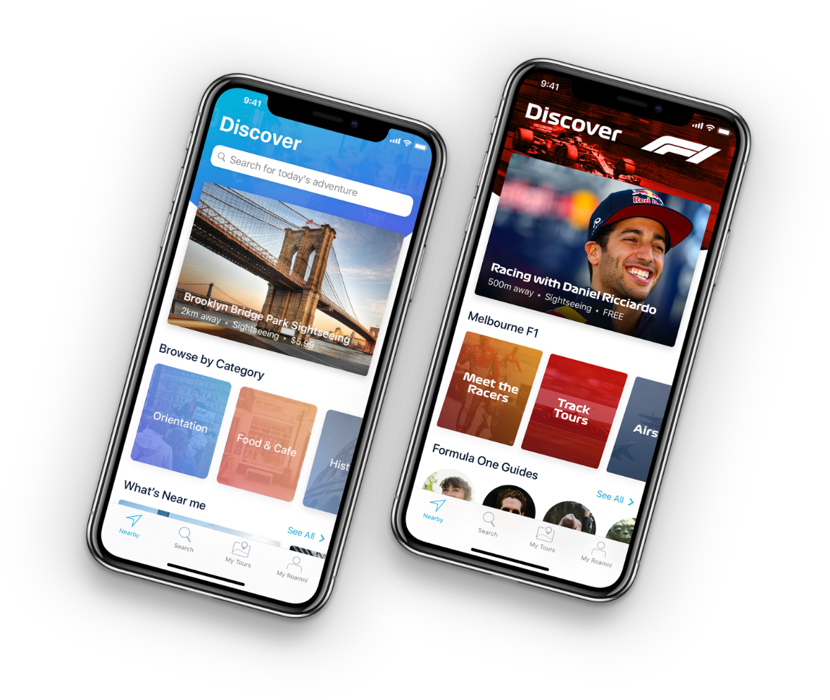
Do you have an app idea that’s worth millions of dollars? If YouFoodz, MyDeal, and Roamni had done it with us, then you can, too.
Contact us today, and let’s discuss what you have in mind.
This article was reviewed by one of our QAs, Roy Vincent Dionela, for comprehensive insights.

Maria Krisette Lim is a Content Marketing Specialist with 14 years of experience producing web and print ad content. Krisette has a BSBA degree, major in Business Management and Entrepreneurship. When she’s not tinkering with words and punctuation, she’s either curled up with a book while sipping hot tea, playing with her toddler, or tinkering with website builders.