
Websites. The digital age’s sales departments and storefronts.
In the pre-Internet era, physical stores needed skilled salespeople to convert visitors to buyers. Now, hosting a well-designed website is a major factor in improving conversion rates.
But in many cases, websites look good only on desktops or laptops. Many organizations and businesses tend to miss the fact that mobile device users also view websites. Due to this oversight, many mobile users suffer a poorer website experience compared to desktop users.
This neglect of mobile users in website design could be a huge loss. Around 60% of website visits in 2022 were from mobile device users. This would greatly reduce your pool of potential customers or supporters if you neglected mobile users when designing websites.
If you’re running an organization or thinking of building one, it’s time to include mobile users in your website design agenda. But, of course, you can only do this if you know something about CRO for mobile, which this article will discuss. In this blog, you’ll learn how to develop a website that attracts as many mobile users as possible to your business or cause.
But first, let’s define CRO for mobile.
What is CRO for mobile?
CRO (Conversion Rate Optimization) for mobile is a focused and systematic approach to increasing the number of mobile users who perform certain actions desired by website owners like businesses and other organizations. Mobile users include those who use tablets and smartphones.
Among the many desired actions from mobile website visitors include:
- Making purchases
- Subscribing to certain services
- Signing up for their content, like weekly newsletters
- Supporting a cause either by signing a petition or donating
Mobile conversion rate optimization involves implementing strategies and tactics to increase the percentage of visitors who take intended actions on mobile websites.
The more mobile users do any of the abovementioned actions, the higher the conversion rate.
Why is CRO for mobile important?
An effective mobile CRO strategy brings many benefits to businesses and organizations of almost any shape and size. These advantages include:
- Better visibility on Google
- Improved understanding of potential customers or stakeholders
- Maximum return on investment per mobile user
- Amplified word-of-mouth marketing
Let’s have a look at each of these.
Better visibility on Google
Do you go beyond the first 10 search results when searching for anything on Google?
Chances are, you only get information from the first three or five pages that Google displays on its search results page (SERP).
So whether you’re selling a cake or a cause, it is best if your website is top of the heap (or somewhere near it) on Google.
But what does a mobile-friendly website design have to do with a higher SERP ranking?
Google has had a mobile-friendly update since 2015. In this update, Google ranks a website higher if its design is easy to use for visitors who use mobile phones. Of course, this assumes the website matches search intent or helps users find what they’re looking for.
Though this update applies only to mobile search searches, companies and organizations can still benefit from a mobile-friendly web design since most Internet surfers now use smartphones or tablets.
Improved understanding of potential customers or stakeholders
Whether you’re pitching your restaurant’s pizza or passionate about a social problem, it’s vital to understand your online audience.
Now there is a chance that mobile and desktop users want different things from your website. This is where CRO for mobile is essential.
CRO tools and techniques make you aware of what mobile users want by the way they interact with your website. You’ll also see where their “footprints” are either missing or few, which indicates conversion bottlenecks. We’ll tackle how to do this later.
Maximum return on investment per mobile user
Running a website and launching marketing campaigns are huge investments. You want to make sure that this cost to acquire customers yields a healthy return.
CRO for mobile helps identify and segment visitors into different categories. This can help you develop customized marketing and communication strategies that lower customer acquisition costs while increasing conversion rates.
Amplified word-of-mouth marketing
In word-of-mouth marketing, two mouths are better than one.
I mentioned that around 60% of website traffic comes from mobile users. If you do the math, that’s roughly two mobile users per desktop/laptop user. That’s two mouths against one who could spread the word about your product, service, or advocacy.
Everything being equal, it is clear that your investment in CRO for mobile can help quickly spread awareness about your business or organization.
Now that you know the why of mobile conversion rate optimization, it’s time to learn how.
6 Simple Steps for Great CRO for Mobile
Our product strategy experts are no strangers to using web-based assets to maximize the growth of our clients.
For instance, we empowered PointsBet to expand to the U.S. market through blogs and career web pages. Check out our case study to learn how our online assets helped PointsBet grow in value from $100 million to $3.2 billion.

From our experience helping clients like PointsBet realize their full potential, we at Appetiser have learned that the following strategies help turn mobile users into sources of value:
- Identify your mobile conversion goals
- Integrate user analytics tools with your website
- Optimize your website for quick page loading
- Make visual elements and site navigation mobile-friendly
- Write right for mobile
- Simplify your website’s checkout process
Let’s unpack each strategy.
Step 1: Identify your mobile conversion goals
Begin with the end in mind.
This is the 2nd habit from Stephen Covey’s famous book, “7 Habits of Highly Effective People.”
What works for highly effective people also works for a highly effective CRO for mobile strategy.
If you don’t identify your mobile conversion goals, any strategy you come up with for mobile CRO won’t be as effective.
In setting up your mobile conversion goals, it’s vital first to determine what conversion means to you. Conversion for mobile users can fall into either of the following categories: micro-conversions or macro-conversions.
As you will soon find out, these categories give you the flexibility to go big or take baby steps toward CRO progress.
Micro-conversions
Micro-conversions occur when website visitors fulfill a series of tasks before reaching a specific milestone.
In other words, micro-conversions are the little steps that bring your mobile visitors closer to becoming paying customers or helping you attain your main conversion goals (or macro-conversions, which I will discuss in the next section).
Micro-conversions can come in many forms, among which include the following:
- A “like” or “share” of one of your website’s blogs or other resources
- Sign-ups for your newsletter
- Call bookings to discuss your products, services, or advocacies
Over time, micro-conversions can serve as predictors of future macro-conversions. They also work well with analytics tools to determine points for improving your website’s CRO for mobile strategy.
Macro-conversions
Macro-conversions happen when visitors do things that help websites achieve their main growth milestones or objectives.
The main growth milestones of website-owning organizations could come in any of the following forms:
- Product purchases
- Subscription payments
- Signatures for a social or political petition
- Donations
It is crucial to note that in order to grow your organization through CRO for mobile, both macro- and micro-conversions are important. After all, without micro-conversions, it will be harder to track your visitors’ progress in becoming the value-adding stakeholders you want them to be.
Once you have identified your conversion goals, it’s time to analyze them. But you won’t just use your mind to do so. Instead, it would help to use data analytics.
Step 2: Integrate user analytics tools with your website
Visitors leave behind digital footprints on websites.
You want to ensure you can see those footprints through user analytics tools.
Whether you’re winging it or asking for help from website developers, make sure analytics tools are integrated into the development of your website.
These tools allow website owners to measure key metrics like page visits, traffic sources, bounce rates, and e-commerce metrics.
Page visits indicate website traffic coming into your website. Meanwhile, bounce rates show how many people visit just one page on your website and then leave. E-commerce metrics include shopping cart abandonment, average order value, and average product quantity per sale.
Website metrics basically measure how many are interested in your business or organization and which of your offerings they’re interested in (or not).
Aside from metrics, some analytics tools like Google Analytics provide so-called heat maps. As you can see in the image below, heat maps show which buttons or areas of websites get the most clicks or attention from visitors.

Source: Crazy Egg
Any “cold” or uncolored areas of heat maps could be conversion bottlenecks. Watch out for which buttons or places on your website are cold to know how to attract more visitors to those areas. Do this, especially if those cold areas greatly affect your macro-conversion goals.
Combining all these analytics tools and metrics with your conversion goals in Step 1 will prepare you for the next steps of CRO for mobile. The next four steps involve designing and building your website based on the said goals and best practices in mobile web development.
Step 3: Optimize your website for quick page loading
Desktop computers generally offer better functionality and Internet connections than mobile phones, resulting in faster page loading times.
But all is not lost if you want to speed up web loading times for mobile users.
You can improve page load speed by reducing the pixel sizes of your uploaded images. Removing unnecessary files, especially excessive JavaScript, can also help speed things up. Leveraging browser caching when building websites also shortens loading times for mobile device users.
Optimizing website load time is crucial as it positively affects your website’s Google ranking and reduces bounce rates. Both these achievements tend to hike conversion rates.
I mentioned before that bounce rates measure how many people visit just one page on your website.
Now, let’s imagine the worst-case scenario of a bounce: when a mobile user just looks at your home page and leaves because they can’t take the painfully slow loading of that page.
This hypothetical bounce scenario does happen. Google attests that bounce probability increases by 90% as page loading times approach 5 seconds.
In other words, your bounce rate could decrease if your website’s pages load in less than 5 seconds.
Step 4: Make visual elements and site navigation mobile-friendly
It’s easy to forget that mobile users don’t use computer mice when surfing the Internet. Instead, they use their fingers to navigate websites.
Keeping this in mind, ensure that your website design enables users to use their fingers easily when:
- Scrolling and navigating your web pages
- Scrolling and selecting buttons or menus in both landscape and portrait modes.
- Tapping call-to-action buttons
Fat finger UX design is the best rule of thumb (no pun intended) when making website design finger friendly. This design principle derives its authority from statistics showing that most mobile users use their thumbs (generally the fattest fingers) when navigating websites on their phones or tablets.
When designing for fat fingers, keep in mind the following principles:
- Conversion buttons or links must have an area of around 7mm to 9mm (26px to 34px)
- Spaces between conversion buttons or links must be at least 2mm (8px)
- Any conversion buttons must be within easy reach of thumbs (see the “green zones” of the illustration below)
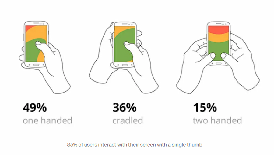
Source: Bootcamp UX Design on Medium
Step 5: Write right for mobile
One key aspect to consider when writing web content for mobile users is your headline. This piece of writing should briefly describe your solution and what visitors can expect. Keeping headlines to 3 to 4 words is ideal for keeping them from running off the page or being partially hidden.
For longer forms of content, implementing the ‘read more’ functionality is beneficial. This approach displays important content above the fold while additional information is loaded below. By prioritizing important content, users can quickly get what they need without scrolling too much.
Though the “short and sweet rule” is not set in stone, it must be the general direction of content writing for mobile users. Studies have shown that understanding complicated content is harder for mobile users than their desktop counterparts.
Step 6: Simplify the checkout process
For this article, we will consider as a checkout the following website transactions:
- Product purchases
- Payment for subscriptions
- Donating to a charity
- Paying to be a member of a nonprofit advocacy group
Though these user actions are usually macro-conversion goals, they are not the only ones.
But all four actions involve some processing of payment via a website.
A convenient payment process is especially crucial for mobile devices due to the limitations of smaller screens and touch-based interactions. If the payment process were clunky, the user experience (UX) and conversion rates would be negatively affected.
There are many solutions to improve the mobile payment experience of website visitors.
One effective approach is to integrate your website with popular digital wallets such as Google Pay and Apple Pay. Users can complete their purchases with just a few taps by offering these payment options, reducing friction and streamlining the checkout process.
Additionally, providing a simplified sign-on option, such as using Google or Facebook accounts, further simplifies the user journey and speeds up the payment process.
Other ways to make online payments easier include:
- Incorporating a checkout progress bar
- Allowing purchases without the need to register
Aside from convenience, ensure your payment infrastructure is secure from any hackers or bad actors who want to get access to customer bank details. After all, nothing screams poor user experience louder than hacks and unwarranted data exposure.
Go pro with CRO for mobile
A predominantly mobile world calls for websites that adjust to tablets and smartphones. A website that takes into account mobile devices enlarges your pool of potential customers or stakeholders.
Applying the CRO for mobile strategies discussed in this article is not the only way to grow your business or organization. Turning websites into web apps can also significantly increase return on investment. Custom mobile app development is another route to go pro.
At Appetiser, we have an award-winning team of app designers and developers in case you want to use apps for financial growth and social impact.
Our product strategy experts are also on hand to ensure your app is as commercially successful as it is technically sound.
Want to go pro through mobile and web apps? Book a free consultation with us and let’s talk about hitting your expansion goals.
People also ask about conversion rate optimization for mobile
Having mastered the key steps to optimize your website for mobile conversions, you can now find answers to the most common mobile CRO questions below.
1. What is a good mobile conversion rate?
A good mobile conversion rate for e-commerce generally falls between 2% and 3%. In 2025, the global average mobile e-commerce conversion rate sits at roughly 1.7% to 2.1%, compared to about 3% to 4% on desktop. These figures vary significantly by industry, with sectors like food and beverage seeing mobile conversion rates above 6%, while luxury goods tend to convert at around 0.7% to 1.5%.
If your mobile conversion rate is consistently above 3%, you are performing well above average. Anything below 1.5% suggests there may be friction in your mobile user experience worth investigating.
2. Why is mobile conversion rate lower than desktop?
Mobile conversion rates are typically 30% to 50% lower than desktop for several reasons. Smaller screens make it harder to browse product details and compare options. Checkout processes that are not optimized for touch input create friction, especially when users need to fill in long forms on a phone.
Mobile users also tend to browse with lower purchase intent, often researching on the go and completing purchases later on a larger device. Network variability adds another layer, as slow load times on mobile connections increase bounce rates. Additionally, many users still feel less secure entering payment details on a phone compared to a desktop browser.
3. What is the bounce rate of mobile vs desktop?
Mobile bounce rates are consistently higher than desktop. In 2025, the average mobile bounce rate sits around 54% to 60%, while desktop bounce rates range from 42% to 50%.
That gap of roughly 10 to 15 percentage points reflects the differences in how users interact with each device. Mobile sessions tend to be shorter, and users are more likely to leave if a page loads slowly or the layout is difficult to navigate on a small screen.
Reducing mobile bounce rates starts with fast page load times, clean layouts, and clear calls to action placed above the fold.
4. What are the best CRO tools for mobile?
Several tools are widely used for mobile conversion rate optimization. Google Analytics provides device-level breakdowns of traffic, bounce rates, and conversion paths. Google PageSpeed Insights and Lighthouse help identify mobile-specific speed and performance issues.
Hotjar and Crazy Egg offer heatmaps and session recordings that show exactly how mobile users interact with your pages.
For A/B testing mobile layouts and CTAs, tools like AB Tasty, Optimizely, and VWO are commonly used. UXCam is another option specifically designed for mobile app analytics, offering screen flow analysis and funnel tracking tailored to mobile experiences. These are just a few examples in the market – the Appetiser Apps team does not endorse any of them unless otherwise noted.
5. Why is mobile SEO different from desktop SEO?
Mobile SEO differs from desktop SEO primarily because Google uses mobile-first indexing, meaning it evaluates your mobile site version first when determining search rankings. This makes mobile page speed, responsive design, and mobile usability direct ranking factors.
Mobile users also search differently, often using shorter or voice-based queries, which affects keyword targeting.
Core Web Vitals metrics like Largest Contentful Paint, Interaction to Next Paint, and Cumulative Layout Shift carry more weight on mobile due to slower connections and smaller viewports.
Structured data and local SEO are also more critical on mobile, since a large share of mobile searches have local intent.
6. How much does mobile CRO cost?
The cost of mobile CRO varies widely depending on whether you handle it in-house or hire an agency. DIY approaches using free tools like Google Analytics and PageSpeed Insights have no direct cost beyond your time. Paid CRO tools like Hotjar, Optimizely, or VWO typically range from $30 to $500 or more per month, depending on features and traffic volume.
Hiring a CRO agency usually costs between $2,000 and $30,000+ per month, depending on the scope of work, the size of your site, and the complexity of your conversion funnels. For most small to mid-sized businesses, starting with free analytics tools and running basic A/B tests in-house is a cost-effective first step before investing in professional services.

Jesus Carmelo Arguelles, aka Mel, is a Content Marketing Specialist by profession. Though he holds a bachelor’s degree in business administration, he also took courses in fields like computer troubleshooting and data analytics. He also has a wealth of experience in content writing, marketing, education, and customer support.