Landing Pages for Apps: 6 Smart Strategies to Attract and Convert Users

In a world where more users tend to increase app-based incomes, every extra eyeball that sees your app counts.
With around 5 million apps on Google Play and the Apple App Store in 2022, it isn’t enough to just put your app on the market and spread the word about it. If you rely solely on these two stores to promote your app, only those who visit them will know about it.
But people surfing the part of the Internet outside those app stores can become aware of your app through special web pages called landing pages. In effect, landing pages give you that “extra net” to haul in a bigger catch of app users.
Curious to know how landing pages for apps can help your app marketing strategy? Read on to learn more about these web pages and how you can use them to your advantage.
What are landing pages for apps?
Landing pages for apps are web pages that intend to promote mobile apps to increase their number of users.
These pages usually contain basic information about the apps and links so page visitors can download them. In most cases, landing pages for apps may also have sign-up forms or other means to enable the visitors to access the said applications.
6 Essential Parts of an App Landing Page (with Real-Life Examples)
Our product strategy experts have noted that a typical landing page should at least have the following components to attract more app users:
1. Headline and subheadline. Usually, the first part of a landing page, this component conveys with as few words as possible what your app is for. This section should effectively grab your reader’s attention and pique their curiosity.
Sample landing page: The headline below on the Pzizz app landing page shows the value of the sleeping app in seven short words (ending with an exclamation point). The subheadline under it explains how the app offers the value highlighted in the headline.
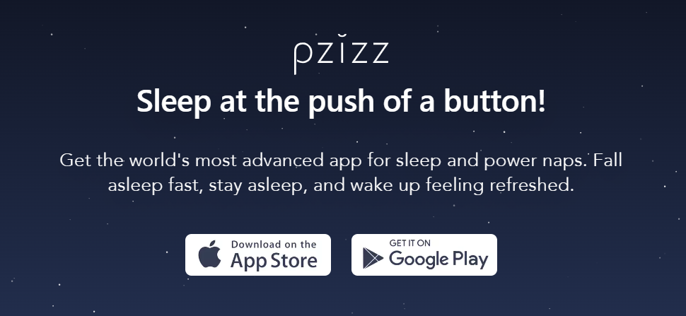
Source: KlientBoost
Pzizz excels not only in its landing page, but also in its ability to boost health and overall well-being. If you’re curious how, check out our review of today’s 7 best sleep apps.
2. Visuals. These include photos, videos, and graphics. It’s important to choose quality visuals that show the readers what your app looks like in action.
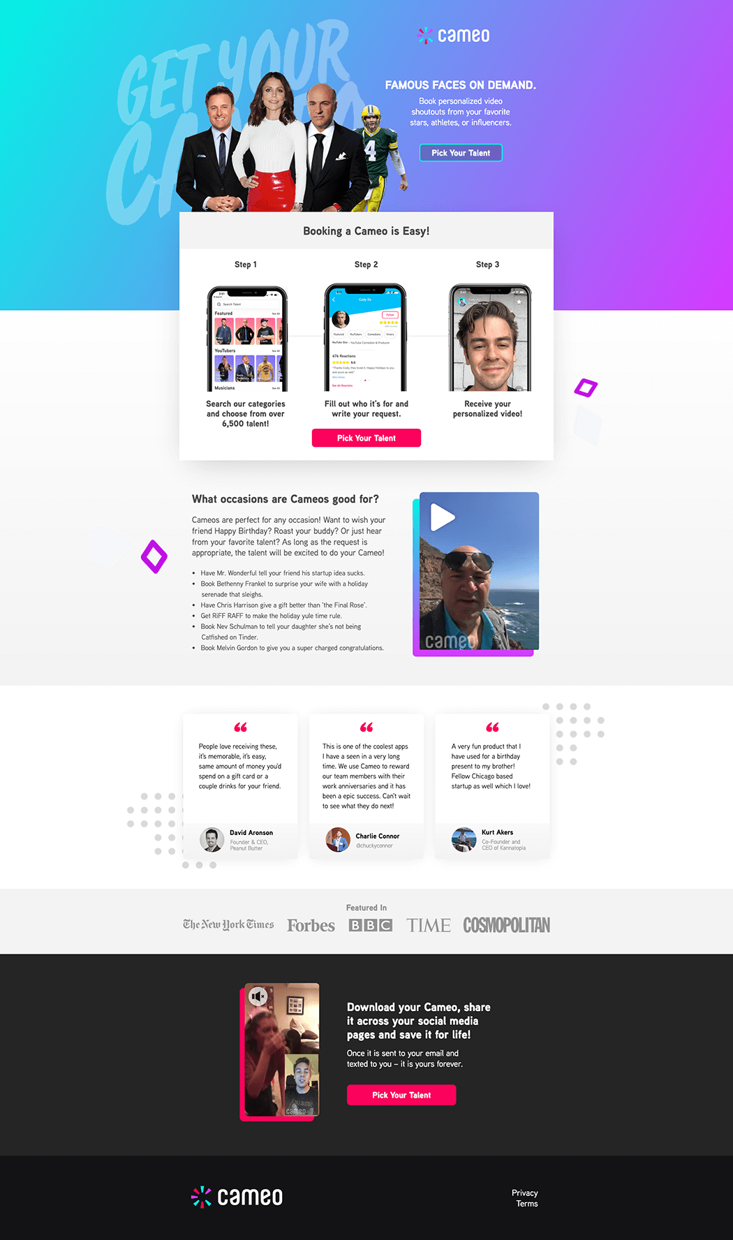
Sample landing page: The right combination of photo and video elements in Cameo’s landing page explains the app quickly and with full impact. The photos indicate how to use the app in a few simple steps. The video feature celebrities who explain how the app works.
For context, the Cameo app allows users to gift their loved ones with video recordings of celebrities wishing them well on occasions like birthdays, anniversaries, etc.
Source: Unbounce
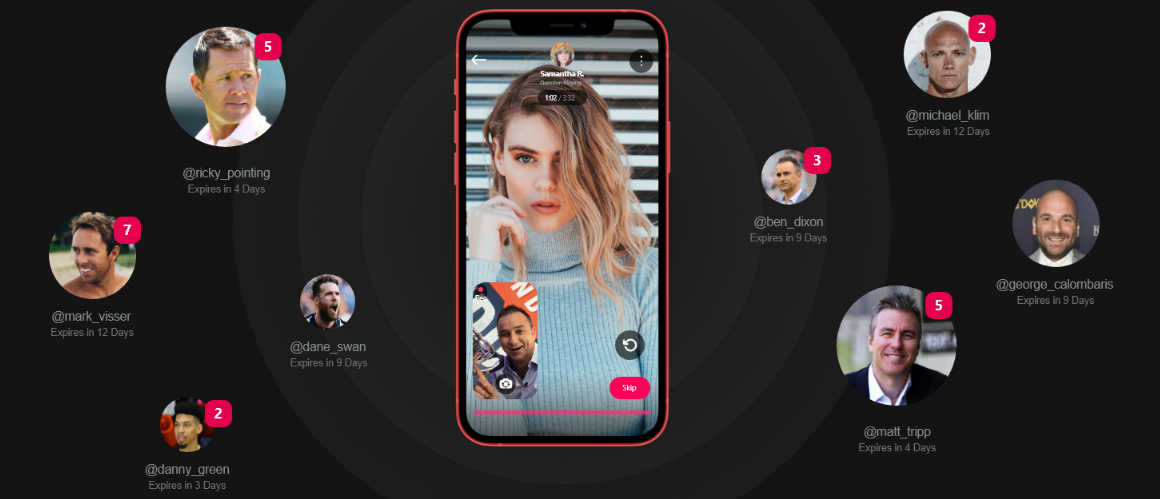
We at Appetiser have developed an app similar to Cameo. Check out our case study to learn how Vello makes celebrities more accessible to the app’s users.
3. Features list. This part of the landing page highlights your app’s basic functions and what makes it special.
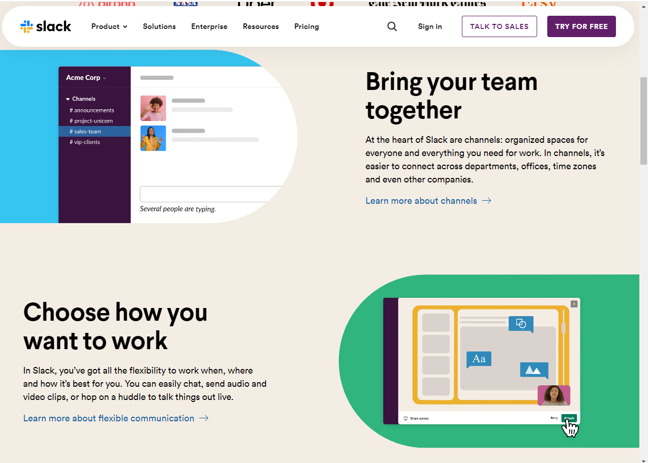
Sample landing page: Slack has a unique way of presenting its features on its landing page. Instead of giving the plain bullet point rundown, the page introduces an app’s features by having the following components per feature:
- Benefit-oriented introduction – A few words, written with bigger font sizes, that indicate how users can benefit from the feature
- Summary of the feature – A short sentence or two identifying the name of the feature and further explanation of the advantages of this feature
- Link to more in-depth feature resources – Blue-colored text that leads to webpages with longer explanations of the feature in question
Check out the image below to see the three abovementioned elements.
Source: Slack
4. Call-to-action (CTA). A clear call to action moves the reader closer to using your app. Hence, it is vital to have app download links or buttons in this landing page section.
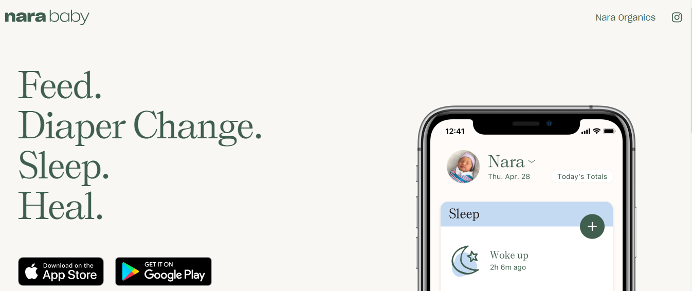
Sample landing page: Infant care app Nara strategically places the two black rectangular CTA buttons under large letters highlighting the app’s value.
Source: Nara Organics
5. Testimonials. These are statements from people who used your app and felt it satisfied their needs. This section of your landing page helps convince the reader that your app is effective, increasing the chances they will use your app.
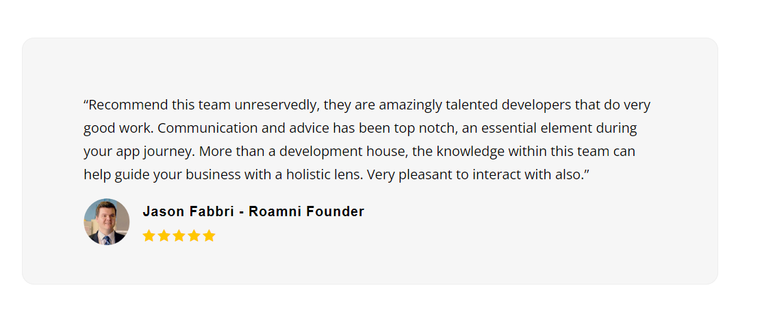
To show an example of a testimonial, let me share what one of our clients thinks of our app development and product strategy services.
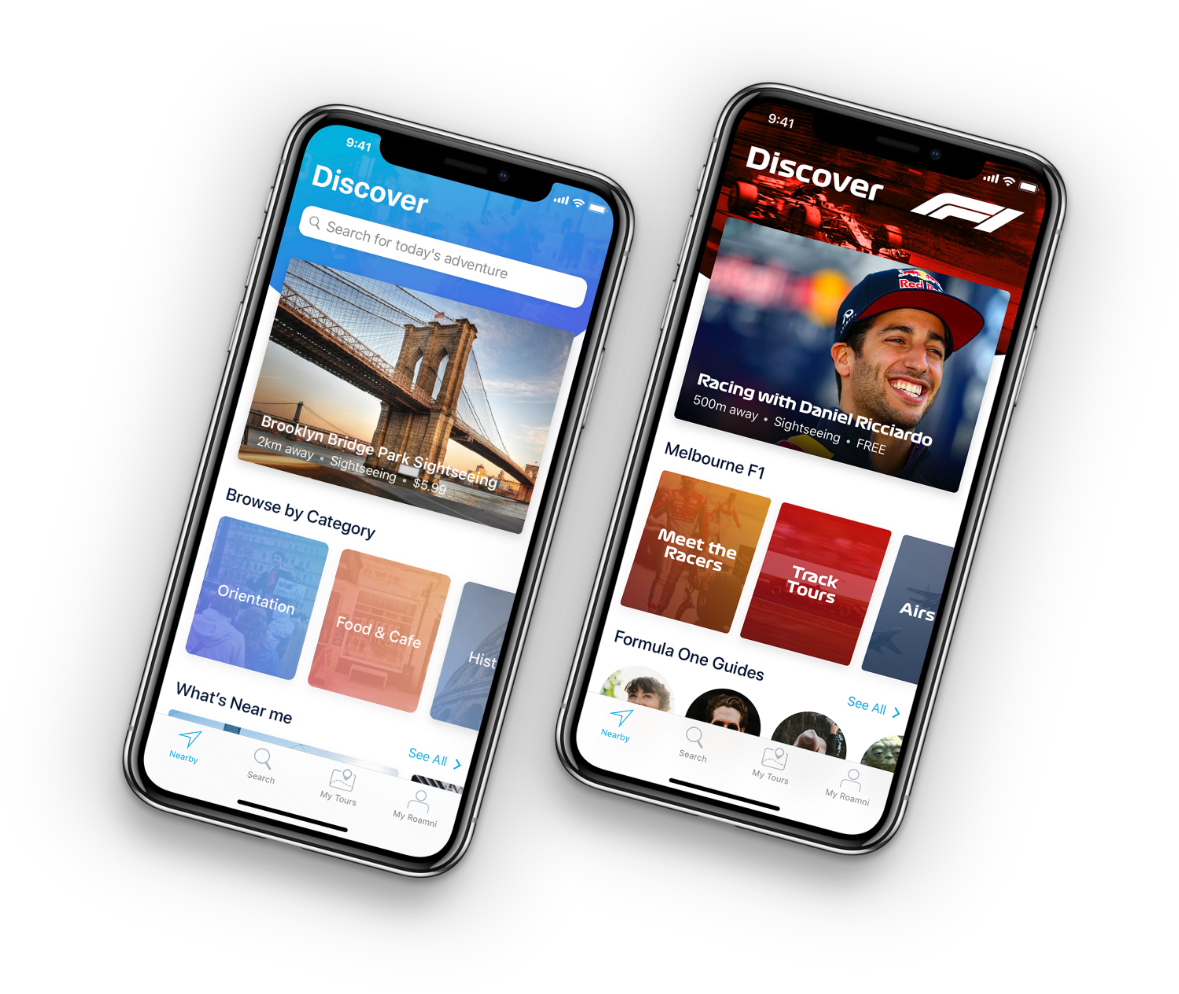
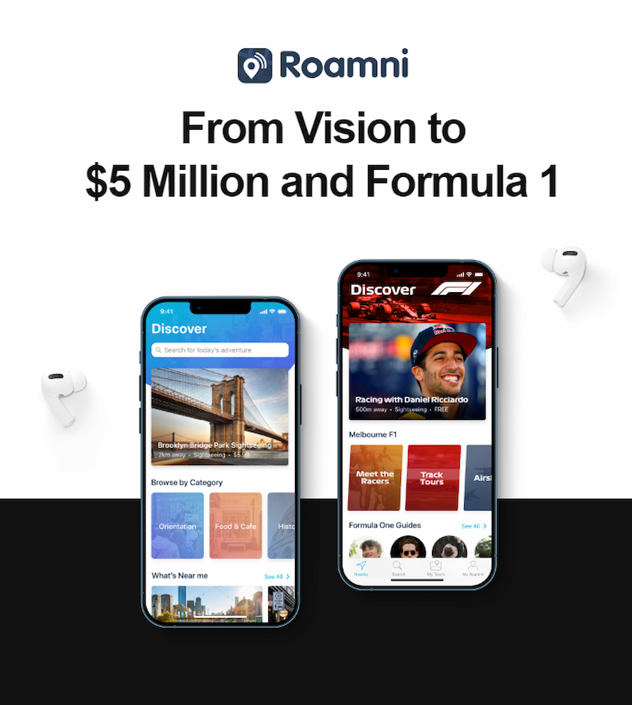
Appetiser’s role in helping Jason and Roamni attract Formula 1 is a success story filled with valuable insights.
6. Contact information. This part contains any link or content leading to your phone number, email address, physical address, or social media account. Including information like this helps the reader reach out to you as they find email address or contact information, increasing your opportunities for converting leads into app users.
6 Valuable Pointers in Making Awesome Landing Pages
Landing pages can’t be hit-and-miss. You have to create them strategically so you can attract more app users without wasting resources on ineffective app pages. Saving resources helps reduce the challenges you face when building apps and their corresponding landing pages.
Our marketing experts recommend the following methods for creating a great landing page:
- Ensure your messaging matches your target market
- Get a landing page creation tool that best fits your skillset
- Use enticing visuals
- Take into consideration mobile users
- Make your landing page part of a coherent digital marketing strategy
- Constantly test and update your landing page
Let me break down each tip to ensure you’re ahead of the landing page game.
Tip #1 Tailor your messages according to the audience
During the app development process and marketing, market research is crucial in determining the traits of your app’s potential users. Information like the language they use or their personal preferences can help you create successful apps while ensuring your content connects with your audience.
The closer the emotional connection with your readers, the higher the chance of getting more app users.
We’ve seen this work for our client PointsBet. We kept their target audience in mind when collaborating with them to create their website and blogs. We also hiked the company’s value to $ 3.2 billion through audience-tailored online assets.
Tip #2 Select landing page builders that suit your skills
It’s good to have web development skills to build landing pages on your own.
But if you’re not much of a techie, don’t worry. There are landing page builders that require little to no coding skills. Many of these builder apps even come with search engine optimization tools, increasing the chances your landing page will be quickly seen on Google or other search engines.
Tip #3 Add eye-catching visuals
A beautiful app landing page pays dividends.
But always remember. What you think looks nice may not be popular with your visitors. So when designing or incorporating assets like video, graphics, and images into your landing page design, always keep in mind your target audience profile, as I mentioned in Tip #1.
Videos
A HubSpot marketing study indicates that 9 out of 10 people want to see some form of video content from their favorite brands.
Chances are, you even have a neighbor or colleague who frequently shares some funny or insightful videos from YouTube or TikTok.
The point is video content is popular. Leverage the power of this form of media to increase app downloads. Adding videos to your landing page increases the likelihood that you will attract more app users.
In fact, we highly recommend video marketing for business growth in general.
Graphics and images
High-resolution images and graphics help highlight your app’s features, making your application more engaging and enticing to your landing page visitors. Make sure images like app screenshots, etc., are of high quality.
But aside from visual design quality, color psychology also plays a big role in boosting your app page’s conversion rates .
Studies show colors induce different physical or emotional reactions. For instance, people associate red with passion and intensity. Meanwhile, green exudes health, serenity, and tranquility.
Using the right colors according to your landing page goals and target audience profile can better convince people to download your app.
Tip #4 Consider mobile users
The main goal of mobile app landing pages is to cast the net wide to get more users.
Even as most web traffic nowadays comes from mobile devices, the desktop version of your app landing page should be as technically and visually awesome as its mobile version. Otherwise, you risk losing that big chunk of users who surf the Net through their smartphones.
Tip #5 Use digital marketing assets to complement your landing page
A landing page is more effective when used with other digital marketing collaterals.
Let’s say visitors have to leave their email addresses on your landing page before downloading your app. Once they leave their email addresses, you can send them collaterals like email newsletters to maintain their interest in your app. Retaining active app users is crucial for anyone wanting to earn money from apps effectively.
When writing content for these newsletters, it’s vital to add value by not focusing solely on upselling your app. For instance, if your app helps users buy stuff online, provide curated content like shopping tips that help save money, etc. Being helpful is as good for your business as it is for your soul.
Tip #6 Improve your mobile app landing page continuously
Two buzzwords to focus on here: heat maps and A/B testing.
Using heat maps is one way to identify the parts of your app landing page with the most (or least) visitor activity.
If you’ve seen weather forecasts with maps overlayed with colors, heat maps look like those. Each color on a heat map represents how long visitors look at a certain part of your landing page or which section they click on the most.
The screenshot below is a heat map of Guardian Unlimited’s web page.
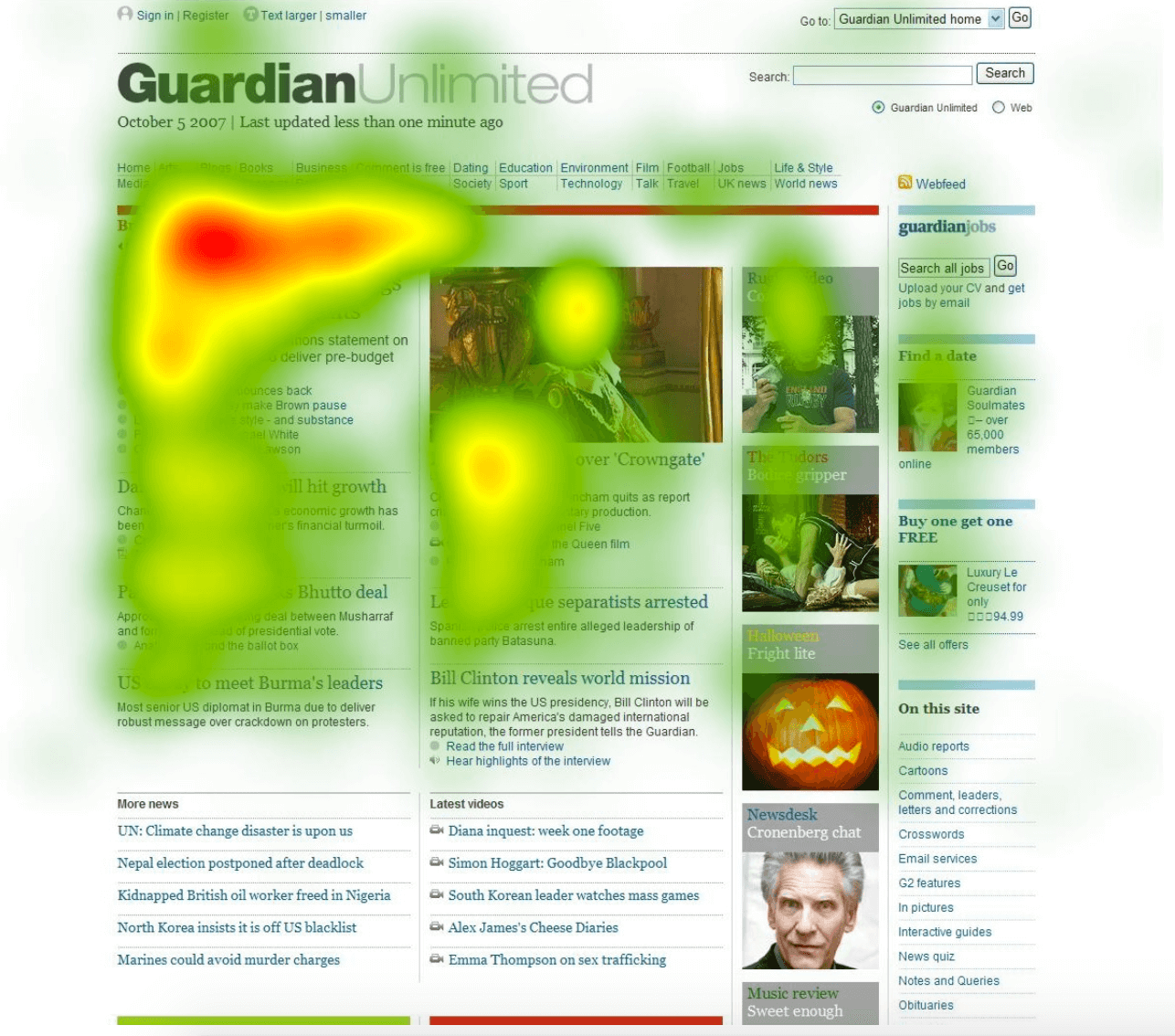
Source: Crazy Egg
Heat maps work best in conjunction with A/B testing. Essentially, based on the information you get from your heat maps, you can design a “B” alternative to your “A” or first landing page version.
For example, on your current landing page, most visitors read the headline and subheadline a lot, but only a few click your download link. In this situation, you can perform A/B testing by changing the size or color of your download button. Then compare the heat map of your page’s “B” version to your first one and see the difference.
This is how you can continuously develop your landing pages for better conversion through heat maps and A/B testing.
Landing that big catch
Publishing your app on app stores is not enough to acquire users. Landing pages are a great complementary tool to other online assets and digital marketing collaterals to ensure you capture netloads of more app users.
Now if you don’t have an app yet that needs landing pages, perhaps it’s time to consider at least envisioning one. After all, studies have shown how apps have empowered individuals, businesses, and nonprofits to earn more or improve how they help others.
We at Appetiser can help you whether you have a rough sketch of your app or already have a solid idea of what you want to build. From design and development to app launch and marketing, our product strategists are on hand to maximize your app’s chance of success.
Book a free consultation with us to learn how to best realize your app vision.

Jesus Carmelo Arguelles, aka Mel, is a Content Marketing Specialist by profession. Though he holds a bachelor’s degree in business administration, he also took courses in fields like computer troubleshooting and data analytics. He also has a wealth of experience in content writing, marketing, education, and customer support.


