Wireframing vs Prototyping: 5 Proven Strategies of Successful Apps
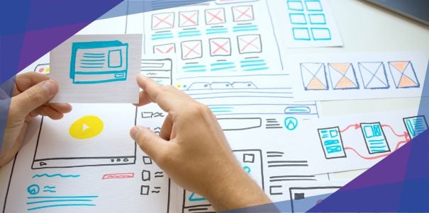
I always thought that great artists like Michaelangelo, Van Gogh, and da Vinci simply applied paint directly to the canvas.
Contrary to my assumption, a beautiful painting starts with a preliminary work. Artists first sketch the outlines, carefully planning the composition and ensuring that every element is in the right place.
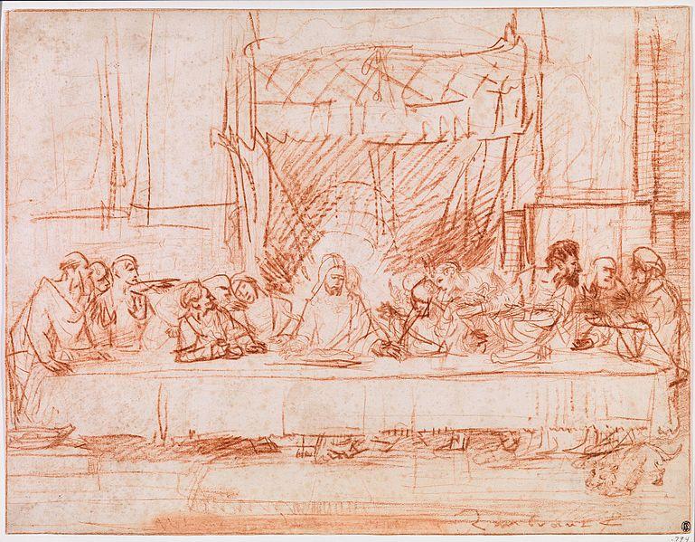
Source: Wikimedia
This initial sketch helps them visualize the final piece and serves as a guide for the detailed work that follows. In the world of app design and development, wireframing is akin to this sketching phase, while prototyping is like adding layers of color, texture, and detail to bring your vision to life.
In this article, we’ll explore the key differences between wireframing vs prototyping and how each one plays a critical role in the app development process. Whether you’re developing an app idea or all fired up to pitch to investors, learn and discover how to set a strong foundation for your next venture.
What’s the difference between wireframing and prototyping?
In app development, wireframing and prototyping produce the blueprints that help teams shape and improve their app ideas before the actual building phase.
What is wireframing and its role in app development?
Wireframing is the process of creating a basic skeletal outline or blueprint of an app or website’s user interface.
Key aspects of wireframing include:
- It’s typically done early in the mobile app design process to map out the basic layout, structure, and functionality.
- It’s normally in low-fidelity, focusing only on layout and structure rather than visual design elements.
- It’s helpful for visualizing the information architecture, user flows, and key features.
- It’s an excellent way to have quick iteration and feedback on core concepts before investing in visual details.
In short, wireframing is the backbone of app design and development. It zeroes in on user needs while fostering seamless team collaboration. Ultimately, it conserves time, resources, and app design costs by greenlighting app concepts before the full development sprint begins.
What is prototyping and its role in app development?
Prototyping involves creating an early model or simulation of the final product that demonstrates its core functionality and minimum viable product (MVP) version.
What makes it different from wireframing is that:
- It’s typically more detailed and interactive than digital wireframes.
- It’s presented from medium to high fidelity depending on the stage of development.
- It’s useful for app designers to test and refine the user experience.
- It’s helpful in visualizing how the final design will look and function.
Prototyping in app development lets everyone get hands-on with a live model, spot usability quirks for enhancement, and gather key user insights upfront.
Additionally, it cuts risks through early concept testing and helps app developers grasp functional needs. With prototyping, you can make ongoing design enhancements.
5 examples of winning strategies for wireframing vs prototyping
What better way to appreciate the differences and roles of each one than to highlight examples and case studies that have shown results?
Here’s a quick run-through of what to expect in this section:
- Start with low-fidelity sketches
- Use wireframes to define user flows and interactions
- Create interactive prototypes from wireframes
- Capitalize on prototypes for app funding
- Iterate based on feedback throughout the process
1. Start with low-fidelity sketches
The design process begins with sketching to explore the initial ideas and main sections of the app.
Remember how I mentioned earlier that an artist creates the groundwork first before painting on canvas? This is also how designers initially craft designs using a variety of design tools. This allows for quick iteration before moving to more detailed wireframes.
Take a look at Youfoodz’s app transformation from Week 1 to Week 6. The basic sketch is simple without the bells and whistles. Fast-forward to Week 6, it looks spectacular with detailed visual elements.
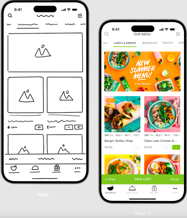
The Youfoodz app’s visual transformation is not the only thing that’s fascinating. Its success story is also as colorful. Check out the Youfoodz case study to learn more.
On another note, Luke Hernandez, one of our product designers, shares his two cents on this process.
During the sketch phase, the designer focuses on the product’s general idea and main sections. The designer should share a presentation to ensure they align with the client.
2. Use wireframes to define user flows and interactions
Wireframes lay the foundation for user interaction, seamlessly guiding users through essential app functions. In the wireframing stage, our design team begins creating different user flows and considering secondary sections and screens in visual detail.
It’s because even the most visually striking product can falter without a coherent, intuitive flow. Users grow impatient with convoluted tasks, illogical sequences, or baffling layouts.
That’s why at Appetiser Apps, the design teams chart user flow with precision, which will then be designed through wireframing before layering on captivating design elements.
Here’s an example of what our team did with the Roamni app, one of our projects.
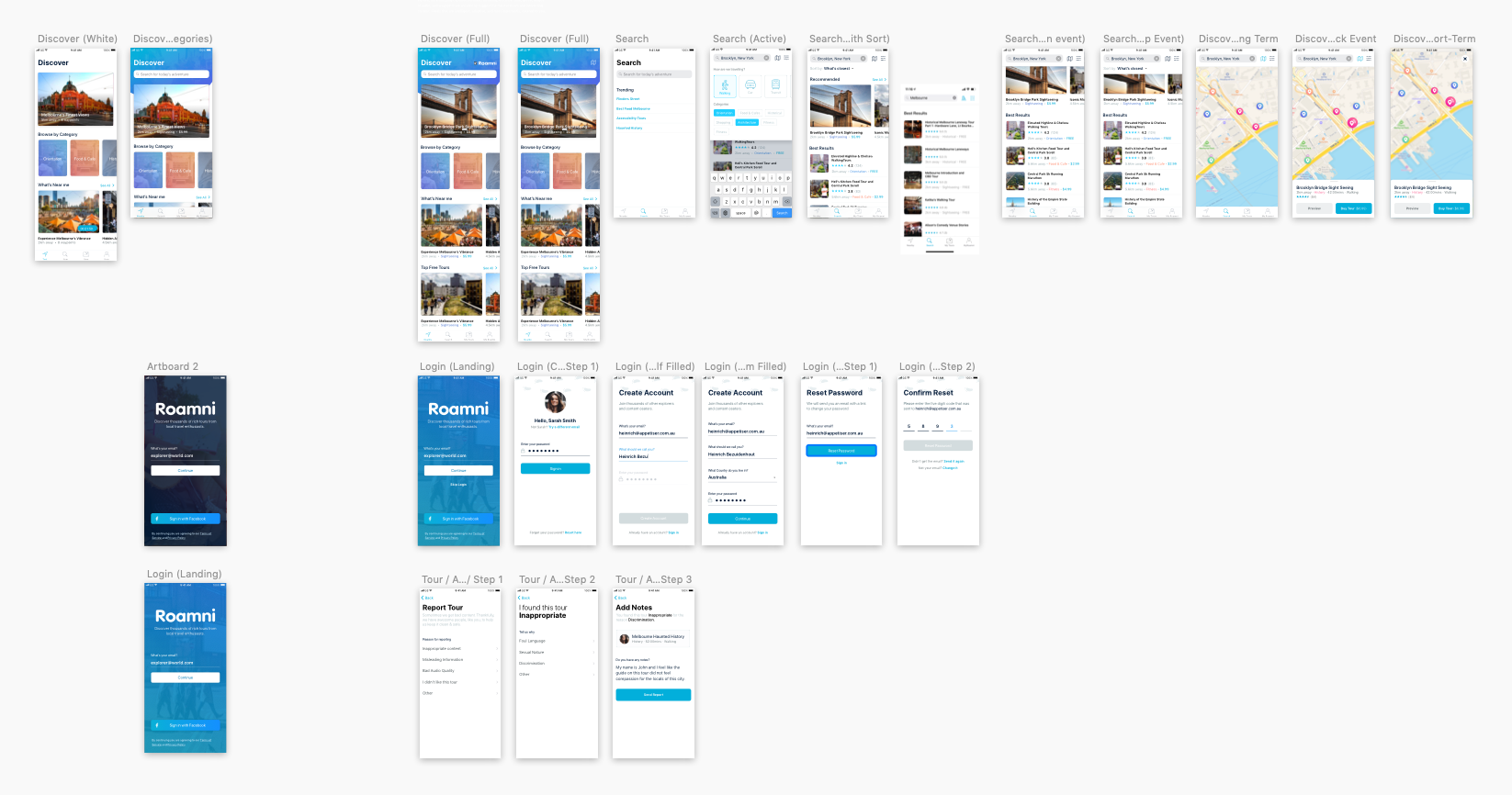
A logical user flow helps designers and developers think from the user’s perspective on how they will interact with the app interfaces.
As our product designer Luke explains further, wireframes allow designers to “create different flows and start thinking about secondary sections, flows, and screens.” This helps define the core user experience before adding visual design elements.
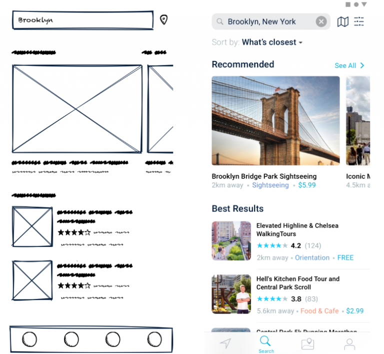
In short, creating a top-notch user experience involves a myriad of intricate details and an understanding of user flow.
Now that I mentioned user flow, you can also check out our guide on creating personas for UX, which provides the basic tenets of designing apps that customers will love.
3. Create interactive prototypes from wireframes
Now that the sketches present the main idea and sections of the app, which will be used for wireframes to show how users will interact with it, let’s move on to the interactive prototypes.
Our design team develops high-fidelity interactive prototypes based on the wireframes. Luke, our product designer shares that this gives clients “a first approach to an interactive prototype where the client can visualize each flow and get a good idea of what Appetiser will deliver at the end of the design stage.”
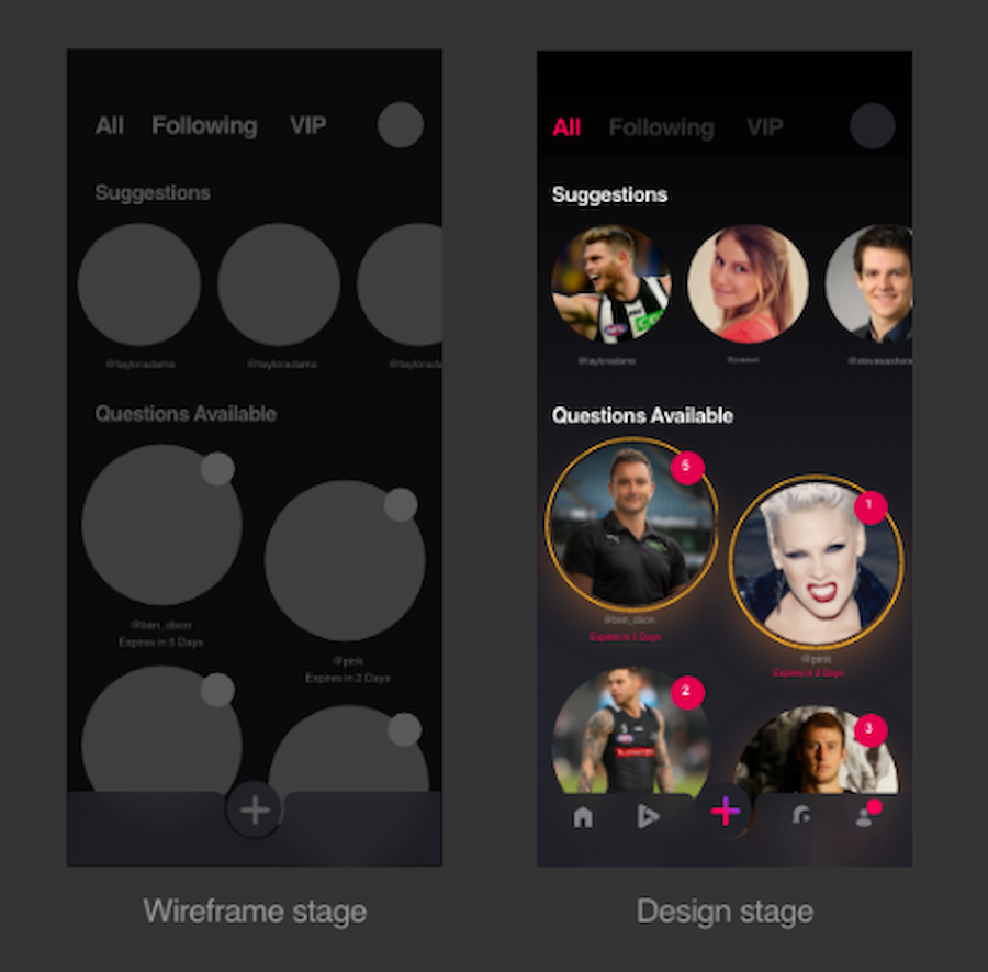
It gives an opportunity to gather realistic user testing and user feedback.
An interactive prototype breathes life into your designs, mirroring your app’s functionality with animated finesse. Here’s an example based on the design provided above.
In short, an interactive prototype is the crucial first step in testing your app’s potential. It provides users with a true feel for your app, immersing them in its essence like no other method can.
App designers and testers can fine-tune every aspect before launch by scrutinizing design, flow, and overall value. In addition, they can optimize the final product for maximum impact by using data-driven insights from usability testing and user interactions.
With Appetiser’s prototype, Vello raised over $1 million, attracting investors who also shared the founder’s vision.
Speaking of attracting investors, the next section will unpack more of this.
4. Capitalize on prototypes for investor pitches and app funding
Prototypes are powerful tools for startups securing app funding. They provide a tangible visual representation of the app, allowing investors to see and interact with the product, which can significantly increase their confidence in your product’s potential.
While a prototype simulates the app’s look and feel, it doesn’t provide actual products or services. Yet, high-quality prototypes have propelled countless startups ahead in the funding race. Let me give you one example.
Armed with our stellar design prototype, Good Empire confidently entered the investor arena, making waves on the crowdfunding platform Birchal.
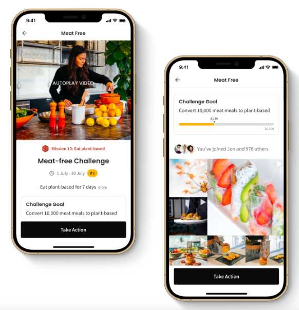
The outcome? Pure success. They aced not one but two crowdfunding campaigns, amassing over $1 million from a supportive community of over 1,000 investors—all without writing a single line of code.
This goes to show that prototypes can demonstrate the app concepts more convincingly than static wireframes. In fact, 36% of successful fundraising efforts attribute their success to building and validating a prototype with the target audience. This highlights the importance of having a tangible product to show investors.
Additionally, with a prototype on hand, you can also implement the next strategy to ensure further delight of your app users.
5. Iterate based on feedback throughout the process
With wireframes and prototypes present in the equation, there is room for feedback, testing, and improvements that will help build more user-centered apps. One of our mobile app developers also chimed in on the advantages of having wireframes:
The benefit that our clients get is that they understand the flow of their app and their product. And at that early stage, they can even already have feedback or some adjustments that they can do to further improve the user experience.
The entire process is like putting on a scientist’s hat by having that experimentation mindset. This is actually important in starting an app business, launching a product or service, or simply gauging product-market fit.
 Source: DeviantArt by KareemCarzan
In his book, The Lean Startup, Eric Ries also emphasizes the need to have this approach.
“The way forward is to learn to see every startup in any industry as a grand experiment. The question is not “Can this product be built?” In the modern economy, almost any product that can be imagined can be built. The more pertinent questions are “Should this product be built?”. “Can we build a sustainable business around this set of products and services?”
Fortunately, wireframing and prototyping give you a direction on where to go and what to do instead of building a product that customers won’t even use.
Set the groundwork for app success
An artist’s masterpiece isn’t possible without the preliminary sketches. The same principle applies to building a user-centric app that is delightful to use.
Sketches, wireframes, and interactive prototypes make the process possible and a dream come true—you’ve seen that with the founders we have supported and helped along the way.
And who knows? The next successful app business founder might be you.
So if you have an app idea that has been brewing in your mind, don’t hesitate any longer. With the right design tools, mindset, and team by your side, you can build the groundwork until you reach the top.
There’s no better feeling than seeing something you’ve envisioned come to life in the hands of satisfied users.
Schedule a call with us, and let’s talk about your vision.

Maria Krisette Lim is a Content Marketing Specialist with 14 years of experience producing web and print ad content. Krisette has a BSBA degree, major in Business Management and Entrepreneurship. When she’s not tinkering with words and punctuation, she’s either curled up with a book while sipping hot tea, playing with her toddler, or tinkering with website builders.


