How to Design an App Icon That Grabs Users’ Attention
")
As small as they are, app icons greatly impact your app’s success.
After all, they are among the first things users see in the app stores, giving them enormous power to attract or turn away potential users.
But how do you ensure your icon delivers positive results for your app?
There are a lot of factors to consider, and it can be overwhelming to know where to start. From color combinations and shapes to other design elements, everything must work together to form a positive user perception.
But with careful planning, strategic thinking, and creativity, you can create an impactful icon to serve as a symbol of your app.
In this blog post, I’ll share tips for creating app icons from Appetisser’s award-winning team of designers.
Read on to gain insights from Australia’s #1 App Designer on Uplabs and create an icon that users would love to click.
What is an app icon?
An app icon is a small graphical symbol representing web or mobile applications or programs. It is typically found on app store listings and displayed on the home screen and app list of smartphones, allowing users to identify and access apps easily.
Why are app icons important?
App icons serve numerous purposes. Among the most crucial ones are the following:
- Increases brand recognition and recall. App icons are an important part of app branding. They help users quickly identify your web or mobile app in the Google Play Store or Apple App Store.
- Helps your app stand out. With thousands of new apps added to the app stores daily, having a well-crafted icon is essential for capturing users’ attention and making a great impression in the crowded app store landscape.
- Gives users an idea of your app’s purpose. Creating an eye-catching app icon isn’t enough; you must also ensure it properly conveys your product’s message. iOS and Android app icons are often designed with clever elements that serve as visual cues, giving users a hint at their function.
- Enhances engagement and conversion. App icons also impact your revenue. According to Store Maven, app icons can increase conversion rates by as much as 25%.
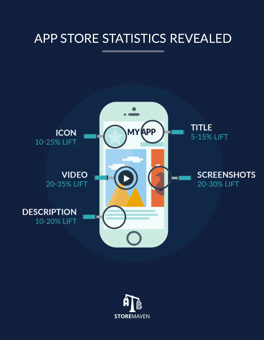
Source: Neil Patel
Now that you know the importance of an app icon, let’s discuss how you can craft a killer app icon design.
How to Design an App Icon That Stands Out
At Appetiser, we understand the power of a world-class design. Be it for a prototype, an icon, an e-commerce, or a custom mobile or web app, a well-thought-out design can lay the foundation for your project’s success.
So, how do you come up with a brilliant app icon design? Here are some tips from our design experts:
#1 Be unique
As mentioned, one of the purposes of an app icon is to help users recognize your app easily. This is something that can’t be accomplished with an app icon design that resembles any app or most apps.
Think about it.
Other than Twitter, do any other brands come into mind when you see this infamous bird symbol on a blue background?
![]()
Source: UCWbLing
Likely none.
To boost your app’s success, choose a symbol that users can associate only with your web, iOS, or Android app.
This may involve familiarizing yourself with your competitors’ app icon designs. Analyze the shape, color, and other elements they use so you know what works and how to set yours apart.
That said, keep in mind that app stores have standard icon guidelines for all the apps published on their platforms.
Here’s a quick guide for your reference:
Google Play Icon Design Specifications
| Final size | 512px x 512px |
|---|---|
| Format | 32-bit PNG |
| Color space | sRGB |
| Max file size | 1024KB |
| Shape | Full square. Google Play dynamically handles masking. |
| Shadow | None. Google Play dynamically handles shadows. |
Apple App Store Icon Design Specifications
Across all platforms, the App Store requires icons to be in PNG format and supports the following color spaces:
- Display P3 (wide-gamut color)
- sRGB (color)
- Gray Gamma 2.2 (grayscale)
While the App Store doesn’t require publishers to create different icons for different devices, they have specific specs per platform. You may refer to the table below.
| Platform | Layers | Transparency | Shape | Size |
|---|---|---|---|---|
| iOS, iPadOS | Single | No | Square | 1024×1024 pixels
(App Store can scale automatically) |
| macOS | Single | Yes, as appropriate | Square with rounded corners | 1024×1024 pixels
(other version sizes are needed) |
| tvOS | Multiple | No | Rectangle | 1280×768 pixels
(other version sizes are needed) |
| watchOS | Single | No | Square | 1024×1024 pixels
(App Store can scale automatically) |
For full details, check out Google Play Store and Apple App Store’s respective developer pages.
Now, you might be thinking, how can you ensure a unique app icon design while complying with the app stores’ uniformity standards?
This is where your creativity comes in. Find the best possible workarounds and make the most of the factors within your control.
For example, while you may not have the liberty to use a unique shape for your icon’s border, you can increase the graphic image’s opacity level or add an interior drop shadow to make your icon stand out.
In other words, think outside the box — just like what our app designers do whenever we stumble upon any roadblock.
This is how we push the boundaries of success for ourselves and our partners. We’ve helped numerous clients overcome what’s keeping them from moving forward.
One of which is MUCUDU.

Despite their industry being heavily battered by the pandemic and having zero technical background, app founders Zenita and James managed to build a hospitality industry platform now sought after as partners of the biggest brands — including Lion.
Their secret? Collaborating with an app development partner that shares their passion for finding opportunities in challenges.
Check out MUCUDU’s case study here to learn more about their exciting mobile app journey.
#2 Show, don’t tell
Your web or mobile app icon should give your users a glimpse of what your app is about — without using words or text.
Keep in mind that users see your app icon on a small screen. As such, it can be difficult to recognize an image, let alone read texts.
Depending on the device, Android app icon size range between 36×36 to 96×96 pixels, while normal iOS app icon size is 120×120 pixels (60pt × 60pt @2x).
Additionally, app stores display your app’s name and description right beside your app’s symbol. Putting text on the icon, especially if it’s the same as the other displayed texts, is not only unnecessary but also visually unappealing.
Of course, there will always be exceptions to this rule. Popular apps that have already established a name and large followings can get away with putting texts on their app icons.
And while I don’t discourage startup app publishers to do the same, texts should be used sparingly and thoughtfully.
An even better option is to use graphical images that give your target audience a glimpse or feel of what your app is about. By giving your target audience a sneak peek of your app, you can spark their curiosity and entice them to download it.
How?
You can learn a thing or two from the game app icons below:
![]()
![]()
Source: Google Play Store
Even without a caption, the app icons above communicate the games’ features using key elements associated with the sports they represent or actions that imply how the games are played.
They also gave users a feel of what it’s like to play their games by choosing angles that put audiences in the POV of a player.
#3 Choose vibrant colors
With more than 5 million apps in the Play Store and App Store combined, capturing users’ attention has become extremely difficult. You must intentionally make your app stand out in every way possible.
Using vibrant colors is a great way to draw attention to your app. This is because people are naturally drawn to bright and bold colors. By leveraging the power of striking colors, you can give your app an edge over its peers.
Don’t believe me? Take a look at the app icons of some of the most instantly recognizable and widely used apps today.
![]()
Source: Dribble
Another crucial thing to keep in mind is that the competition for users’ attention doesn’t end in the app stores — the cutthroat fight continues even after the download.
According to research, an average mobile user has about 80 apps installed on their iOS or Android devices.
Creating app icons with bold and vibrant colors enables users to recognize your app easily on their home screens, driving continuous interaction and boosting retention.
#4 Practice minimalism
As with any app element, simplicity is key to creating an impactful app icon.
Minimalist web, Android, or iOS app icons allow users to easily find what they need without being overwhelmed with too many details.
On the other hand, an app icon with lavish details can confuse viewers or give them the wrong impression, leading them to pass on the app altogether.
One great example of a brand that understands the power of icon design is Netflix.
![]()
Source: NicePNG
When it comes to the design of its app icon, Netflix is chill.
It only takes a single bold red typography on a black background for 2022’s most downloaded video streaming app to create one of the most instantly recognizable apps in the app stores.
#5 Create multiple variations
The possibilities are infinite when it comes to app icon design. While this is generally an upside, it can also cause some app publishers to feel overwhelmed and stuck.
That’s why it pays to brainstorm different app icon design ideas. Brainstorming is a valuable tool for sparking creativity and innovation.
Take it from us. This creative exercise has led our team to come up with numerous unexpected, innovative ideas, empowering us to achieve maximum impact for our partners and our company.
Brainstorming can also help you identify potential issues or deficiencies in app icon designs. By taking the time to consider different possibilities, you can develop an app icon that stands out amongst the rest.
Snapchat’s app symbol makes a good case in point for why you should create multiple versions.
Did you know that the infamous ghost-shaped has undergone three design changes since its launch?
![]()
Source: 1000 Logos
In 2011, Snapchat introduced its symbol named Ghostface Chilian, which represents the app’s key feature of showing text or image snaps that disappear after they’re viewed.
Later on, the company decided to adopt a more minimalist version and kept just the silhouette of the original version. In 2019, they altered it again to its current version with a thicker border to allow easier identification even from larger distances.
While the latest iteration didn’t affect the brand’s recognizability, reports say that many users didn’t like it. It has received numerous complaints and negative reviews in the App Store.
Our takeaway?
Creating multiple versions of app icons can be a smart move. It allows you to test out different designs and content elements to see what resonates best with your target audience.
Having alternate app icons also provides flexibility when it comes to adapting to multiple platforms or needs. You’ll have custom sizes ready for desktop, mobile, and other devices, saving you time and ensuring consistent branding across channels.
Start building your app’s icon
Now that you have a better grasp of designing a great app icon, it’s time to put your knowledge into practice. Keep the above principles and tips in mind as you brainstorm ideas for your own app icons.
Lastly, don’t forget to have fun.
Best of luck!
If you need a full-journey app development partner that understands the principle and power of a world-class design, reach out to Appetiser today.
People also ask
When it comes to making your app stand out, your app icon plays a crucial role. Below are some of the most common questions about designing an effective app icon and how to get it right.
1. What makes an app icon grab attention?
A good app icon is unique, bold, and instantly recognizable. It pops against busy app stores and home screens, lets users know what your app does, and helps you stand out against competitors.
2. How do I design an app icon that stands out?
Research what competitors use and pick colors, shapes, or graphics they don’t. Choose bright, high-contrast images and follow store guidelines—but get creative with internal details or accents to make it memorable.
3. Which colors work best for app icons?
Bright, bold colors catch the eye and drive recognition. High-contrast color combos also help your icon stand out, but make sure colors match your brand and look good at small sizes.
4. What size should an app icon be for each platform?
For Google Play: use 512×512 pixels, PNG. For iOS: 1024×1024 pixels, PNG. Stick to supported color spaces. Double check each platform’s latest guidelines.
5. Should my app icon show what my app does or just look nice?
Always hint at your app’s purpose, whether through shape, color, or visual cues. The icon should be easy to remember and help users identify your app fast.
6. How can I test if my app icon works well?
Make several versions and get feedback from potential users. Try A/B tests to find the icon people click and remember most.
7. How do platform rules affect my icon design?
Follow the fixed sizes, PNG format, and shape rules, but focus on creative inside-the-box design: use graphic tweaks, colors, and techniques to stand out even with strict guidelines.

Jane Eslabra is a content strategist with 18+ years of experience. Working alongside app development teams, she helps founders and startups move from idea to action through content that breaks down what actually works in real-world app building and scaling.