Frictionless First-Time Use: Turn New App Users Into Habitual Users With These 4 Atomic Habits-Inspired Best Practices
“To create good habits, you must make them obvious, attractive, easy and satisfying” — James Clear, author of Atomic Habits.
What makes social media apps irresistible?
If you ask me, it’s because they understand the fundamentals of human behavior.
Think about it.
What do you do the minute you hear the cue indicating you have a new message on Facebook? Like most people, you likely almost instantly pick up your phone and check the message.
This is just one example of how social media understands how humans form habits, including how we respond to cues. I’ll dwell on this insight later, but first, let me explain why I am talking about habits.
According to research, 40-60% of users open downloaded apps just once. Unfortunately, the life of mobile apps lies in having a high number of frequent and engaged users — something that rarely happens organically, at least not right away .
To get your users to the point where they automatically interact with your app, you have to promote habitual usage. And it starts the first time they use your app.
Fortunately, James Clear, author of the bestselling self-improvement book, “Atomic Habits,” offers a clear and easy-to-replicate framework for creating habits.
In this article, I’ll share how you can apply this framework to make the first-time user experience as frictionless as possible.
Let’s dig in.
What is first-time user experience?
First-time user experience is a user’s first interaction with your app. It encompasses all the initial stages of app usage, from signup to onboarding. It is from these experiences that users form an impression of your app.
The importance of a frictionless first-time user experience
Ensuring a frictionless first-time use is crucial because it is the phase where new users decide whether your app is worth using or abandoning. In a highly competitive app development market, users rarely give apps a second chance to make a great first impression.
Most app categories would often see a 14-15% decrease in retention within seven days of download. By day 30, most would only have a 6-7% retention rate.
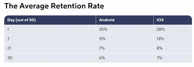
Source: Adjust
You have to make the most out of the little window of opportunity given by first-time users to convince them of your app’s value and hook them into using it habitually.
The first step to achieving that is ensuring their experience is as frictionless as possible.
Frictionless First-Time Use: 4 Best Practices for Driving Habitual Usage Among New Users
#1 Make it obvious
According to Clear, our brains often respond to cues automatically. These cues trigger our brains to do a certain action in anticipation of a reward. Many of our everyday tasks are triggered by cues, but we barely notice them because they have become so ingrained into our habit system.
So, we must make a cue obvious if we want to drive a certain behavior. For example, if you want to change your habit of forgetting small but important stuff at home, you can post a reminder note on your front door.
Clear calls this the 1st Law of Behavior Change. The same principle applies to first-time user experiences.
If you want first-time users to continue using your app, it shouldn’t be hard, and it shouldn’t take long for them to find value in it. You must make the action they need to take and “what’s in it for them” obvious from the start.
Here are some best practices we often suggest to our partners to highlight their apps’ value:
- Simplify the welcome page. Your welcome page should immediately give your customers a clear picture of what they will get from your product. It doesn’t have to be long or complex; in most cases, it doesn’t even have to have a literal welcome message.
In our experience, the simpler the welcome page, the better it drives actions. The less cluttered the design, the more obvious the cues.
- Write concise, benefit-driven copy. Highlighting the benefit of using your app rather than its features can give customers the impression that you care about what they need. Keep it short, simple, and direct to the point.
- Use call-to-actions. What can be a clearer cue than a straightforward call-to-action button? Use clear, concise, and actionable texts to encourage users to take the next step.
Take a look at how OneFriends, a social app and one of our custom app development partners, made the benefits of their app obvious in a simple, concise manner:
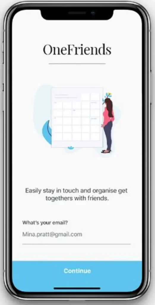
In a single page and using a short, one-liner, and actionable copy, OneFriends clearly explained how users could benefit from their app.
And just a side note, we played a role in OneFriends’ app success.
#2 Make it attractive
Creating a habit is about training our brains into liking doing something we don’t normally look forward to doing. Often, this doesn’t happen without a promise of a reward.
By Clear’s definition, a reward is something that we associate with a positive feeling. The anticipation of that reward is what motivates us to take action.
But let’s face it. Most, if not all, mundane tasks have no such appeal. Many of us would rather pay someone else to get such jobs done. This is why James Clear suggests habit stacking or bundling a task you don’t enjoy doing with something you do enjoy.
In other words, if you want something done, you have to make it fun. As Clear puts it: “The more attractive an opportunity is, the more likely it is to become habit-forming.”
How can we apply this principle in the context of first-time use? By intentionally designing an enjoyable onboarding experience.
While the download pages on the app stores are where your users have the first sight of your app, the first interaction happens during user onboarding.
It is at this stage that where users decide if your app is indeed attractive. To catch their interest, inject fun and excitement into the process.
Here are some practices that have worked for many of our partners:
- Take users on an interactive product tour. There’s a reason why your phone’s user manual sits unread in some corner of your room. Your brain anticipates no pleasure in reading it because it associates the activity with something boring.
If you want your new user’s first interaction with your app to be different from that, offer a more exciting way to introduce them to your product. For example, you could use interactive guided tours, video tutorials, and other visually appealing mediums.
- Gamify user onboarding. Gamification is proven to enhance user experience and engagement. This is because people naturally tend to be competitive and are motivated by a challenge.
While gamification suits most digital products, you must carefully consider if the strategy suits your app’s genre. If it doesn’t align with your brand’s image, adding a simple progress bar may be enough to elevate the user experience.
- Personalize the experience. According to SmartHQ, 72% of consumers now say they exclusively engage with brands with personalized messaging. But aside from addressing them by name, how else can you tailor an experience for a first-time user?
#3 Make it easy
One of the many insights in Atomic Habits that struck me is the Law of Least Effort.
Think about it. Why did manually operated televisions eventually become obsolete? Because apparently, using rotating dials or buttons requires more effort than using a remote control.
Clear was right in his observation. Humans naturally tend to gravitate toward options that require the least amount of work.
Our takeaway?
Less friction = a higher chance of action repetition.
If you want to encourage habitual app usage from your new customers, using your app shouldn’t feel like a challenge. Instead, you must design their “environment” to make achieving a successful and delightful first-time experience easy for them.
Here are some best practices our design and development team suggests to ensure a frictionless first-time user experience:
- Allow single-step signups using existing profiles. The signup page is the first stage of your onboarding process. Your only goal at this point should be to encourage new users to move forward, something that a long signup form will likely fail to deliver.
According to Userpilot, complex signup flows have a bounce rate of 76%. The fewer the steps, the more frictionless the experience, and thus, the greater the chance of getting a positive response.
- Welcome guest users. Asking for too much information or commitment before offering value is a surefire way to turn new users off. To avoid this, consider allowing first-time users to use your app without registration and strings attached.
- Keep options to a minimum. Giving users too many choices can make things appear complex and overwhelming. Instead, make deciding easy for your users by removing optional questions on forms and removing all unnecessary initial steps.
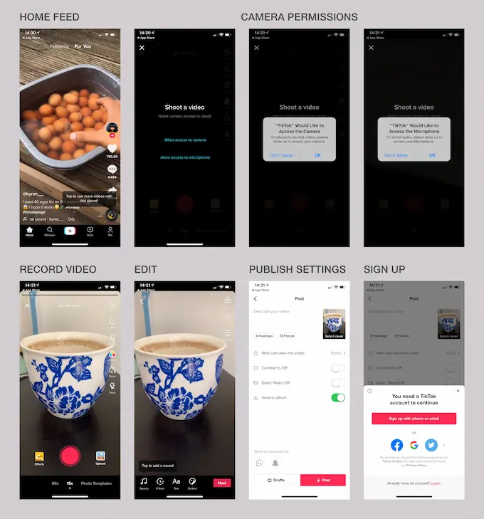
One app that gets frictionless first-time use right is TikTok.
Source: Page Flows
The social and video-sharing app allows first-time users to explore and experience most app features without signing up.
They only have to register when they want to leave a comment or follow an uploader. But even that can be accomplished in a single step!
#4 Make it rewarding
According to Atomic Habit’s Fourth Law of Behavior Change, immediately rewarded actions are often repeated. This is because our brains have evolved to seek immediate rather than delayed rewards.
So, if you want an activity to be a habit, you need to make yourself feel successful immediately after accomplishing it — even in a small way.
For example, you may reward yourself with a quick afternoon nap after accomplishing your to-do list for the day.
Applying the principle to first-time user experience is just as straightforward. To encourage new users to engage continuously with your app, reward them for doing so.
According to a survey by KPMG, 75% of consumers favor a brand with a loyalty program that rewards members.
Incentivizing your users also communicates that you appreciate them and want to build a long-term relationship with them — key elements for enhancing user retention and loyalty.
Here are some best practices to consider when implementing a new user incentivization strategy:
- Provide free app coins or tokens. Many apps, particularly mobile games, give new users app currencies as a welcome gift. This is a smart way to promote repeat interaction since the users can use the tokens within the app.
You may also bundle the incentives with gamification. For example, after completing the product tour, you may give a specific reward to new users.
- Give a new user discount. You may give exclusive discounts to promote first-time purchases and allow new users to experience what it’s like to shop using your app. This strategy often works for e-commerce apps.
- Offer redeemable freebies. You could also offer branded merchandise, like caps, sweatshirts, mugs, or any other items that align with your brand. Platforms such as Printful, Printify, and Merchize make it easy to set up and start offering these products quickly, without managing inventory or upfront investment. This is a great way to market your app while driving a rewarding user experience.
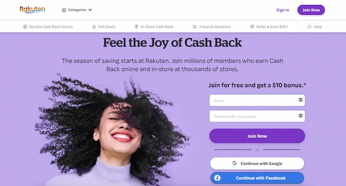
One example of a brand that exemplifies the power of instant reward is Rakuten.
Source: Rakuten
The Japanese e-commerce and retailing brand gives a $10 bonus to new users who spend at least $25 within 90 days of download.
One thing you should always remember
Let me end this article with another key insight from Atomic Habits:
“Everything is impermanent. Life is constantly changing so, you need to periodically check in to see if your old habits and beliefs are still serving you.”
The best way to design the ideal user experience, first time or otherwise, is never to stop learning about your users. Stay abreast of their fast-changing and ever-evolving needs and adjust accordingly.
If you need a partner to help you design and build an app flexible enough to accommodate user feedback and preferences, contact us at Appetiser Apps today!

Jane Eslabra has 14+ years of experience producing content across traditional and digital platforms. She channels her strong passion for fostering tech startup growth through knowledge sharing.


