9 Key Notification UX Strategies to Engage Your Users Like Never Before (Including Types You Should Use!)
")
Notifications are an essential part of a successful web or mobile app experience.
According to research, sending push notifications can boost app engagement by up to 88% and increase app retention rates by up to 10x.
Impressive, right?
Here’s a puzzling twist: notifications are among the top drivers of app uninstalls.
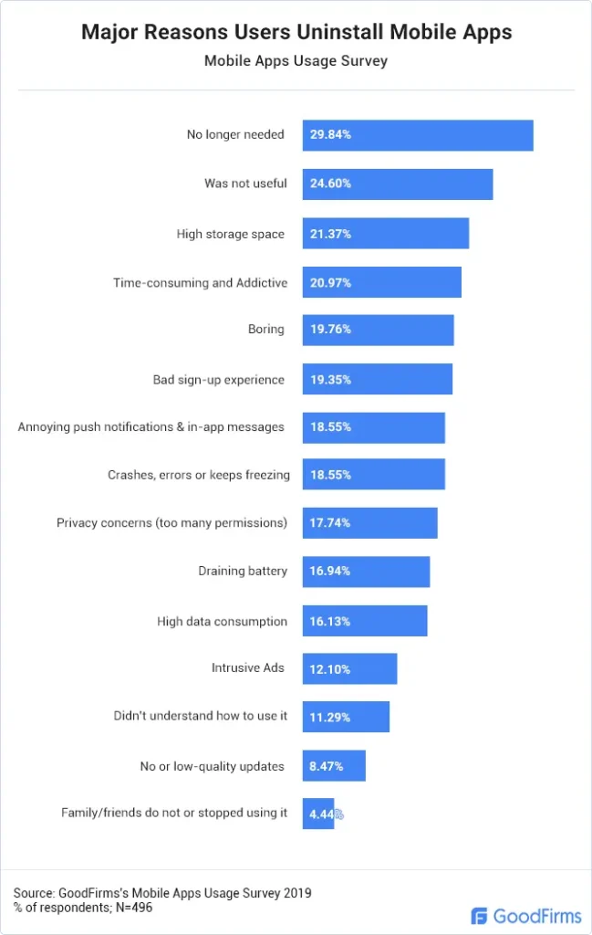
Source: GoodFirms
Designing a great notification UX strategy is a balancing act that requires careful thought and planning. Tipping the scale on either end can frustrate users and drive uninstalls, so it’s important to get it just right.
In this article, I’ll discuss app notifications, their types and uses, and the do’s and don’ts of designing a great notification UX.
Read on to equip yourself with crucial information and insights to ensure the best user experience.
Let’s get started!
Need more? Get the resources you need delivered straight to your inbox.
What are notifications?
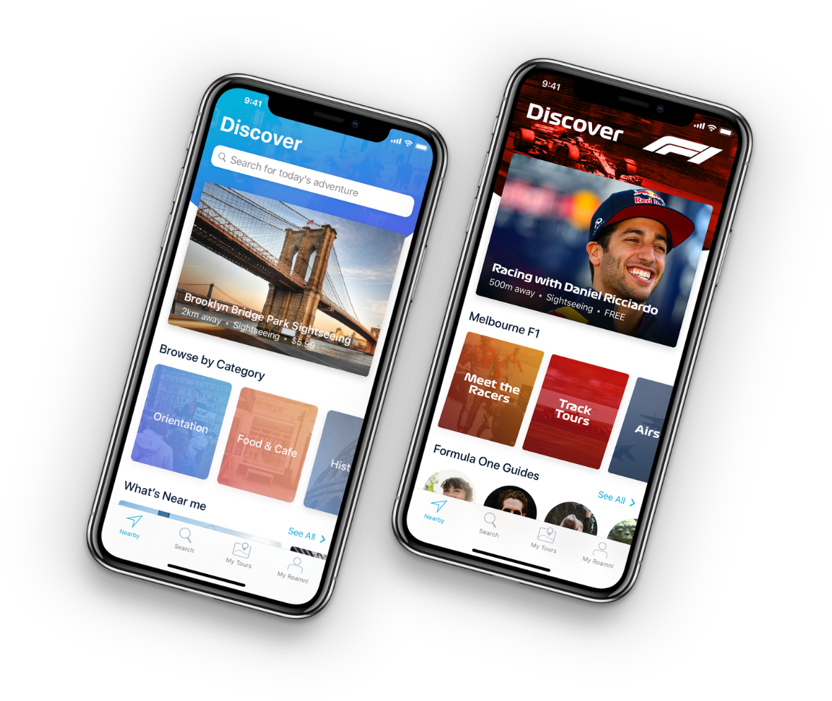
Notifications are digital alerts that appear on mobile phones or other digital devices. They are a convenient way to inform about system status, new content, events, updates, and other factors crucial to app usage. When properly designed, notifications are also a powerful app marketing tool.
Why is notification UX important?
Think of notifications like little nudges from a helpful friend. Imagine you’re using a fitness app, and it sends you a timely reminder to drink water or track your workout right when you need it. That’s great notification UX—it’s helpful and makes you want to keep using the app.

Now, picture an app that bombards you with constant, random alerts at all hours. You’d probably get annoyed, maybe even uninstall it.
A well-designed notification system strikes a balance: it sends useful, relevant updates without overwhelming users. This keeps them engaged and returning, creating a positive experience that strengthens loyalty.
What are the types of notifications?
Notifications come in all shapes and sizes. To simplify things, I’ve divided them into categories: how much user action they need, where they’re sent, and what triggers them. This makes it easy to pick the right type for your app.
| According to user participation | According to the where they’re sent | According to triggers |
|---|---|---|
|
|
|
According to user participation:
1. Passive notifications
Passive notifications are those subtle nudges that pop up on your screen, delivering information without asking you to do anything. These push notifications do not require users’ input or interaction to show the notification content. Their purpose is to inform the users. Passive notification design often appears with a simple interface.
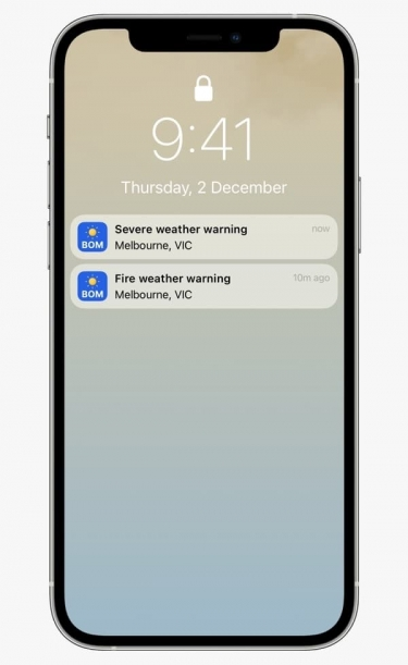
Source: iTwire
Think of it like getting a weather update in the morning—it simply tells you it’s going to rain, no need to click or respond, just useful info to help you plan your day. These notifications are great for sharing quick, important updates like flight delays, order confirmations, or even stock price changes. The design is usually clean and minimal, making it easy for users to glance at the info and move on without feeling interrupted or overwhelmed.
Other common examples of passive notifications are traffic and order status updates.
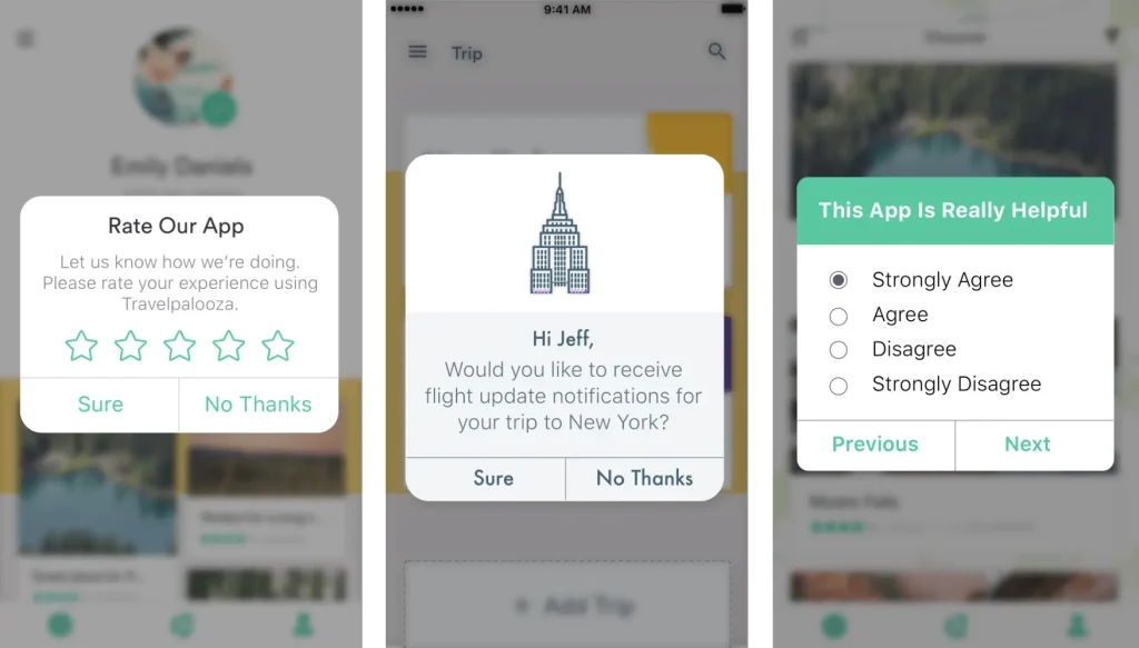
2. Smart notifications
These notifications require users to respond—whether confirming an appointment, voting in a poll, or completing a task. They also use more tailored notification UX to send relevant messages at the right time and place.
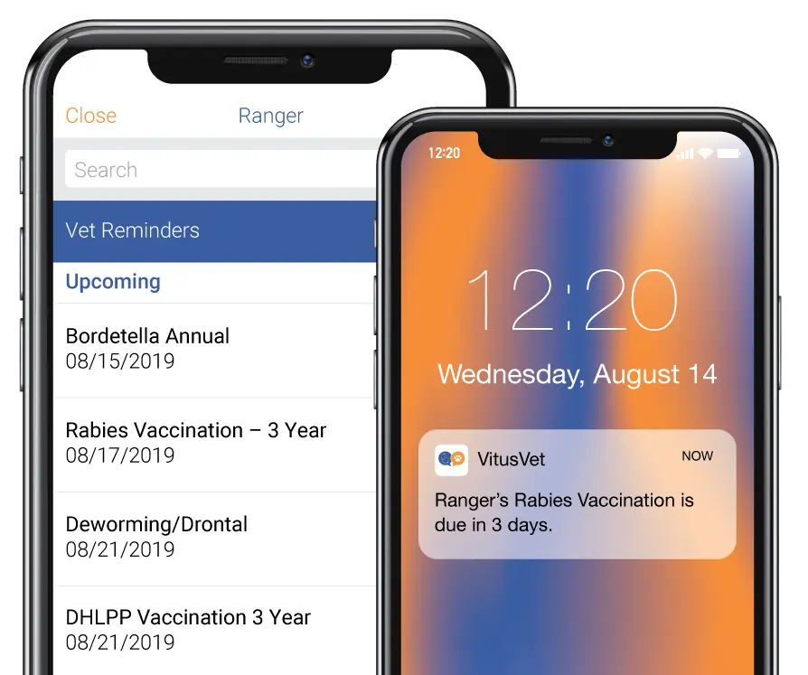
Source: VitusVet
Picture this: A user is strolling past their veterinarian’s office when your app pings with a friendly reminder that their dog’s appointment is just around the corner.
With a quick tap, they can confirm their attendance and ensure their furry friend gets the care they need. That’s the magic of timely, relevant notifications that keep users engaged and their pets happy!
According to where they’re sent:
1. Push notifications
These alerts go straight to your user’s mobile device, cutting through the noise and grabbing their attention instantly. Whether it’s notifying them about a new feature, a limited-time discount, or an upcoming event, mobile push notifications help keep your users informed and engaged without them having to open the app.
Let’s say you’ve just launched a new product feature. A well-timed push notification could inform users about how this update enhances their app experience, driving them back into the app to check it out.
Or imagine a scenario where your e-commerce app sends a push notification to remind users of an abandoned cart, sweetening the deal with a 10% discount if they complete their purchase in the next hour.
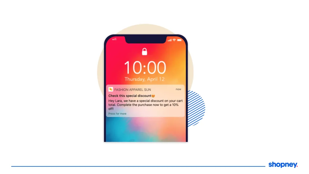
Source: Shopney
That’s how you turn a simple notification into a powerful engagement tool that keeps users coming back.
2. In-app notifications
In-app notifications are like push notifications, but they’re designed to grab users’ attention while they’re already inside your app. In other words, the app itself is the notification channel.
In-app notifications appear as banners, pop-ups, or even small messages right within the app’s interface. These are perfect for promoting new features, guiding users through a process, or encouraging them to take specific actions without disrupting their flow.
Source: Leanplum
For instance, a first-time user has just signed up for your messaging app, and they haven’t completed their profile yet. An in-app notification can pop up as a friendly reminder: “Complete your profile to unlock personalized recommendations!”
Or, say you’ve just launched a new service within your app—an in-app notification can showcase this feature, giving users a quick overview or even offering a demo. This keeps users informed and engaged without needing to rely on external nudges.
![]()
Check out our article on in-app messaging for more tips!
3. SMS notifications
SMS notifications are short text messages sent directly to mobile phones. Unlike push notifications or in-app alerts, they stand out because they demand attention right away. This makes them perfect for urgent updates that users need to see and act on promptly, such as appointment reminders, shipment tracking numbers, or account expiration dates.
For example: A user has booked a flight through your travel app, and the airline sends an SMS notification with crucial information. “Your flight has been rescheduled. Please confirm your new time.” This type of message is time-sensitive and requires immediate attention, ensuring the user stays informed without having to sift through emails or log into the app.
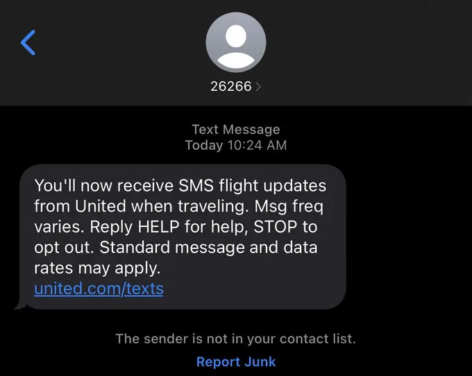
Source: Reddit
However, it’s essential to use SMS notifications judiciously. Because they are so direct, you want to ensure that the messages you send are valuable and relevant.
Overusing SMS notifications can lead to user frustration, so focus on urgent and critical updates that enhance the user experience.
4. Email notifications
Similar to SMS notifications, email notifications provide users with important updates and information about their accounts or services via email. They are best used for less urgent updates, such as product announcements or promotional offers that don’t need immediate action on the user’s part.
Email notifications can serve as a storytelling platform for your app, transforming mundane updates into engaging narratives that resonate with your users. Instead of simply listing features or promotions, why not craft emails that tell a story?
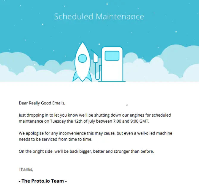
Source: Really Good Emails
According to triggers:
1. Context-generated notifications
Following user approval, context-generated notifications serve tailored content based on the user’s historical data. These proactive alerts are triggered by the user’s current context, such as the person’s location, time of day, or even the weather, to remind them of events or activities that may interest them.
Let’s say your app is a coffee shop loyalty platform. It’s mid-morning, and one of your users is walking past their favorite café. A notification pops up: “Craving your favorite vanilla latte? Stop by now and enjoy 50% off your order, just for you! The perfect pick-me-up for your day.”
Now, that’s a deal users would notice—and crave!
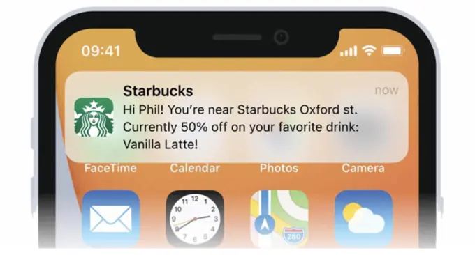
Source: AppSamurai
![]()
Pro tip: Always get consent!
Before diving into personalized notifications, make sure users have given their thumbs up for data collection. This builds trust and keeps your app compliant with privacy regulations. Remember, a happy user is a loyal user!
I wrote another blog on how to keep your app and users safe. Give it a read and stay protected!
2. System-generated notifications
System-generated notifications are essential for keeping users informed about important app events, even when they’re not actively engaged. These notifications are triggered automatically by the app itself, without any direct user action.
You might receive error messages or alerts about new system updates, reminding you to keep your software current. Or maybe you see an icon badge on your app, signaling how many unread messages or notifications are waiting for you. These subtle nudges ensure users stay in the loop, helping them manage their interactions without feeling overwhelmed.
Source: notificare
3. User-generated notifications
User-generated notifications are those that users actively opt into, giving them control over what they want to be reminded about or alerted to.
Whether it’s setting a reminder for an upcoming event or signing up for specific promotional alerts, these notifications are designed to fit seamlessly into a user’s daily life, ensuring they get the information they care about at the right time.
The way I see it, user-generated notifications are especially powerful because they’re built on intent. Unlike other types of notifications, these alerts aren’t seen as intrusive or irrelevant. They’re expected and often welcomed because the user has already shown interest. It’s not the app pushing random content—it’s the user saying, “Hey, I want to know when this happens.”
Source: Apple Developer
Notification UX Do’s and Don’ts: Quick Overview
| The Do’s | ✅ Write clear, catchy, and concise content |
|---|---|
| ✅ Incorporate visuals | |
| ✅ Personalize where possible | |
| ✅ Include actionable elements | |
| ✅ Consider your brand positioning | |
| The Don’ts | 🚫 Don’t send too many notifications |
| 🚫 Don’t neglect notification settings | |
| 🚫Don’t send irrelevant and overly generic push notifications | |
| 🚫Don’t forget to test various versions |
The Do’s: 5 Best Practices for Crafting Compelling Notification UX
Now that you know the various notification types, let’s talk about the key things you need to keep in mind to ensure you’re designing a great notification UX strategy.
1. Write clear, catchy, and concise content
When crafting push or in-app notifications, keep your messages short, sweet, and on point. Avoid long-winded sentences or overly technical jargon.
Complex and lengthy content can overwhelm users and cause them to miss details that could be important. In our experience, the more straightforward the message, the more likely users will read — and act on it!
But how short is short enough?
Although the maximum number of allowed characters varies according to devices, most browsers and operating systems can accommodate up to 39 characters for the title and 150 for the message.
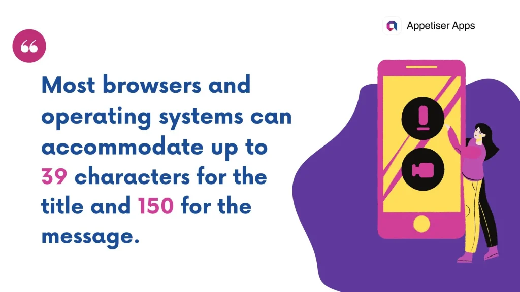
Technically, any length within the platform’s limit is okay. But if you can fit everything in a single line, the better. This is to help your readers absorb your entire message, even with a glance.
Example: Nike Run Club’s “Are We Running Today?” campaign
One of the best examples I’ve seen is Nike Run Club’s “Are We Running Today?” campaign. Nike nailed it with these push notifications, making it feel like a friend was casually checking in on me.
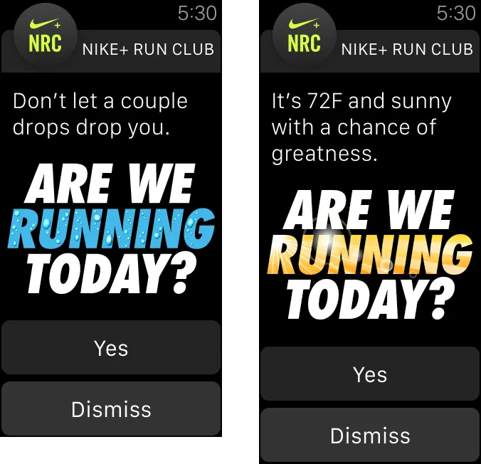
Source: Nike Run Club
What made this notification so effective for me was how personal it felt. It wasn’t just an app telling me what to do—it was almost like a workout buddy nudging me to get moving. Plus, it was short and sweet, so I could read it in an instant without feeling pressured.
The simple question form made me pause and think, “Hmm, yeah, I probably should go for that run.” And that’s where Nike nailed it—by tapping into my sense of accountability without being pushy. Those gentle reminders kept me on track with my fitness goals and coming back to the app.
2. Incorporate visuals
Did you know that the average person’s attention span is less than 9 seconds?
And with an average mobile user toggling between 9 apps daily, how do you give yours a fighting chance to gain that elusive user attention?
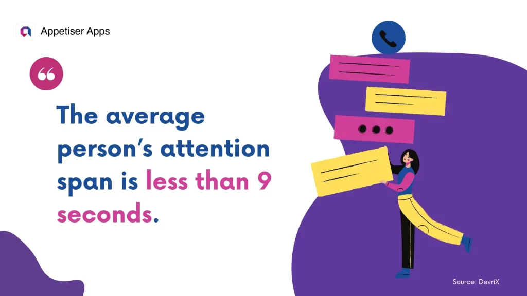
Using visuals such as icons, images, or GIFs can help draw attention to your notification without being intrusive or overwhelming. One study found that notifications with images gain 60% higher click-through rates than those with plain text.
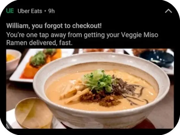
Example: Uber Eats
I’ve seen this firsthand with apps like Uber Eats. Their notifications often use mouth-watering images that make it hard to resist.
Check this image out and tell me you didn’t salivate at the sight of that steaming bowl of ramen. It’s that irresistible visual hook that makes me tap without hesitation:
Source: Taplytics
To learn more about the importance of visuals in user experience, check out our article on key UX design principles for apps.
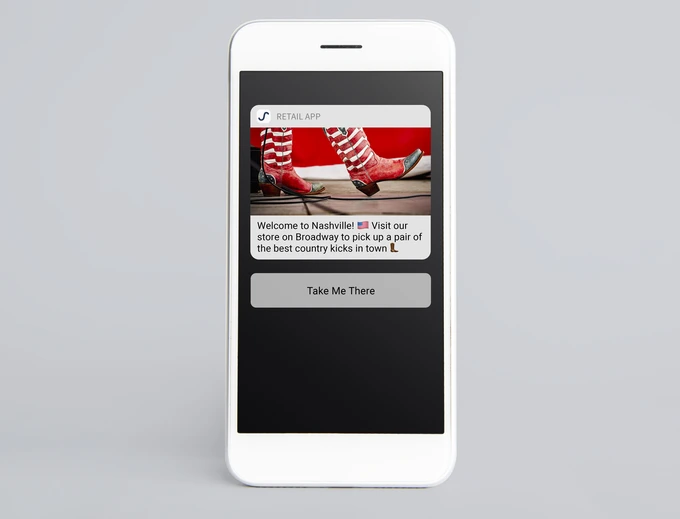
3. Personalize where possible
The most successful notifications are all about personalization and context. Did you know that personalizing push notifications can boost reaction rates by a jaw-dropping 400%? That’s right!
But personalization goes beyond just slapping a first name on a message. It’s about tailoring every detail—from the words you choose to the tone and even the visuals—based on the user’s demographics, behavior, and preferences.
All elements, from word choice and tone to images and layout, must be tailored according to the user’s demographics, app behaviors, and other data.
Contextualization is equally important. It means sending the message at the right time and place. For instance, when a user just arrived on your city, a notification like this might be great:
Source: MessageGears
Timing is key here. Maybe it’s in the evening, just after they’ve been scrolling through your app. That’s when they’re most likely to have a few moments to think about shopping.
By ensuring your message hits them when they’re ready, you significantly increase the chances of bringing them back to complete that purchase. This simple strategy makes your notifications feel relevant and timely, turning casual browsers into happy buyers.
4. Include actionable elements
Like any critical UX enhancements, the law of least friction applies to app notifications. If you want to steer your users toward a desired outcome, you must ensure that the steps they need to take are communicated clearly and that accomplishing them is as effortless as possible.
Adding actionable elements like clickable call-to-action buttons makes it easy for users to take action without opening your web or mobile app. From our experience, the easier it is for users to act on notifications, the more likely they are to engage. It’s all about reducing friction and creating a seamless experience that keeps users coming back for more!
Example: Headspace
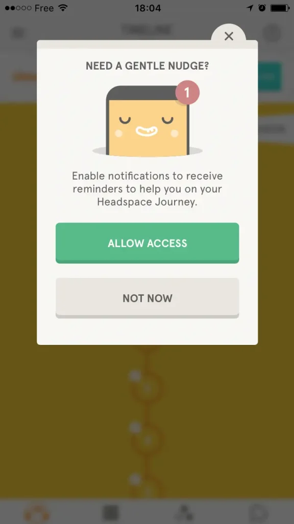
Source: Headspace
Let’s talk about Headspace’s actionable notifications. Whenever users receive a reminder about enabling notifications, the notification includes a button that says, “Allow Access!” This makes it ridiculously easy for them to turn on those reminders without any extra steps.
By simply tapping that button, users can ensure they won’t miss out on their daily mindfulness practice. This seamless experience encourages consistent engagement and helps transform those little nudges into daily habits.
5. Consider your brand positioning
Push notifications in itself is a double-edged sword. The act of sending one alone can either engage or frustrate users. More so, if you mix it up with a controversial strategy, such as what Duolingo does.
The language learning app’s unignorable notification campaign proactively uses intrusive, guilt-tripping, and passive-aggressive notifications to reengage lapsed users. It’s a bold move that results in some users loving it and others hating it.
Example: Duolingo
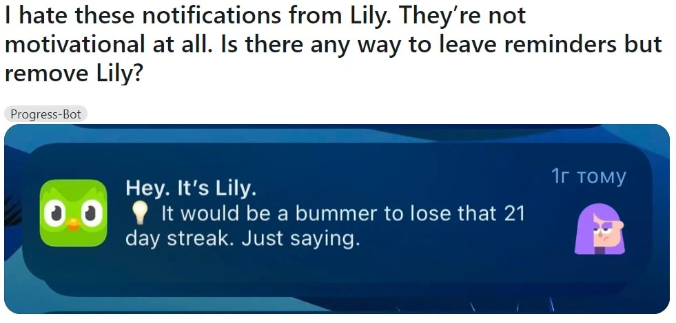
Source: Reddit
To be clear, I am not discouraging you from taking risks. We always encourage our team members and partners at Appetiser to Think Big, Become the Best.
In fact, I like to see Duolingo’s campaign as a glass half-full despite receiving some backlash. After all, it did manage to make its notifications unignorable.
However, you must ensure that your chosen strategy suits your brand positioning.
In the case of Duolingo, the company has already earned some distinction for being edgy even before the campaign, so it can get away with such a level of notoriety.
If that’s not how you want to establish your brand’s identity, I suggest you veer from embracing a similarly controversial strategy.
TL;DR: Whether you decide to play safe or follow suit with Duolingo’s gutsy move, always consider how you want your target users to perceive your brand.
The Don’ts: 4 Common Pitfalls to Avoid for a Compelling Notification UX
1. Don’t send too many notifications
While you want to keep your users engaged, you don’t want to overwhelm them with multiple notifications. Bombarding users with alerts may prompt them to silence notifications or delete your app entirely.
Plan and time your notification. Again, this requires taking the time to gain enough insights about your users. Then, focus on sending out fewer high-quality messages that offer value.
![]()
General Ideal Times for Notifications
⏰Early Morning (7 AM – 9 AM): Users often check their phones right after waking up.
⏰Midday (12 PM – 2 PM): Lunch breaks are prime time for engagement.
⏰Early Evening (6:30 PM – 8:30 PM): Post-work relaxation boosts notification response.
![]()
Industry-Specific Tips:
🛍️E-commerce: Target evenings and weekends for peak shopping times.
📰News: Send updates between 10 AM – 12 PM and around 5 PM.
🍿Entertainment: Best engagement happens from 8 PM to 10 PM, during downtime.
2. Don’t neglect notification settings
User control and freedom are essential to creating a satisfying app experience. This means that you should offer an easy-to-navigate system so your users can manage their experiences according to their needs and preferences.
You must ensure your app has options for allowing users to customize how often they receive notifications, choose the types of notifications to receive, and, yes, even opt out of receiving notifications. This will help your users feel in control while still keeping them informed.
3. Don’t send irrelevant and overly generic push notifications
Notifications should foster meaningful interactions, not run on autopilot.
If a notification you compose or an automated response you generate is too broad, it may make your users feel spammed and can quickly become ineffective. You’ll end up wasting resources and risk losing user trust.
When designing in-app or push notifications, take the time to analyze your users’ behavior and past interactions with your app. Then, leverage the data to craft content and design that reflect their needs, values, and wants.
Be it for a website, an app, or a notification, a data-driven strategy always drives better results.
We’ve witnessed this happen many times for our clients, including YouFoodz, Australia’s #1 Healthy Food Delivery Service.
In 2017, YouFoodz tapped us to build a custom app to help the company stand out in the food delivery landscape through a unique e-commerce app design.
Right away, our team of app developers mapped out a holistic strategy to communicate how YouFoodz understands and values its customers’ needs and expectations.
In 6 short months, we built an app with a user-friendly interface and capable of delivering a satisfying experience through real-time order status notifications and other top-notch features.
The impact?
Since the app’s launch, YouFoodz has seen exponential improvements in their customer acquisition and retention rates. Best of all, they continue to generate hundreds of thousands of revenue daily!
YouFoodz’s journey to app success is packed with valuable insights for anyone seeking business growth through mobile apps. Check it out!
4. Don’t forget to test various versions
A/B testing is the ideal way to ensure that your notification strategies are successful. It helps you better understand how users interact with various versions.
By seeing what types of content and design resonate the most with your target audience, you can quickly identify areas for improvement and iterate your notification accordingly.
This will allow you to save time and resources and maximize return on investment from your campaign.
On a related note, the importance of testing and gaining user feedback is as important for notifications as it is vital to creating new apps. A minimum viable product is the best possible type of app to allow this sort of testing and learning from user reactions.
Make the most of every interaction
User experience isn’t limited to interactions within your web, iOS, or Android app. All potential touchpoints — from onboarding notifications to retargeting ads — play an integral role in forming a positive or negative perception of your app.
By paying careful attention to every element of your notifications and keeping your users in mind, you can create a notification system that can push your app’s success.
If you need a partner to help you design and develop an app that users would love, reach out to Appetiser today!

Jane Eslabra is a content strategist with 18+ years of experience. Working alongside app development teams, she helps founders and startups move from idea to action through content that breaks down what actually works in real-world app building and scaling.