In-App Messaging Best Practices to Boost Customer Retention
Source: Appsflyer
Imagine you have a small window of opportunity to capture attention and keep them engaged in the first month.
But how can you do that? Enter in-app messaging. These contextual in app messages prompt users to take action while using your app.
It’s actually easier said than done when transitioning a new user to a loyal customer.
Fortunately, we can always learn from the best practices of other brands with proven track records. Read on to gain insights to boost customer retention.
What Is In-App Messaging and Its Importance?
In-app messaging refers to direct contextual in app messages that users get while interacting with the mobile app. When you leverage in app messaging capabilities, you can:
- Share new functionalities
- Push feature announcements
- Show promotional messages, or
- Answer frequently asked questions
These in app messages, unlike push notifications that are sent on the mobile device, can be triggered based on a user’s behavior:
- When they first download the app
- When they haven’t used it for a while
- When they are about to leave the app
Having an in-app messaging strategy can:
- Increase user engagement – In-app messaging helps nurture user relationships by meeting users where they’re at when using the app. This can make them feel supported and understood. For example, offer assistance through a quick in app message if new users struggle with app navigation – it improves their experience and, as a result, their engagement.
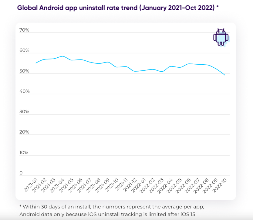
- Enhance user experience and retention – Sending tailored messages targeting a user’s interests, behavior, or history with the app can help them feel valued and connected with the app – remember, 77% of mobile apps churn after three days of installation. It’s your chance to keep them in the loop.
- Build brand loyalty – Pushing special promotions or discounts to existing users who browse particular categories or products is one way to incentivize purchases while showing you value their business and are willing to go above and beyond.
Common Types of In-App Messaging
1. Chatbots
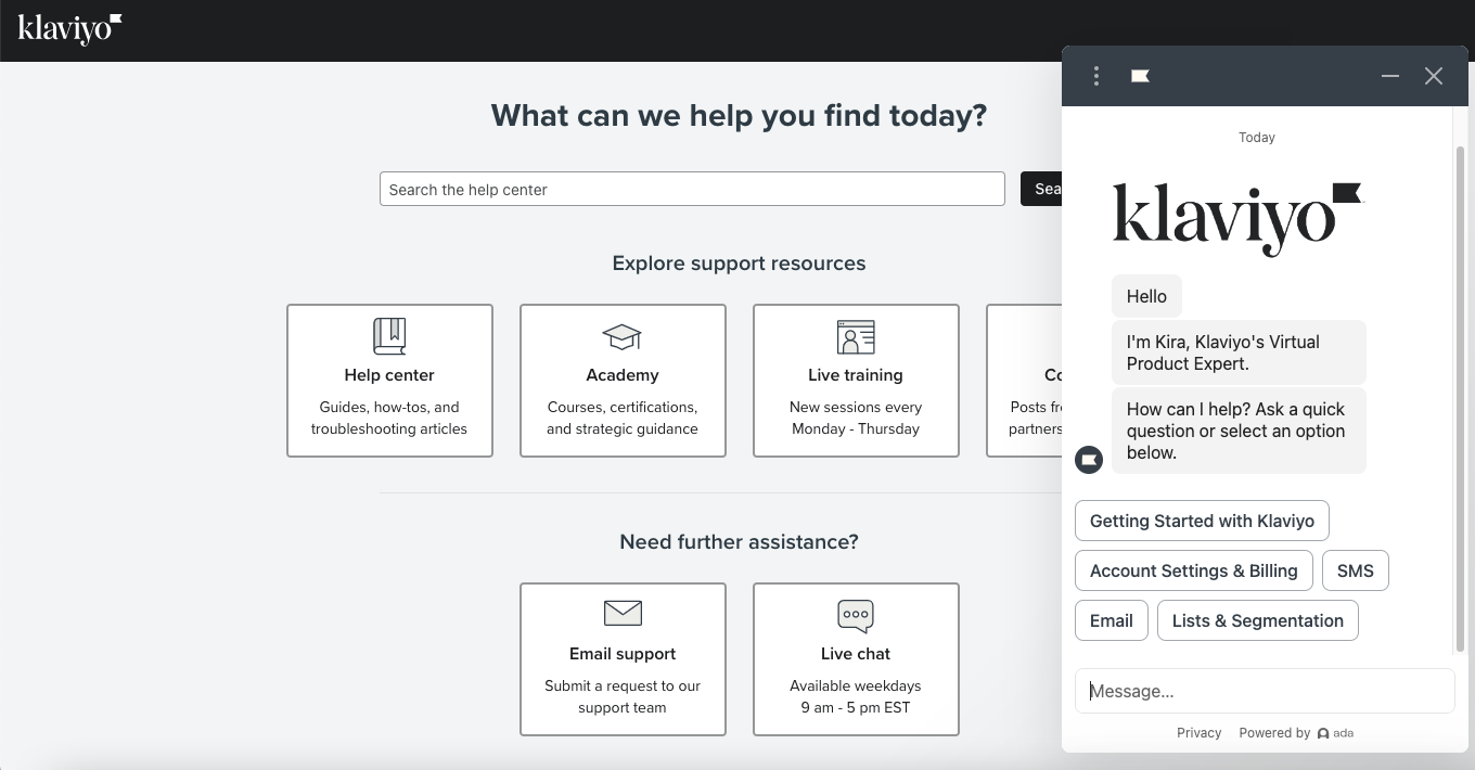
Chatbots are AI-powered tools that communicate with users and offer tailored responses based on user queries like getting help, asking questions, or reporting an issue in real time.
This popular in-app messaging type instantly responds to customers’ common issues while freeing the customer service team to tackle more complex queries.
Source: Klaviyo
2. In-app surveys
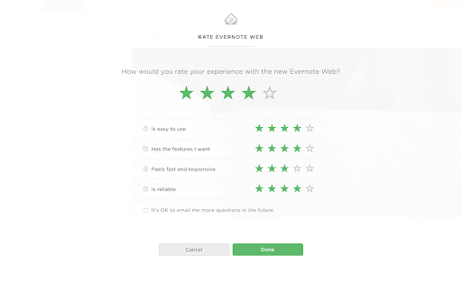
In-app surveys can ask about app functionality, user experience, or anything for enhancements. They give you valuable insights into user needs and preferences.
Capitalizing on this type of in-app messaging, like an in app survey, lets you get direct and accurate user feedback while interacting with your app. This can help you identify areas of improvement, pinpoint bugs or issues, and understand how they use the app.
Source: Appcues
3. Tooltips
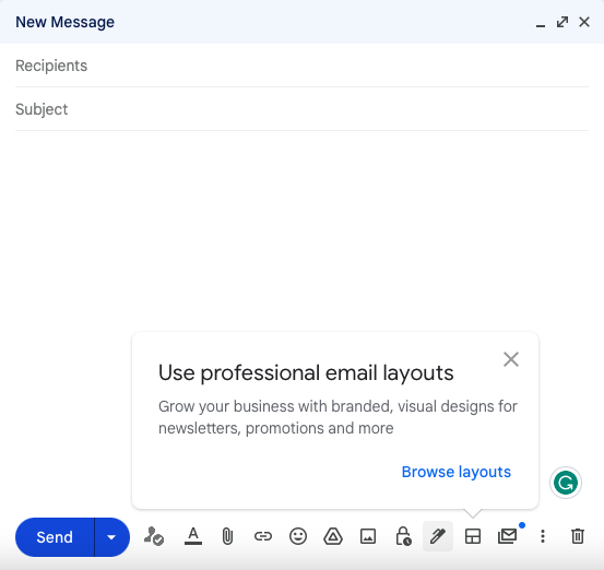
Tooltips are another type of in-app messaging that provide brief information when the user hovers or clicks on a specific element in the app. These contextual messages, such as small pop-up boxes, display helpful hints, clarifications, or additional details about the feature or function.
Tooltips enhance the user experience by providing instant feedback and guidance. Users no longer have to search through help documents or FAQs to learn about a feature or function. They don’t need to be disturbed by push notifications. Instead, they can simply hover over an element and receive a concise explanation.
Source: Gmail
4. Product tours
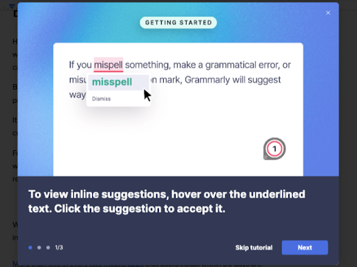
Product tours are brief overviews of the features and functionality of an app or software. They serve as an interactive guide to help users navigate the application and understand its key features.
Product tours save time and reduce frustration for users. Unlike push notifications, a guided tour allows users to acclimate to app features quickly, improving user experience and retention.
Source: Grammarly
5. Slideouts
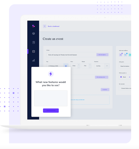
Slideouts are a type of in-app messaging that appear as small windows or panels that slide in and out of the app interface. They can be triggered by various user actions, such as tapping on a button or swiping in a particular direction.
They are non-intrusive and allow users to navigate the app seamlessly while still receiving prompts. As they don’t disrupt the user flow and app experience, slideouts are a great way to engage users without risking frustration or annoyance.
Source: Appcues
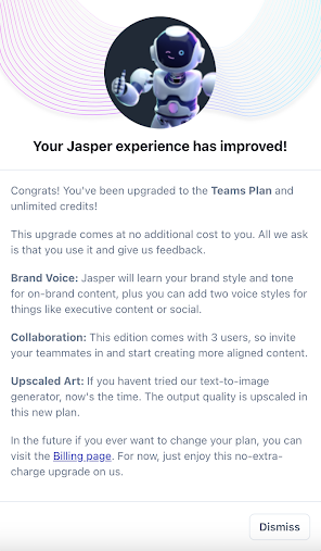
6. Modals
Modals are a type of in app messaging that pop up in the foreground, temporarily halting user interaction with the app. This brief interruption captures the user’s attention and conveys essential information, like a major feature update.
They are an effective way to push critical messages. With a modal, you can highlight special offers, reminders, or push notifications about terms and conditions that need immediate attention.
Source: Jasper
5 Best Practices for Implementing In-App Messaging
Nothing beats best practices that have shown results in in-app messaging. Get inspired by these examples.
1. Personalize your in-app messages
Personalization can go a long way in making your app users feel valued.
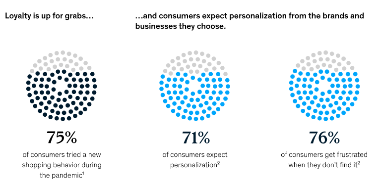
According to McKinsey, 71% of consumers expect companies to deliver personalized interactions with them, and 76% feel frustrated when that doesn’t happen.
Source: McKinsey
Take Youfoodz , one of Australia’s top-rated food service apps offering fresh and healthy meals as an example. The app helps people save time on grocery and cooking and live a healthy lifestyle most conveniently and enjoyably.
To retain users and build loyalty, the brand uses in-app messages – from the welcome message to ordering meals up to delivery. Appetiser is a catalyst of its success in ensuring its mission is lived out daily.
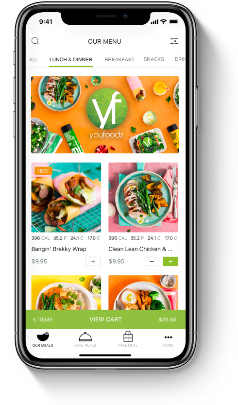
Customers who opt in for purchases are updated about their orders and receive push notifications and promotions. They also receive vouchers, gift cards, and codes as they participate in different offers and promotions and place multiple orders.
This feature makes a difference in motivating users to smash their health and lifestyle goals.
Our takeaway? Personalized messages taps the emotions of users. Brands can bring value to their lives — by helping them achieve goals. Health and fitness apps can benefit greatly from these.
👉🏻 Read the case study if you want to know how YouFoodz generated 100,000 plus orders per week from its active users
Here are some additional tips from our app developers when creating personalized content:
✅ Use the user’s name – It may seem simple, but addressing user’s names can help them feel a stronger connection with your app. It shows them that you know who they are, that you care, and that their experience when they receive in app messages is not an after thought.
✅ Offer personalized recommendations -By analyzing user behavior, you can offer recommendations for products or features. For example, if a user frequently looks at a specific menu or food within the delivery app, send in app messages or in app notifications about any discounts or deals available for that day.
✅ Celebrate special occasions – Sending a greeting on a user’s birthday or anniversary can create a stronger bond with them and add a personal touch to the experience. Throwing in special discounts or store credits as part of your messaging campaign is also a great way to make them feel appreciated and increase brand loyalty.
2. Invest in triggered in-app messages
Triggered in-app messages are messages that are automatically sent at just the right time to users based on their behavior or actions within the app. They can be highly personalized and relevant to the user’s current situation.
When users complete specific steps or reach particular milestones, these app messages are sent to encourage further engagement or to offer rewards and incentives.
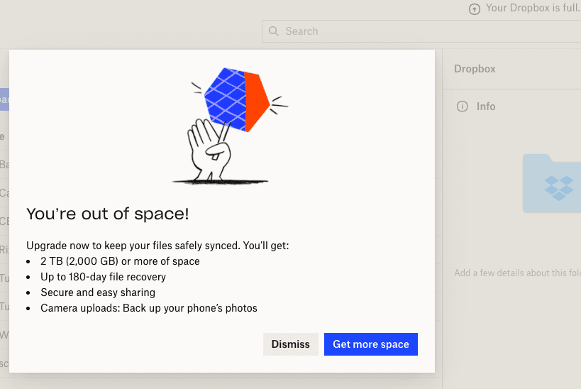
You may also use these messages when onboarding new users — initially upon launching your app or prompting the user to upgrade as Dropbox does.
Source: WhatIf
According to the users’ app behavior, this triggered in-app messaging was set with a condition. For instance: if the user’s storage is maxed out, show this message.
Dropbox also provided two call-to-action buttons to allow users to choose without being too pushy – Dismiss or Get more space.
Our takeaway? Pair up triggered messages with clear call-to-actions for upselling as part of your marketing strategy. It’s your chance to gain 10% – 30% in revenue.
Other tips worth considering when crafting triggered app messages:
✅ Re-engage inactive users – Say the user has been inactive for a certain time (e.g. two weeks or one month). You could incentivize the user to engage with the app and opt in again by offering a discount on their next purchase or highlighting new features that have been added since they last logged in.
✅ Write educational content – Provide users with educational content to help them use your app better. An example of app messaging could be, “Did you know you can create a personalized playlist on our app? Here’s a step-by-step guide on how to do it!”
✅ Decrease abandoned cart – If a customer adds items to their shopping cart but doesn’t complete the purchase, send them an app messaging reminder with an incentive to encourage win-back and complete the transaction. For example, offer them free shipping or a discount code.
3. Keep it short and on-point
When it comes to in-app messaging, brevity is crucial. Users don’t have the
patience to read lengthy messages, so keep your messages short, clear, and to the point. Use simple language and avoid jargon or technical terms when crafting app messages.
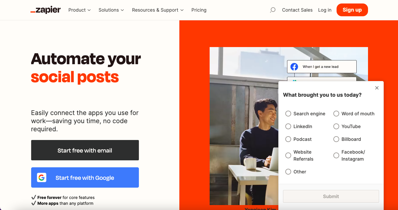
Zapier does it swiftly once you visit their website. A pop-up message on the right side of your screen serves as a survey form.
No bells and whistles. Just an on point question: What brought you to us today?
Source: Zapier
The text is clear and conveys the message quickly and concisely for first-time users. Visitors would only choose one option and click Submit.
Who says survey forms are long and tedious when you can integrate them stealthily according to browsing habits? It’s an organic way to know where visitors are coming from aside from Google Analytics data.
If you need to craft or optimize your existing in-app messages, consider these best practices:
✅ Make it visually appealing – Use eye-catching colors, images, and emojis to make your app messages stand out and attract new users. For example, including a colorful thumbs-up emoji can help convey a positive message. A photo editor can help you achieve visually appealing designs for your app messages.
✅ Create urgency – Prompt users to take action by creating a sense of urgency in your messaging. For example, instead of “Check out our new deals,” try “Limited time offer: 50% off until midnight!” This psychological principle taps into the customers’ subconscious fear of missing out.
✅ Use numbers and statistics – Data-driven app messaging is more powerful than generalized app messaging. You could send in-app messagea to a user saying, “Congratulations! You’ve reached the 10th milestone on our fitness app”. Studies show engaged users who reach this milestone are likelier to stick to their fitness routine long-term.
4. Consider the timing when setting up the in-app messages
Timing is everything when it comes to in-app messaging. Users are most receptive to app messages when they are active in your app.
Message timing can vary depending on your app’s purpose and user behavior. So, monitor user activity to determine the best timing for your in-app messages.
Take Geavi as an example – an innovative recording tool that records video evidence on a service level in the background, enabling users to use their phones as usual. Upon launch, users are prompted on how to get started, which is a good user onboarding experience.
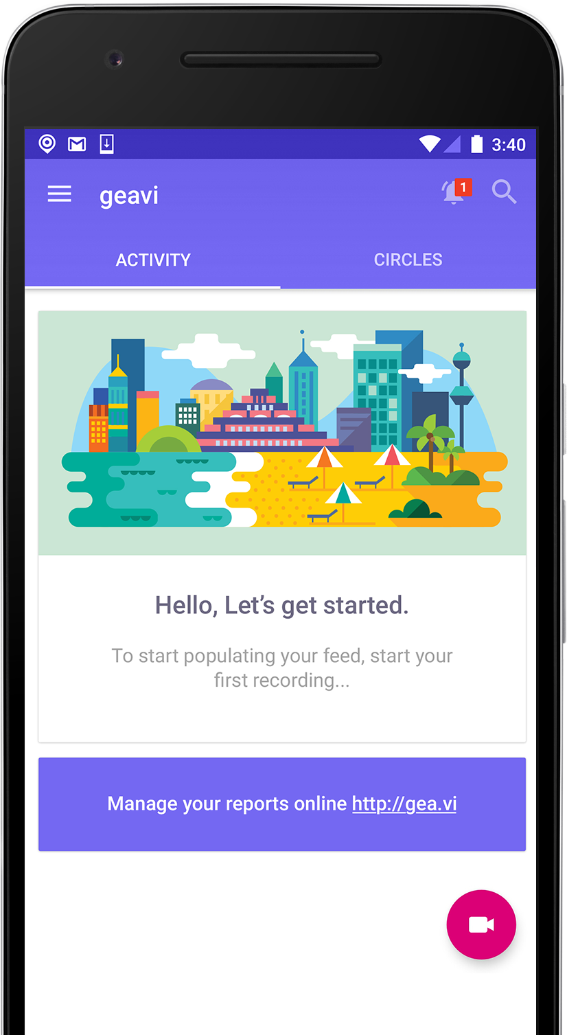
The in app messages are timed to coincide with how the users interact with the app.
Marry up the timing and messages to create a consistent, satisfying experience for the user. Take note of these when thinking about the customer journey and app behavior:
✅ Sync feedback to the user’s app interaction – In-app messages that time well after an interaction or task can evoke more meaningful contextual feedback and satisfaction. After a completed delivery, should the user feel satisfied, send them a link to leave feedback about delivery quality.
✅ Show major announcements upon launching the app – A product update in app message could be a pop-up message or modal on the user’s home screen when they open the app instead of showing it in the middle of the user’s task.
5. A/B test your messages
Testing different mobile app in app messages with different groups of users determines which messages are most effective at engaging users.
Common elements to A/B test in in-app messaging include text, call-to-action (CTA), placement, and imagery.
It is recommended to constantly run A/B tests on in-app messages to improve user flows and test specific factors like the right message type, tone, timing, and location.
Source: MUCUDU
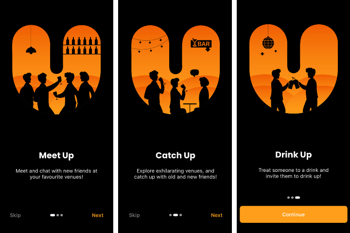
MUCUDU does it playfully with its welcome in app messaging. “Meet Up. Catch Up. Drink Up.” They have summarized the mobile app’s functionality in these simple yet action-oriented texts and paired them with eye-catching graphics.
First-time users will surely understand what they’re getting from this app. Our takeaway? Play with words. See which ones resonate with your target audience.
Some noteworthy tips to remember:
✅ 1. Determine your goals
Before you begin testing, ensure you clearly understand what you want to achieve with your in-app messaging.
Are you looking to increase user engagement, promote a new feature, encourage app store reviews, or reduce churn?
Define your goals and use them as a guide throughout the process.
Suppose your goal is to increase user engagement. Then you might test variations of your in-app message that highlight different app’s features or encourage users to complete specific actions within the app, like filling out personal information.
✅ 2. Create variations
Craft variations of your in-app message that test significant aspects that affect the customer journey, such as copy, design, timing, or targeting.
For copy variations, you might test one in app messaging with a friendly, conversational tone and another with more formal language.
For timing variations, you might want to send messages immediately upon app opening versus waiting until the user has been in the app for a certain amount of time.
✅ 3. Decide on sample size and the duration
Determine how many users you want to include in the test and how long the test will run. Ensure you have enough users and time to generate statistically significant results.
Say, decide to test variations of your in-app message with 10% of your user base over a week.
✅ 4. Analyze results and make changes
Once the test is complete, analyze the results and make changes based on what you learned. Use the data to inform future in-app messaging strategies.
If the version of your in-app message that uses conversational language is more effective at increasing user engagement, you might incorporate similar language into your in-app messages.
People also ask
1. What is in-app messaging?
In-app messaging are the pop-ups, banners, or chat bubbles that appear while users interact with your app, such as a tip after completing a task, a reward for a milestone, or a quick offer. Done right, they guide users in real time and turn passive users into active ones.
2. Why should I use in-app messaging?
Humans forget. Well-timed tips, nudges, or rewards can boost engagement by 20–30% and keep your app from being uninstalled too soon.
3. How do I send in-app messages without annoying users?
Trigger messages based on user behavior, personalise them like a friend who knows their preferences, and always include a dismiss option. Timing and context beat volume every time.
4. Can in-app messaging increase conversions?
Yes. Subtle, personalized nudges delivered at the right moment can lift conversions 10–20%. Think helpful hints, not shouting ads.
5. When is the best time to send in-app messages?
Send them right after key actions: finishing onboarding, completing tasks, or hitting milestones. A well-timed nudge feels helpful. Too early or too late, and it’s just noise.
6. What types of in-app messages work best?
Tips, reminders, rewards, and interactive elements like polls or tooltips. Keep messages short, clear, and contextual. Celebrate wins, guide users when stuck, and add small surprises to keep them hooked.
7. How do I know if in-app messaging is working?
Look at opens, clicks, and retention, but more importantly, watch how users behave after seeing messages. Metrics help, but real engagement tells the story.
Small implementations, significant results
Integrating in-app messaging into your customer retention strategy can significantly impact the success of your app.
Not only does it provide an opportunity for timely and personalized communication, but it also allows you to gather valuable data on user behavior and preferences.
Implementing best practices such as segmenting users and using concise and relevant messaging can make all the difference.
We understand the pain points that come with user retention, and it’s challenging to keep users coming back, so we believe in the power of in-app messaging. Investing in this strategy can increase user satisfaction, loyalty, and, ultimately, revenue.
At Appetiser, we specialize in creating minimum viable products (MVP) and world-class designs for mobile apps and websites. Our award-winning agency is dedicated to helping you achieve success. We offer various services to help bring your app to the next level and ensure that your users will adore it for life.
Don’t let user retention be a struggle any longer.
Let us help you implement the best practices and take your app to the next level.
Contact us today to learn more about our app development services.

Maria Krisette Lim is a Content Marketing Specialist with 14 years of experience producing web and print ad content. Krisette has a BSBA degree, major in Business Management and Entrepreneurship. When she’s not tinkering with words and punctuation, she’s either curled up with a book while sipping hot tea, playing with her toddler, or tinkering with website builders.


