User-Centric E-Commerce App Design: 6 Top Considerations for a Successful Mobile Shopping App

Are you a startup business owner looking to make waves in the digital world? If so, one of the crucial aspects you should pay attention to is your e-commerce app design.
With more than 27 million e-commerce sites globally, consumers are spoiled with options. They expect a knockout user experience and will quickly leave an app that fails to meet their needs or expectations.
Studies show that:
- 88% of online shoppers say they wouldn’t return to a site after a bad user experience.
- 76% of consumers will stop doing business with a brand after a single poor customer experience.
- 53% of mobile site visits are abandoned if pages fail to load within 3 seconds.
- 40% of users who have a negative experience on a brand’s mobile app or website will switch to its competitor.
What do these figures suggest? Simply put, your mobile or web app design is crucial to the success of your e-commerce business.
A well-designed e-commerce app with features that provide an enjoyable user experience (UX) can give your business the edge it needs to thrive in a hyper-competitive e-commerce landscape.
But what does a UX-centric shopping app design look like?
Read on to find out the top things you need to consider to boost e-commerce app success.
E-Commerce App Design: 6 Key Considerations for a Successful Mobile App Store
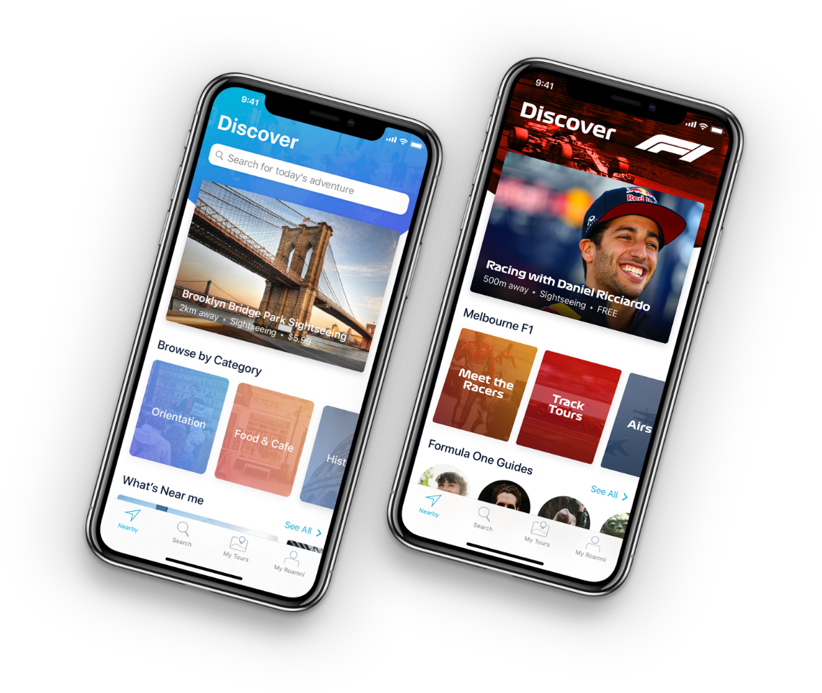
#1 Intuitive navigation patterns
If users don’t have the patience to wait for an e-commerce site to load for more than 3 seconds, chances are, they won’t spend time learning how to navigate an e-commerce mobile app either.
This is why incorporating clear, intuitive navigation patterns into your e-commerce UI design is essential.
Creating intuitive navigation involves strategically using and placing app components to guide users through a natural and instinctive experience.
In other words, it’s designing your shopping app in a way that users simply know how to find their way around it.
But how exactly do you execute it?
Here are some best practices our designers often consider when working on e-commerce platforms:
- Including product categories, subcategories, and filters
- Adding a search feature
- Using universally recognizable elements, such as shopping cart 🛒or contact 📞 icons
- Adding relevant and descriptive labels in menus
- Giving users feedback after their actions
#2 Clear visual hierarchy
Effective e-commerce app design relies on a logical hierarchy of visual elements, such as icon shapes and colors, fonts, size, layout, and images. An organized app interface allows users to find their desired items easily and quickly, ensuring an effortless shopping experience.
Clear visual hierarchy also eliminates long explanations since every element on e-commerce websites can be easily understood in one glance.
To meet this requirement, our app designers often suggest that our e-commerce partners arrange their products in the following order:
- Categories
- Sub-categories
- Products
By doing so, users can quickly find items and process orders, encouraging them to keep returning whenever to your shopping app when they need something.
An example of an e-commerce business that got this principle right is MyDeal, a platform that connects retailers and customers and one of our Appetiser’s app development partners.
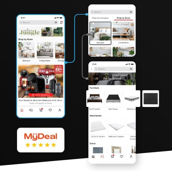
After two unsuccessful startups, MyDeal founder Sean Senvirtne tapped Appetiser to help him explore new markets.
Blending our teams’ expertise in UX and UI design with Sean’s app vision, we’ve built a beautifully designed and highly organized mobile app well-loved by 883,000 and counting active users — and sits above Uniqlo, Asos, Wish, H&M, and Groupon in the app stores.
Find out more about this ecommerce company’s inspiring journey by reading the MyDeal case study.
#3 Simple and consistent user interface
In our experience, less is more when it comes to e-commerce app design and interface. According to a JungleScout study, convenience is the third-leading reason consumers shop online.
Adding too many elements to your platform can confuse users and cause inconvenience, especially if you have a huge catalog.
On the flip side, a streamlined design featuring concise text, clear imagery, and necessary functions ensures that users understand how to use your e-commerce app quickly and efficiently.
Take Amazon, for example.
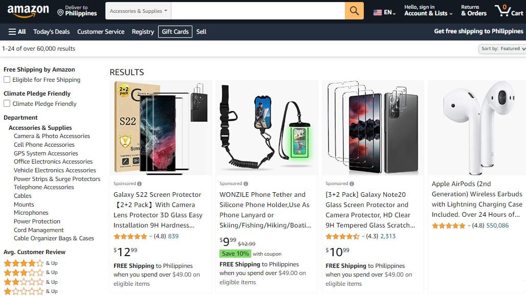
Source: Amazon
Amazon has more than 12 million items in its inventory. This even excludes products posted on its marketplace. And yet, the retail giant continues to be the most visited e-commerce platform in the world, with nearly 2.5 billion visits monthly.
It’s secret?
A simple and consistent UX-UI design that works to make users’ shopping experience as convenient and streamlined as possible. With its clean visuals, easy-to-understand layout, and organized product categories, Amazon helps its users easily navigate its vast app marketplace.
But if you think its founder got all these right the first time, think again.
![]()
Fun fact: Did you know that Amazon started as a small bookstore out of Jeff Bozo’s home garage? Today, as you may already know, the brand sells nearly everything.
That’s another reason to keep your e-commerce app simple.
Creating a simple and reliable e-commerce user interface is also more cost-efficient and requires a shorter development timeframe.
And the earlier you get your app to market, the faster you can start gaining revenue and gain valuable feedback to iterate your platform according to the needs of your market.
This is why at Appetiser, we always recommend our app development partners start lean with a minimum viable product (MVP).
Build something with enough quality features and functionalities to launch your app fast and test market viability — at a fraction of the cost.
For more insights, check out this article on how to start to lean with an MVP.
#4 Appropriate element layout
Have you ever heard of the “eye-level, buy level” principle?
It means that in a physical store such as a grocery shop, products placed within customers’ line of sight and are within their reach have higher chances of being purchased.
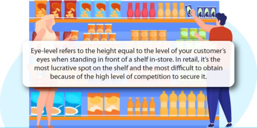
Source: DotActiv
On some level, the same principle applies to e-commerce UX design. But instead of focusing on the users’ line of sight, you pay attention to the users’ thumbs and hands.
You need to consider what app developers call the “thumb-friendly screen zones.” It means deliberately placing key elements of your e-commerce app, such as menus, buttons, and search bars, within reach of users’ thumbs.
Thumb-friendly screen zones:
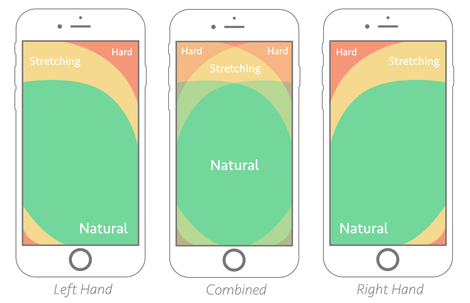
Source: Smashing Magazine
Another factor to consider when designing your app layout is how different mobile app users hold and interact with their smartphones.
Different ways users hold smartphones
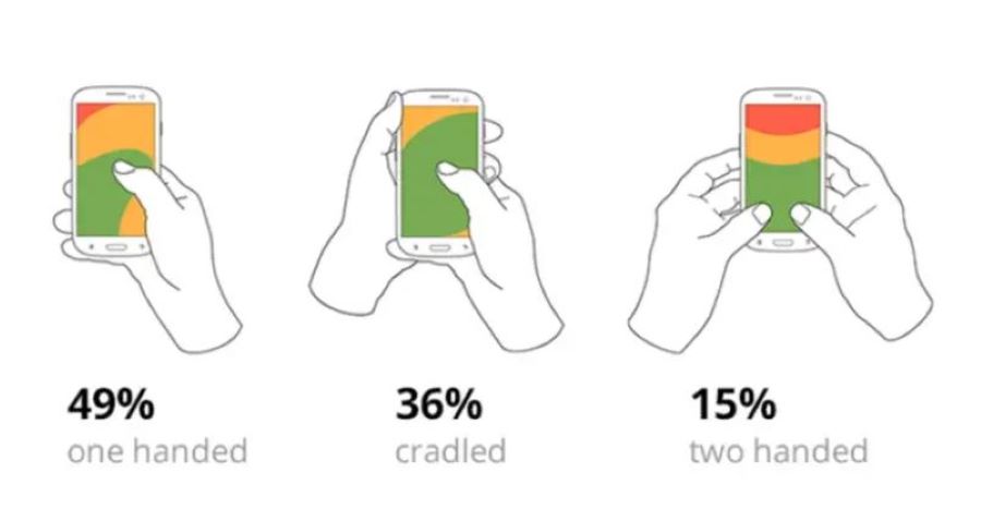
Source: Bootcamp
- Using one hand. Holding the smartphone in one hand while using the same hand’s thumb to navigate.
- Using two hands. Holding the smartphone in one hand while using the other hand’s forefinger to navigate.
- Mix. A combination of the first two items.
Indeed, the success of your mobile e-commerce app is in the hands of your users — literally. By designing your platform to accommodate the factors mentioned above, you can prevent customer frustration and boost engagement and sales.
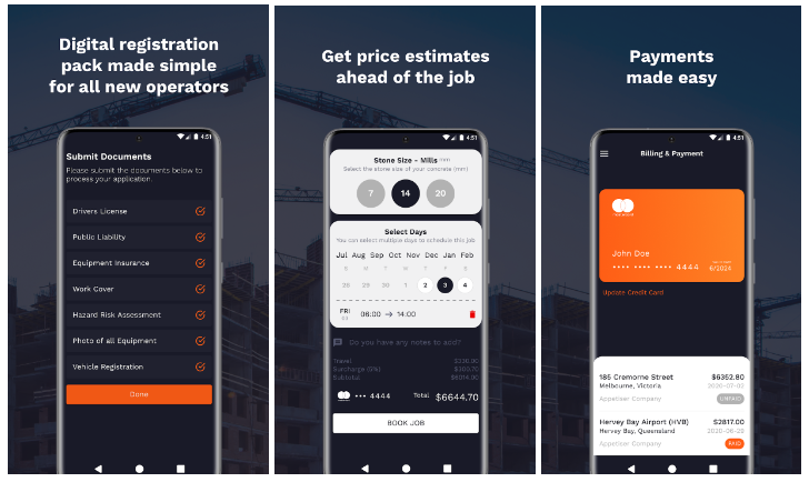
#5 Seamless login and checkout
A seamless login and checkout process can distinguish between converting a visitor into a customer or one abandoning a cart.
According to a study by Baymard Institute, asking shoppers to create accounts and long or complicated checkout processes are among the top reasons for cart abandonment.
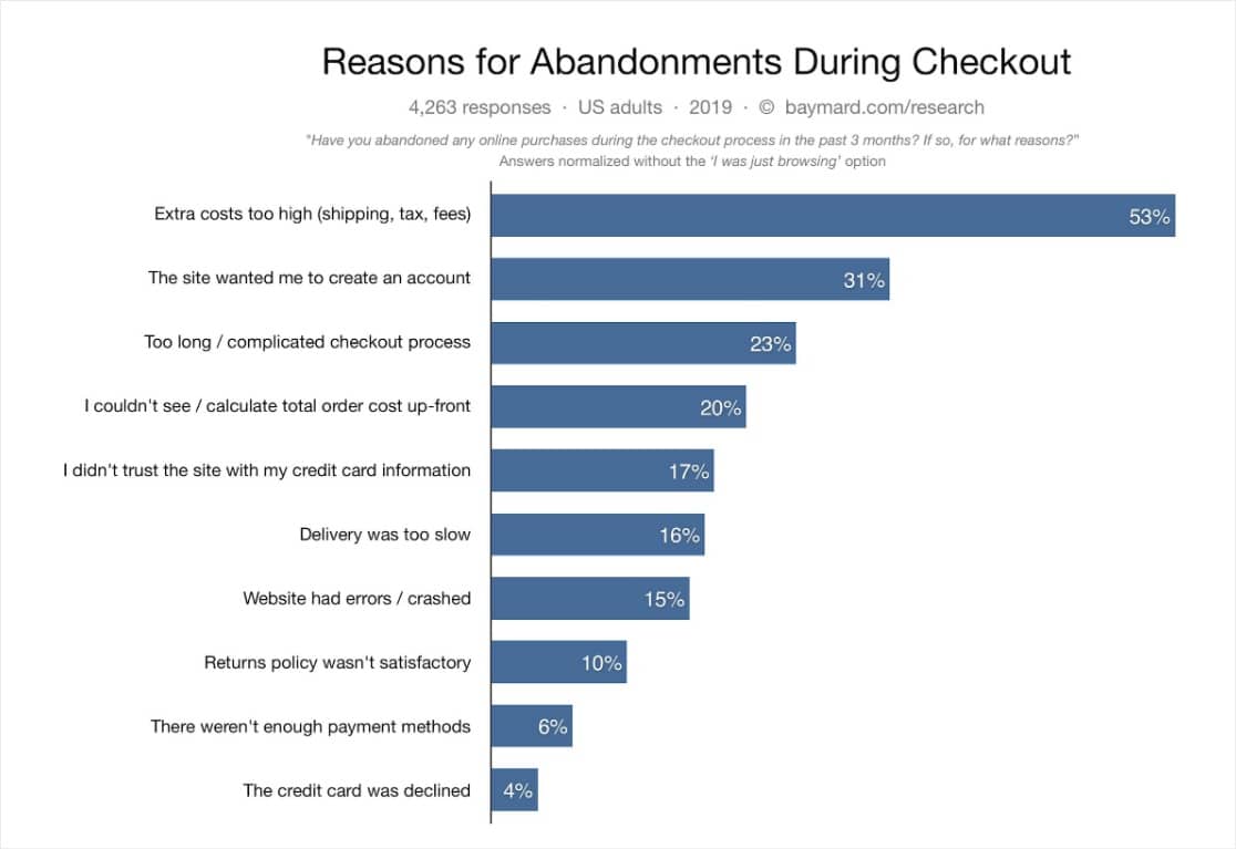
Source: Baymard Institute
To increase e-commerce app success, you need to ensure that login and checkout processes maintain the shopping experience flow.
Here are some key tips from our designers to help ensure your e-commerce app design runs smoothly:
- Keep sign-in forms as short as possible; avoid additional fields that aren’t essential for authentication.
- Use accurate error messages that explain why the login was unsuccessful.
- Offer single-step sign-on using customers’ existing Google or social media profiles.
- Provide a ‘remember me’ feature for easy login
- At checkout, display purchase totals so customers know exactly what they’re paying for.
Implementing these tips will make your e-commerce apps more user-friendly, helping you increase conversions and make the most of every customer.
It worked for one of our partners, Construction Zone 1, so I’m confident it will also work for you.
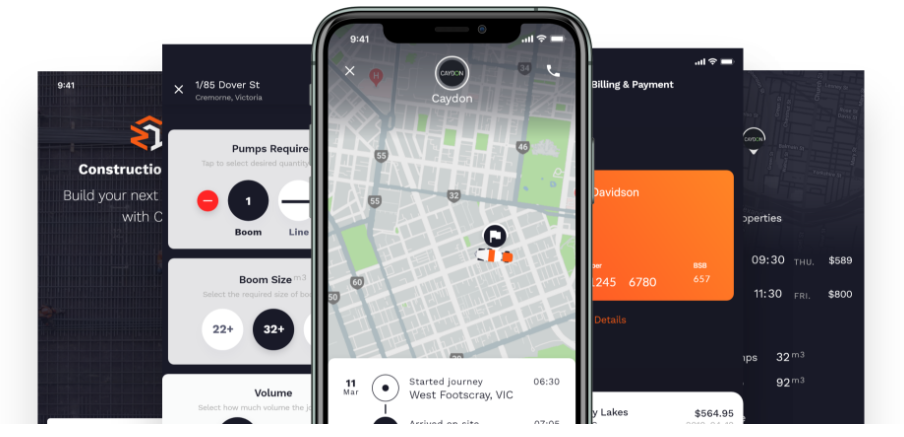
To realize its vision of providing users with fast and convenient platform to find reliable pump operators, Construction Zone 1 worked with our award-winning design team to build an app that allows users to get things done in a few simple steps.
All users have to do is enter their location, select volume, and start pumping.
Check out the Construction Zone 1 case study to learn more about our role in the company’s development.
#6 Multiple and secured payment options
According to Statista, approximately 15 million data were exposed worldwide through data breaches in the third quarter of 2022.
It is not surprising to learn that while users want the convenience of selecting the payment method right for them, they also want to ensure their information is kept safe.
As such, multiple and secure payment options have become among the key elements to consider when crafting an e-commerce app design.
Allowing customers to choose from various payment options and requiring secure authorization procedures can help make them feel more confident in making purchases through your e-commerce app.
Ensuring that these elements are part of your web or mobile app design provides your users with peace of mind, leading to greater customer satisfaction and loyalty.
User experience and loyalty go hand in hand
A well-designed and user-friendly app can go a long way in boosting sales and customer loyalty. By ensuring that your e-commerce app is intuitive, visually appealing, and secure, you can make the mobile shopping experience enjoyable for both first-time users and diehard fans of your brand.
If you’re looking for a partner to design and develop a quality, user-centric e-commerce web or mobile platform, Appetiser is the right choice:
We are:
🏆 Clutch’s Top Australian Mobile Design Company for two straight years.
🏆 #7 Globally in UpLab’s Designer Ranking
🏆 Design Lab’s #4 App Design Agency in the World 2019
Most importantly, we know that design excellence is the foundation of our partners and our company’s success.
Reach out to us today. Together, let’s make an impact with technology.
People also ask about design tips for ecommerce apps
Now that you know the key design considerations for a successful e-commerce app, here are answers to some of the most common questions about e-commerce app development.
1. How much does it cost to build an ecommerce app?
The cost of building an ecommerce app in 2026 ranges widely depending on complexity, features, and development approach. Note that these figures are based on general industry research and may not reflect the pricing of any specific agency, including Appetiser Apps.
Actual costs can vary depending on the team, location, and project scope. A basic MVP with core features like product listings, cart, and checkout typically costs between $20,000 and $50,000. Mid-tier apps with AI-powered recommendations, loyalty programs, and analytics range from $50,000 to $120,000. Enterprise-grade platforms with multi-vendor support, AR features, and custom ERP integrations can exceed $150,000 to $300,000 or more.
Cross-platform frameworks like React Native or Flutter can reduce costs by 20% to 30% compared to building separate native apps for iOS and Android. But before investing in an app, it’s worth asking whether you even need one.
2. Do I need an ecommerce app or is a website enough?
While a mobile-responsive website is a strong starting point, a dedicated ecommerce app offers several advantages for businesses looking to scale.
Apps generally convert at up to 3 times higher rates than mobile websites, according to Criteo, thanks to faster load times, smoother navigation, and features like push notifications and saved preferences. Apps also allow offline access to basic information and provide a direct marketing channel to customers without relying on third parties.
However, websites remain important for discoverability through search engines. Many successful ecommerce businesses run both a website for acquisition and an app for retention and repeat purchases. If you do decide to build an app, the next question is how long it will take.
3. How long does it take to develop an ecommerce app?
Development timelines for ecommerce apps depend on scope and complexity. A basic MVP can be built in 2 to 4 months, while a mid-tier app with features like user reviews, analytics, and push notifications typically takes 4 to 6 months.
Enterprise-level apps with advanced personalization, multi-vendor architecture, and live shopping features can take 8 to 14 months. Using pre-built solutions or app builders can shorten the timeline to a few weeks, though they offer less customization.
Working with an experienced development team and starting lean with an MVP is often the fastest path to market. Regardless of timeline, certain features are non-negotiable for any ecommerce app.
4. What are the must-have features of a successful ecommerce app?
Beyond design elements, a successful ecommerce app needs several functional features to drive sales and retention. These include advanced search with filters, a wishlist and save-for-later function, product reviews and ratings, push notifications for promotions and order updates, real-time order tracking, multiple secure payment options including digital wallets like Apple Pay and Google Pay, a loyalty or rewards program, and in-app customer support such as live chat.
Personalization features powered by AI, such as product recommendations based on browsing history, are also becoming standard in 2026. The features you need will also influence which platform or framework you choose to build on.
5. What platforms or frameworks are best for building an ecommerce app?
The best platform depends on your budget, timeline, and technical requirements. For custom development, React Native and Flutter are popular cross-platform frameworks that let you build for both iOS and Android from a single codebase, reducing cost and development time.
Native development using Swift for iOS and Kotlin for Android delivers the best performance but requires separate codebases. For businesses wanting a faster launch with less investment, no-code or low-code solutions like Shopify Mobile, AppMysite, or Tapcart can generate functional apps from existing online stores. Each approach involves tradeoffs between cost, flexibility, performance, and time to market. Once your app is live, the final piece is knowing how to measure whether it’s actually working.
6. How can I measure the success of my ecommerce app?
Key performance metrics for ecommerce apps include conversion rate, average order value, cart abandonment rate, customer retention rate, and session duration. In 2025, the average mobile ecommerce conversion rate sits between 1.5% and 3%, depending on the source and niche, so tracking how your app compares to this benchmark is important.
Other valuable metrics include push notification open rates, app store ratings, customer lifetime value, and cost per acquisition. Tools like Google Analytics for Firebase, Mixpanel, and Amplitude provide detailed insights into user behavior, funnel performance, and revenue attribution to help you continuously optimize your app experience.

Jane Eslabra is a content strategist with 18+ years of experience. Working alongside app development teams, she helps founders and startups move from idea to action through content that breaks down what actually works in real-world app building and scaling.