Mobile App Design Process: From Idea to Industry Dominance
A stunning app design goes beyond aesthetics.
Though appealing visuals are equally important with functionalities, the cornerstone of good app design is the fulfillment of an actual market need. This principle is crucial, given that product-market mismatch is a leading reason many tech startups fail.
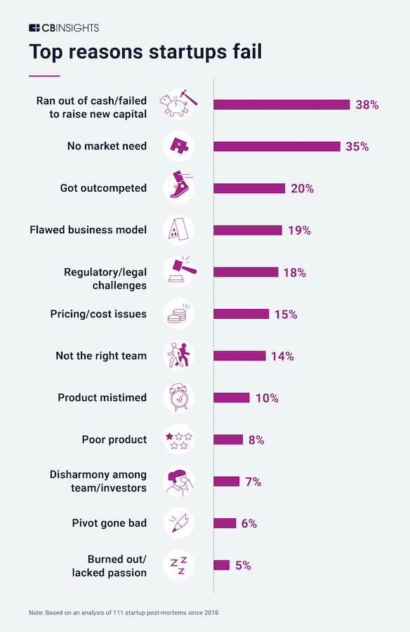
Source: CB Insights
At Appetiser Apps, our app design and development strategy prioritizes an application’s users and potential market. In this article, we will share insights to help you conceptualize and design apps that will effectively build your dreams, grow your business, or enhance your social impact.
Read on to discover:
But before we get to the juicy insights that can help you create a popular and desirable app, let’s start with the fundamentals of app design.
Basic concepts about mobile app design
Mobile app design is essentially focused on how users engage with the app’s visual elements, like its buttons, etc. But it’s not just about making things look pretty; it’s about making the app easy to use and enticing. In addition, a strong logo design also plays a crucial role in creating a memorable brand identity, making the app instantly recognizable to users. Some companies avail brand identity design services to make sure all the elements in the design leave a lasting impression on users.
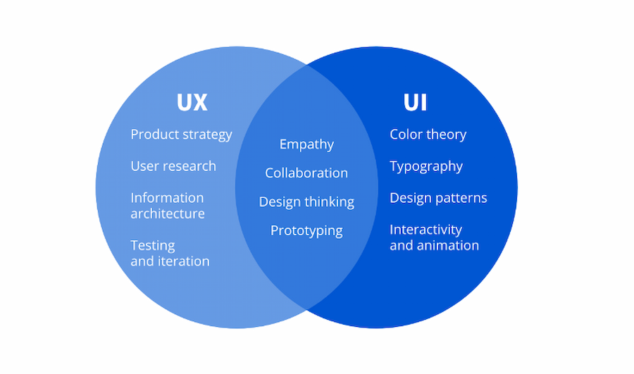
Designers work to ensure that the app feels human and intuitive, considering how users will navigate through it. App design has two main parts: UX (user experience) and UI (user interface). Though both play a role in crafting the overall app, they focus on different design aspects.
UX Design
UX, or user experience, concentrates on effectively meeting the user’s requirements. The core aim of UX experts revolves around ensuring the app aligns with user expectations while offering substantial value. Key elements underpinning successful UX design include superior usability, accessibility, dependability, and practicality.
The principal duties of UX practitioners include the following:
- Conducting user research
- Crafting user personas
- Determining the information architecture of an application
- Devising user flows and wireframes
- Generating prototypes
- Executing user testing
This discussion on UX design just scratches the surface. To learn more actionable tips related to this concept, check out our article on UX design for creating web and mobile apps.
UI Design
User interface (UI) pertains to the visual and interactive aspects of an application as experienced by the user. It includes elements such as color schemes, buttons, labels, animations, and transitions, shaping how the user perceives and uses the app.
In essence, UI design involves striking a balance between making an app aesthetically pleasing and ensuring it achieves the goals of the person or organization designing and launching the app.
Key responsibilities for UI designers typically include:
- Translating requirements into cohesive style guides and visually appealing interfaces
- Identifying design challenges and determining effective solutions
- Implementing animations to enhance user engagement
- Selecting appropriate fonts and color combinations
- Crafting UI components like scrollbars and icons
As you can see, UI and UX are closely interrelated. They are both crucial in delivering a superior product experience. Hence, careful attention must be given to both aspects throughout the mobile app design journey.
Source: Coursera
Now we’re done with the basics, it’s time to design apps that users will actually love.
The 8-Step Mobile App Design Process for Creating Successful Apps
Mobile apps that succeed in the market are designed with the end users in mind.
In other words, you are designing your mobile app based on the actual pain points and inconveniences of your potential users or target audience. Though it’s good to have awesome visuals and add cutting-edge features, you should be designing for real people with real needs.
The design process below guarantees a high chance of market success and shortens the timeline between conceptualizing an app and launching it in the market.
The method below also opens up avenues for attracting large sums of investments.
Without further ado, here is the 8-step mobile app design process that our product strategists and design experts highly recommend:
Step 1: Conduct market and competitor research
The word “research” may sound really formal, thorough, or even tough.
But the market and competitor research we’re advocating is simpler than you might think.
Our product strategists believe in thinking big yet starting small. Often, it’s more feasible to serve the needs of people close to your sphere of influence before trying to conquer the world with your app.
That’s why market research in the context of app design can be as simple as asking your neighbors, friends, relatives, colleagues, local schools or charities, and others near your locale questions such as:
- What mobile apps are you using? Which ones are not serving you the way you want to be served?
- What features would you want to see in your mobile applications?
- Are there any problems in your life that a mobile app can solve? What features should this app have to address your pain points?
As you conduct market research, you can add your own questions to the set mentioned above. You can also get answers to these questions by noting your friends’ or colleagues’ random comments about apps or their life problems instead of asking the questions directly.
After you’ve done your market research, choose one or two predominant problems that you think a single mobile app can solve. For instance, if most of the people you interviewed want a better food delivery app, that’s an app you could aim to design.
Once you’ve decided to design an app for delivering food, you can look at some existing food delivery apps and check out their features. This is your competitor research. If you find that no features from competitor apps can address the pain points you’ve discovered in your market research, you may incorporate those features in your app design.
Depending on what niche you intend to make an app for, you can choose to study other apps, such as fitness tracking apps and travel applications. Whatever mobile apps you decide to examine, ensure that your competitor research aligns with the predominant pain point you’ve learned from your market research.
Your market research and competitor study serve as the basis of the next step in the mobile app design process: outlining your app’s features.
Step 2: Conceptualize your app’s features using the MVP concept
For simplicity’s sake, let’s assume the best-case scenario: your market and competitor research has uncovered 10 features that users long for but are not found in any rival application.
Will you include all these 10 features in your app design? Well, no. At least initially.
When helping entrepreneurs and companies succeed through mobile and web apps, we want to ensure they enjoy the twin advantages of quality and speed-to-market. After all, a quicker market launch minimizes the chances that a competitor will copy your app idea and succeed before you do.
Businesses and organizations that have worked with us have been able to launch their apps 50% faster than the industry average due to our adherence to the minimum viable product (MVP) concept.
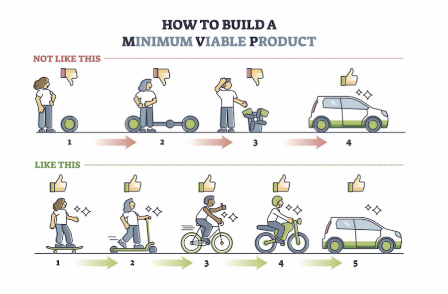
The MVP concept is basically about including just the minimum number of features in your app design to gain initial market traction. In other words, if your app can gain a critical mass of users with just 3 features and it can also do so with 10 features, opt to design and develop an app with just 3 features.
Note that “3’” here is just a rough figure and not a specific industry benchmark.
Why the MVP way?
Designing an MVP app takes less time than designing a feature-rich app. The fewer features, the less time it takes for mobile app designers to create sketches and wireframes (which you will learn about in the succeeding steps). The less time it takes for designers to finish their jobs, the less app design expense you will incur.
Another benefit of designing MVP style is that it provides room for cost-effective app improvements through market feedback. Even though an MVP mobile app only has basic features, designers and developers can eventually add new functionalities to this product based on what the initial group of users say about the application.
Source: Inflective.co
Once you know the features you will include in your MVP app, it will be easier to outline the different app menus users go through. The next step focuses on outlining the user flow.
Step 3: Draft sketches of the user flow
The user flow indicates how individuals transition between screens within your app. Essentially, it outlines the sequence of actions required to achieve tasks within the application.
To better illustrate this phase of the mobile app design process, check out this user flow that we used to help MyDeal design a user-centric ecommerce app. Though the image below is rich in color and visuals, take note that the user flow can be as simple as a pencil or pen sketch.
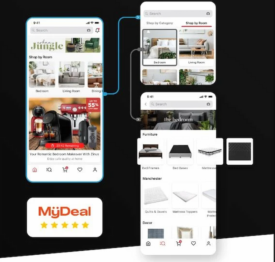
The user flow above shows how a person using the MyDeal mobile app can move from one broad product category to a more specific one. A design asset like this one was instrumental in helping MyDeal founder Sean Senvirtne engage with an increasing number of mobile-based customers.
To learn how Sean leveraged mobile app development to attract investments and generate higher revenues, check out the MyDeal case study.
The visualization of the MyDeal user flow aided in the precise planning of screens and assets required for design, significantly streamlining the process.
MyDeal and other app-reliant companies also utilize user flow diagrams as tools for effectively identifying and addressing potential friction points early on.
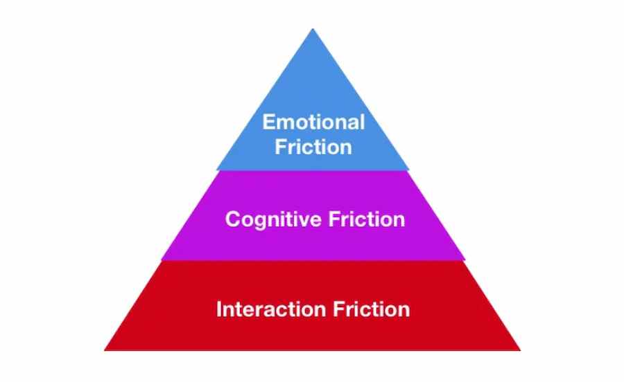
Friction is any obstacle that reduces the quality of the user experience.
For instance, a common UX dilemma involves excessive and unnecessary steps between two menus or app screens, leading to interaction friction that delays task completion. Additionally, this could result in cognitive friction due to increased mental effort and emotional friction due to user frustration.
Source: Sachin Rekhi via Medium
Designers can efficiently identify and rectify such issues by carefully examining user flow diagrams. Quickly identifying friction points brings an app closer to market success and saves on expenses otherwise incurred if these issues were detected in the development phase.
Step 4: Develop wireframes
The sketches of your user flows serve as the basis of more detailed design outputs called wireframes.
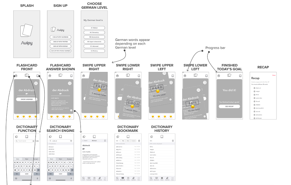
Wireframes are crucial in the mobile app design process because they act as information-rich blueprints for your app’s interface elements. They provide a basic framework for visualizing screen layouts, content, and interactions.
Aside from visuals, wireframes contain annotations and other information to help express how the app is intended to work. For instance, wireframes have element labels and explanations on how users will interact with various interface components such as buttons, etc.
Source: Risa Nakajima
The level of detail and data found in wireframes help stakeholders collaborate on and improve the app design. For instance, the wireframes we create ensure that our output strikes the perfect balance between what our clients actually want in their apps and what will ensure their success in the marketplace.
To learn more about how our world-class app designs have empowered organizations and entrepreneurs, book a free consultation with us.
Step 5: Create a prototype based on your wireframes
Prototypes are basically enhanced versions of wireframes.
Wireframes show you different app pages laid out side-by-side. Prototypes enable you to tap buttons and go from one page to another as if you were actually using the app being designed.
In almost every aspect, prototypes look and feel like real mobile apps. The only difference is that prototypes don’t allow users to access live content, products, or services.
There are many mobile app design tools for creating different types of prototypes, from the simplest to the most complex. To learn more about these types of software, check out our article on tools for creating dynamic mobile app designs.
Once you’ve built your prototype, it’s time to present it to the stakeholders who will significantly impact the success of your app.
Step 6: Present your prototype to users and investors
Aside from you or your app development outsourcing partner, two groups of people could greatly affect your app’s success in the market. They are your potential users and investors.
Potential users
Remember the people and organizations you should talk to during market research? They can also become your focus group and provide feedback on your prototype.
Imagine your prototype as a free sample of a cake you want to make and sell. As you give small slices of the cake to people in your neighborhood, you can ask them what they like about it, what they don’t like, or even if they want a different flavor. Using their feedback, you improve your cake sample until you can make and sell multiple batches of the sweet treat in your bakery.
Likewise, you can use feedback from your focus group to develop your prototype. As you gain more feedback, subsequent versions of your prototype become better.
It’s important to note that gathering user feedback through a prototype is more economical than programming an app and then asking people to rate it. Modifying a prototype is less expensive than reprogramming a fully functional app.
Investors
Only some people are aware that prototypes are also key tools to acquire financing.
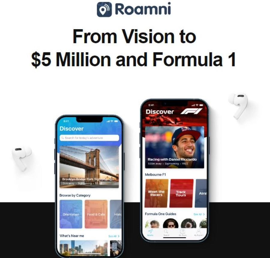
Social media startup Vello and tour tech company Roamni are living proofs that you can use prototypes to raise funding for app development. Their prototypes were so convincing that Vello garnered around $600,000, while Roamni got around $3 million from investors. The two companies used this sum of money to delve into full-fledged app development.
With some prototypes costing just around 0.8% of the financing acquired by Vello and Roamni, it’s evident that prototypes provide opportunities to get a huge return for relatively little investment.

It’s vital to note that the most crucial part of this step is showing your prototype to potential users and gathering feedback. You can proceed with this task of acquiring feedback even if you’re having a hard time finding financing.
Step 7: Write product specifications based on your final prototype
Once your best possible prototype is ready, provide your developers product specifications to guide them before the programming process occurs.
Product specs are like a roadmap for developers, laying out exactly what design assets they need to use in the app. Basically, these specs ensure that your prototype gets translated into the final product with pinpoint accuracy.
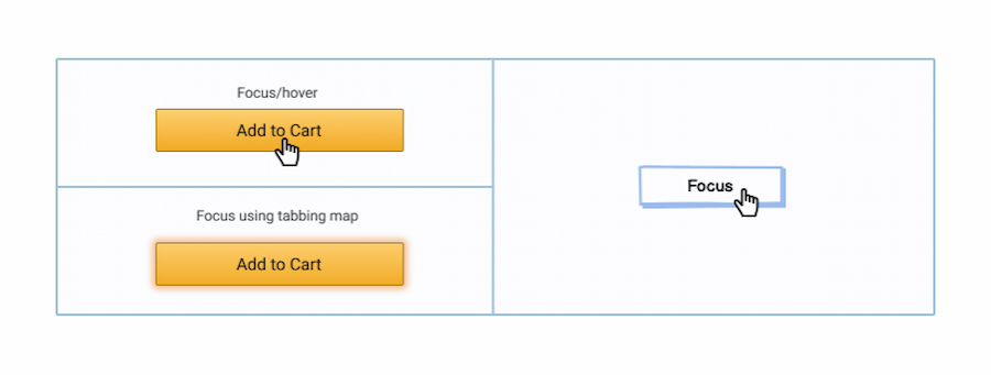
They cover crucial details like dimensions, file formats, color codes, and font names. Plus, they’re essential for showcasing different prototype component states that might not be immediately obvious.
Take button states, for instance. A solid set of product specs should illustrate how the button should appear when it’s active, pressed, or disabled.
Source: Balsamiq
Step 8: Give your prototype and product specifications to your developers
You can skip this option if you intend to develop your own mobile app. Though independent development has its advantages, it may not be feasible in a highly competitive app market.
Check out our article on how hard is it to make an app to compare creating an application on your own versus enlisting the expertise of external parties.
However, if you have an app agency or in-house team to develop your app, you can hand over your prototype, product specifications, and email design assets to them during this phase of the design process.
One of the main challenges during this stage is how to effectively align and collaborate with developers. This is especially true if you outsource your app development project to freelancers or app agencies outside your country.
In such cases, you can use online tools like Slack, Google Meet, Zoom, Figma, Miro, and other similar communication and project management tools. We’ve used these brands of software to empower our clients and foster collaboration within and across our international teams. Hence we highly recommend them.
Another main hurdle during this phase of the design process is communication. Developers and designers speak different languages, with their own jargon and ways of seeing things.
To make sure everyone’s on the same page, you need to hold a formal hand-off meeting (whether online or in person) after sending developers your design assets.
In the meeting, explain the design thoroughly, share your expectations and open the floor for questions and clarifications. And don’t stop at one meeting; have several during the app development process.
Continuous communication between designers and developers is crucial to ensure your mobile app performs optimally and closely matches the preferences of your target market.
People also ask
1. What are the actual steps involved in designing a mobile app?
It usually starts with getting super clear on your idea—what problem you’re solving and for who. Then it moves into wireframes (basically, app blueprints), followed by high-fidelity designs, an interactive prototype, and final design assets for the dev team. Each step helps shape the experience before a single line of code is written.
2. What’s the difference between wireframes and the final designs?
Think of wireframes like rough sketches—they show layout and flow but not the final look. High-fidelity designs are the polished version, complete with colors, fonts, icons, and images. One maps out structure, the other brings it to life.
3. Why bother with a prototype before development?
Because it’s way easier (and cheaper) to spot problems in a clickable prototype than in a live app. Prototypes let you test the user journey, gather feedback, and make sure the app feels right before you start building anything.
4. What’s the difference between UX and UI design?
UX (user experience) is all about how the app works—how users move through it, how easy it is to complete tasks. UI (user interface) is about how it looks—colors, fonts, buttons, layout. A great app needs both working together.
5. How long does it usually take to design an app?
It depends on how complex your app is, but most solid design processes take about 3 to 6 weeks. A simple app might move faster, while something with lots of screens or user types could take a bit longer.
Design a better future
As you can see, the mobile app design process is more than just laying out your app’s visuals or outlining how users interact with your digital product. It also involves knowing how to conceptualize your app well through market and competitor research without neglecting close collaboration with developers.
This unique method of designing mobile apps has enabled our partner companies and entrepreneurs to survive and thrive in a world where more customers and content consumers are using smartphones to connect to the Internet.
Don’t miss out on the digital revolution. Book a free consultation with us to start designing a better future in a rapidly changing world.

Jesus Carmelo Arguelles, aka Mel, is a Content Marketing Specialist by profession. Though he holds a bachelor’s degree in business administration, he also took courses in fields like computer troubleshooting and data analytics. He also has a wealth of experience in content writing, marketing, education, and customer support.


